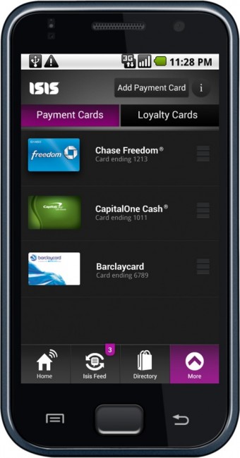
Above is the first shot at what we can expect Isis to look like on our Android devices. Looking past the Froyo notification bar, we see a simple layout of your synced credit cards, an “Isis Feed” which is most likely a payment history page, a shopping directory, and a settings button. So far, we are fans of dark and minimal approach with the purple accents. What are you thoughts on the first look at Isis?
Via: Isis

Collapse Show Comments56 Comments