Now that I have had some time to toss around this new Chrome Beta for Android, I thought I would share some of my initial thoughts and reactions to it. As a reminder though, this is definitely in a first edition beta which means there are some bugs and nuances that Google needs to work out for it to have the polish of the official Android browser. For the most part, it’s pretty damn awesome. Let’s get to it.
Syncing
Other than some fancy UI tweaks, the coolest part of Chrome Beta for Android is easily its syncing abilities. The Honeycomb and Ice Cream Sandwich browsers have had the ability to sync for the most part, but not on this live “real time” level. If you have your PC’s Chrome browser synced, you can view all of your tabs on your phone, access those same pages, etc. Firefox has been doing this for a bit now, but the sluggishness of that browser overall even after dozens of updates has made it not much of an option. For many of you, this is the first time you will have experienced real time syncing.
With that said, Chrome for Android so far has been finicky when it comes to syncing, but once it does, it works better than you would expect. Since it’s a beta, we will try not to be too harsh over the fact that it took almost an hour to get our device to sync. Now that it has, I’m impressed with it.
Also, it does a great job of syncing bookmarks, separating them into folders from Chrome on your PC and then allowing you to manage them.
Two Tips: Transitions and Text Preview
Two things that I initially had been using for the last couple of hours yet managed to leave out of this review were pointed out in the comments as pretty major features, so I’m adding this quick section to make sure everyone is aware of them. The first is the ability to flip between your tabs by simply sliding your finger from the edge of your phone across either left or right. Again, you have to start your finger almost off of your screen and then onto it to activate the slide.
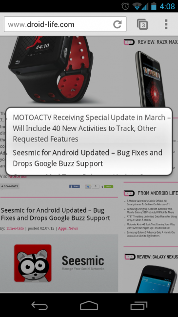
The second thing is to activate Chrome’s new zooming feature for small text areas. As you can see in the screenie on the right, I tapped in our “Recent Posts” widget which had 5 links in it. Since Chrome was unable to recognize or possibly didn’t want to guess which link I was trying to tap, it zoomed out on that area, giving me a close up look at the links. I was then able to choose the exact link. Cool, right?
UI and Polish
The look of Chrome for Android is an odd mix that we both like and dislike at the same time. It utilizes swiping gestures very well and includes beautiful transitions, but none of it reflects Ice Cream Sandwich whatsoever. Obviously Chrome is its own brand that is separate from Android, however, you get the feeling that this browser was made to eventually replace the stock Android browser. Now, there is time for them to work out all of the kinks in it and theme it to make it official or even steal some of the new features and bring them to Android, but for now, it feels like what it is, a separate product. Overall though, it looks as good as any other Android browser out there. Plus, the tilt scrolling is simply too awesome to not play with for a few minutes.
No Flash
Many of you noticed immediately that Chrome for Android lacked Flash support. It’s unfortunate, but with Adobe announcing the end of mobile Flash support a few months back, this is not surprising. They also released a statement this afternoon confirming that this product will likely never support Flash, as they have moved their focus on to HTML5.
Lack of Quick Controls
The lack of “Quick Controls” that are in the stock ICS and Honeycomb Android browsers is killing me already. We understand that this is an Android “Labs” feature, but how difficult would it be for one of these two teams to port it to Chrome. It could happen at some point, but that could be dependent on whether or not Chrome becomes the official Android browser.
Wrap-up
This browser is my new phone browser. It’s that simple. The fact that I can essentially manage my internet world from either PC or phone is something that I have longed for. As a first release, Chrome for Android has bugs and will annoy you at times, but the benefits of using it as a daily driver are outweighing those shortcomings. This is as fully-featured (aside from a lack of Flash support) a browser as you will find.
What are your initial impressions? Can’t survive without Flash? Or is fully-featured enough to get beyond that?


Collapse Show Comments103 Comments