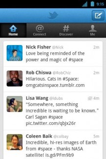
Twitter fiends can head on into the Android Market and snatch up the newly redone application. They have given the user interface a nice new sparkle along with sort of changing the way you interact with Twitter. You have always had your timeline, mentions, profile, and the search option – now you have “Home” which is your timeline, “Connect” which is your mentions, “Discover” which is your search and hashtag center, and finally “Me” which is your organized profile just as you would see on the desktop version.
Since we are on the subject of Twitter, don’t forget to follow us. Below is a video demonstrating Twitter’s newly enhanced web experience that also just came into effect. Go tweet!
http://www.youtube.com/watch?v=0qqDy5BmYKE

Collapse Show Comments15 Comments