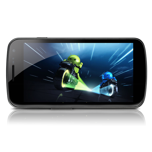
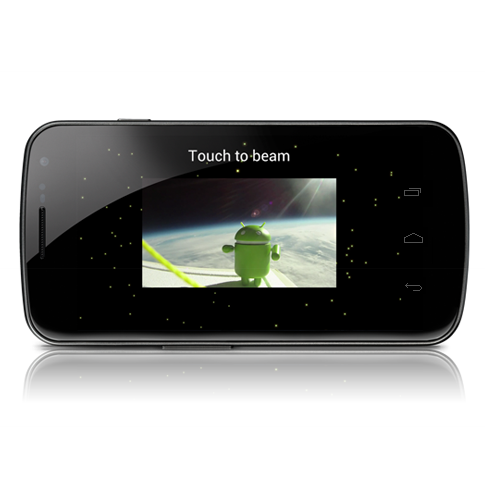
This week Google announced the latest version of Android, Ice Cream Sandwich. With the announcement came a number of revelations about the philosophy being pursued by Android’s lead designer, Matias Duarte. Joshua Topolsky’s exclusive interview with Duarte was extremely helpful in understanding the ideology that influenced the massive changes made in Android 4.0.
The first major change in ICS is the new UI. Rather than keeping the same Phone, Apps, Web launcher from Froyo and Gingerbread, ICS offers the option to have any four applications on the launcher, two on either side of the Apps button (which has also been redesigned). Above the launcher you can see a thin line separating your applications from your homescreens. That line doubles as a screen indicator, glowing in one of five spots as you flip between homescreens. Rather than add a search widget, Google has opted to place Google Search on the forefront, making it the header of every homescreen. This is exactly the sort of subtle polish that Android enthusiasts like myself have been clamoring for.
Google has made no attempt at hiding the Tron influence that began in Honeycomb and has continued in Ice Cream Sandwich. In Topolsky’s interview, Duarte specifically stated that the new UI design came from a desire to do something that was not trying to replicate the world (Apple) and not trying to overemphasize digital simplicity (Windows Phone 7). The elegance and beauty found in Android 4.0’s design was indeed a reaction to the philosophies of Microsoft and Apple. Google, a company primarily identified with search, has realized that design is almost as important, if not more, as functionality.
Making things simple yet beautiful is no easy task, but Duarte seems to have been able to steer Rubin’s team towards creating a UI and UX that gleams with polish. Gone are the days of grey app drawers and unmatched color schemes. Ice Cream Sandwich is the first release of Android that offers a level of polish and synergistic user experience that rivals Apple’s aspirations of beauty and Microsoft’s aspirations of simplicity.

Rubin’s team hasn’t just improved the look of Android, though. Android 4.0 offers new features that are built into the system to make the whole experience less dependent on third-party apps. Features that were once only available in custom ROMs or skinned versions of Android, like taking a panoramic photograph or dismissing individual notifications, are now built into Android by Google.
The result of all of these changes has been to create a mobile operating system that looks stunning and feels feature complete. Google has been increasing the functionality and beauty of many of its products over the last year, but the changes to Android stand out from among the rest. As Duarte claimed in his interview with Topolsky, Google has been hard at work over the past year transforming Android from a powerful, yet cumbersome OS to an operating system that people will love.
Why has Google been so aggressive in their changes to Android 4.0? Obviously Android has been competing with iOS and to some extent Windows Phone 7 and Blackberry to offer the best mobile experience possible. Part of the reason to innovate is simply to continue to improve their software faster than their competitors. That said, I believe there are two more important reasons that pushed Google to really change Android’s look and feel.
The first reason for these massive changes is fragmentation. Every manufacturer from HTC to LG has created their own skin to go on top of Android. In the days of Android 1.6 this certainly made sense, but as Android has evolved and become more polished, the justification for delaying updates in order to skin Android has diminished. Rather than force manufacturers to stop skinning Android, Google can influence the manufacturers to stop because the UI doesn’t need any more enhancements. In order to ensure that every phone released receives updates for eighteen months after release, it seems more and more likely that Google will have to enforce a no-skin rule. The easiest way to make this argument is to make Android an OS that doesn’t rely on third-party customizations to be both elegant and powerful.
The second reason for Google to push for these massive changes is litigation. Google’s manufacturers have been involved in massive lawsuits with Microsoft and Apple over the past few years. While Google has avoided litigation with Microsoft and Apple directly up to this point, it cannot escape litigation forever. With partners like Motorola threatening to sue other Android partners and Samsung starting lawsuits with Apple abroad in response to Apple’s initial litigation, Google has to do something to avoid legal battles. Google purchase of Motorola was almost certainly a response to the threat of civil war between Android partners, but how should Google deal with Samsung fighting a losing battle against Apple? Samsung has already decided that it will change the Galaxy Tab in Australia to avoid infringing on Apple’s IP, but that may not be enough. Google may have decided that the best solution would be to offer an operating system that did not require manufacturer customizations for OEMs to consider it competitive.
Google is entering a new era. The company that makes its money primarily from search advertisements is out to change the way we work, play, and communicate. Google needed its manufacturing partners to help spread Android as the Lingua Franca of operating systems, but now it’s time to take control back. It’s possible that the Nexus program has always been about putting Google back at the forefront of innovation instead of relying on the manufacturers. The fact that Google purchased one of its OEMs is evidence enough that the game has changed. Google is positioning itself to defeat Apple in the mobile space through quality and utility from the top down, rather than through manufacturers. Android 4.0 is just the beginning of a whole new Android and a whole new Google.

Collapse Show Comments127 Comments