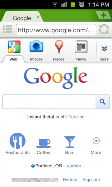
Two weeks ago to the day, Google introduced a new mobile site that made it easier for users to search for nearby places with shortcuts, but it also aimed to make searching in general much more fluid. Today though, they’ve taken all of those new features and made them so 2011 by slapping them with the pretty stick.
As you can see above, you now have a set of colorful icons along with a tabbed look to maneuver around that can be accessed by simply swiping downward. From there, you can touch the “More” button which will bring you to a list of available search items or “apps” like Buzz, Picasa and Google Reader. Everything, all in one place.
And this is going to sound odd since we can search from just about anywhere on our Android devices, but this new look and easy access to my favorite Google products has made the mobile version of google.com incredibly appealing.
Nothing that I know of that you can do to make it look all snazzy like this, so to see if the updated version is available to you, just head to google.com from your phone’s browser.

Collapse Show Comments36 Comments