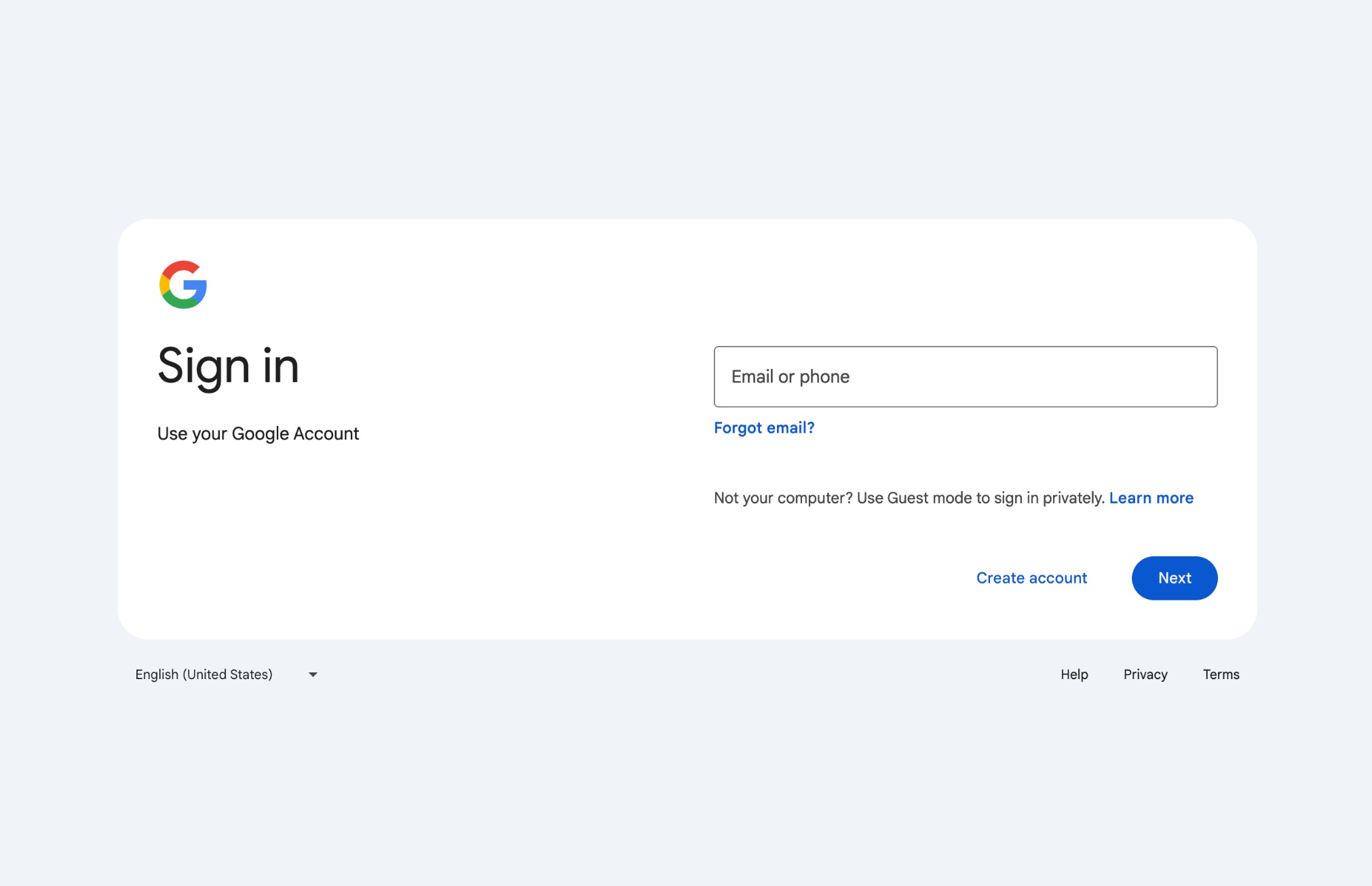
If you have been asked to sign in to your Google Account in recent days, you likely saw the notice at the top that read, “A new look is coming soon,” and that Google was “improving the sign-in page with a more modern look and feel.” We now know what that new look will look like.
Google shared the refreshed design today in a note to Google Workspace customers. The new layout and interface is more “modern” and with the Material Design principles we’ve seen across other Google apps and services. The biggest change, which you can see below, is the removal of the word “Google” and simple “G” in its place. Huge, guys.
And well, that’s pretty much all there is to say. Google makes it clear that this “is strictly a change in visual appearance” and that “there are no functionality impacts or changes.” So all that teasing just for a “G” logo.
New Google Account sign in
The change should start showing up within 15 days for your accounts starting from today, February 21. It will rollout to all Google Workspace customers and personal Google Accounts, like your Gmail account.


Collapse Show Comments6 Comments