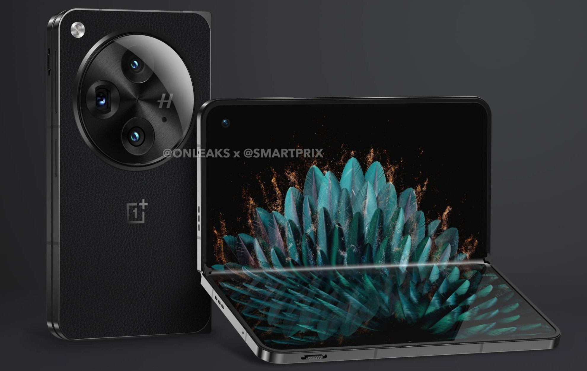
Most early leaked renders over the years have been accurate and often spoil the big reveal from a company who has been working on their next big device. It happens almost every year, sometimes multiple times per year, with Samsung, OnePlus, and Google devices. I couldn’t tell you the last time we didn’t know exactly what the next major phone from one of those companies looked like before it was announced. We knew months in advance for many of them.
For OnePlus’ upcoming first foldable, thought to be called OnePlus Open, we saw the first purported renders of it a little over a month ago and the device looked great. It looked a lot like the design and shape of Samsung’s Z Fold line, which came as a bit of a surprise knowing related OPPO foldables. Now, a late switcheroo has apparently happened and OnePlus might instead have a very different foldable on the way.
Leaker @onleaks dropped a new set of renders this weekend of the OnePlus Open and it now looks like OnePlus has gone with a design closer to Google’s Pixel Fold than the Galaxy Z Fold.
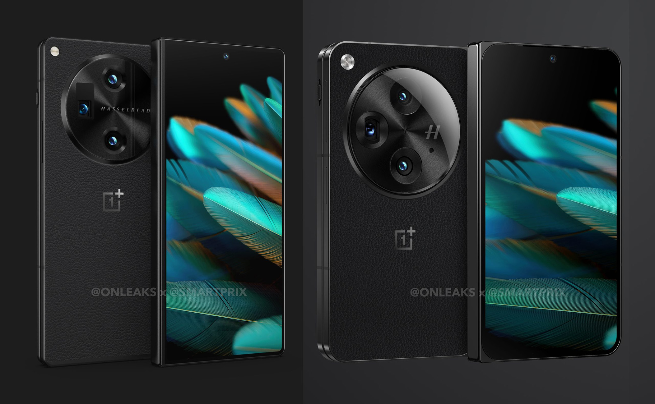
As you can see in the images here, this new device appears to be shorter, with a wider cover display that would then open to a wider tablet style device. The previous model was more vertical in design, which is why it matched up closer to Samsung’s line than Google’s.
The changes can really be viewed in the comparison image below, where everything in the new design looks much fatter and flatter. This thing really looks a lot like a Pixel Fold now, plus the camera is supposedly getting a redesign with a new, bigger module. We’re also getting OnePlus’ classic alert slider and a power button with fingerprint reader, as well as a faux leather backside.
So when is the OnePlus Open arriving? Well, we all thought it would show up this month after OnePlus started teasing it. At least one reliable leaker believes it has been delayed over a screen change, though. And that would make sense if we’re seeing refreshed renders this late. A new design like this would likely require a different display panel.
Which design are you a fan of? I think I’m leaning towards the new one, although that bottom left corner is going to be sharp in the palm.
// Smartprix


Collapse Show Comments7 Comments