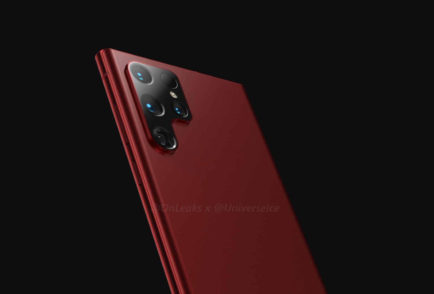
Let me start this post by saying that when we post 3rd-party renders of unannounced devices, know that what we see can always change. That could be the case for the Galaxy S22 Ultra, whose initial renders weren’t greeted with a ton of enthusiasm from the Android community. After all, it was just a Galaxy Note 10 with a funky camera layout. Thanks to yet another round of renders, we’re getting an updated look at what we might expect from this upcoming device.
As we can see in these new renders (new design posted above), there could be a big difference with regard to the camera housing from what we saw originally (below) to what we get when the phone is launched. The housing could be separated or combined into a single piece. At this moment, no Samsung insider can confirm which design is more accurate, but at least we know Samsung is working with a few options.

These renders also show the device in a very nice dark red color, though, this is likely an artistic choice and not something we as consumers should look forward to. I’d be very happy with it, but Samsung has a history of disappointing me when it comes to color options.
What do you think? Do you want the new separated look or do you like the original combined look? Personally, I’d opt for this new separated option. It looks cleaner to me.
// @OnLeaks

Collapse Show Comments18 Comments