On the surface, for non developer people such as ourselves, there are not many front-facing changes inside of Developer Preview 3 for Android 12. However, for those who can code, they can unlock the secrets and detail all of the sweet stuff that Google is working on behind the scenes. Obviously, that’s the interesting stuff we want to talk about, so let’s check it out.
Thanks to @kdrag0n on Twitter, who went through what appears to be many lines of code and things I don’t understand, we can get a sense of what Android 12 is going to offer users. And honestly, there’s some sweet stuff in here.
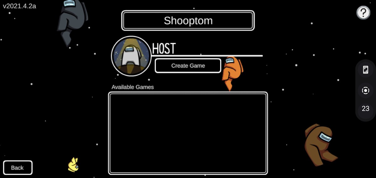
An Actual FPS Counter
The game dashboard now displays an actual FPS count, instead of showing the display’s refresh rate. As you can see in the screenshot below, on the right side, there’s a number value for frames per second, right under the record button. For all you gamer peeps, this is great.
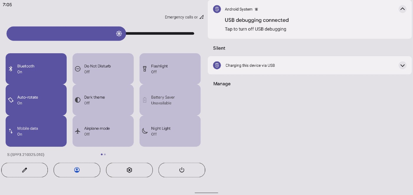
Quick Settings Redesign
The quick settings (QS) menu is getting a big time redesign, with tiles becoming large rounded rectangles. You’ll also note they cover most of the screen. Hate it or love it, one awesome addition is a new dedicated power menu button.
Wallpaper-based Theme Engine
We already knew this was coming, but it’s still nice to see what it can look like once fully implemented. If you weren’t aware, Android 12 should allow for users to have their device’s theme based on the wallpaper they are using. For example, setting a darker wallpaper will set a darker system theme. This will certainly be a nice touch.
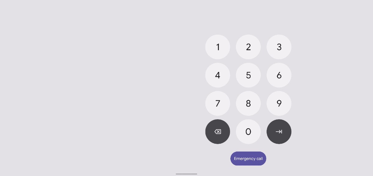
One-Handed Lock Screen for Tablets
Notification Shade Tablet Layout Change
Fancy Charging Ripple Animation
This is still only Developer Preview 3, so we’re sure to see even more things get enabled and baked into Android 12 in the future. However, it’s also possible some of this doesn’t make it into the public build. That’s the nature of the Developer Previews.
What do you think?
// @kdrag0n


Collapse Show Comments21 Comments