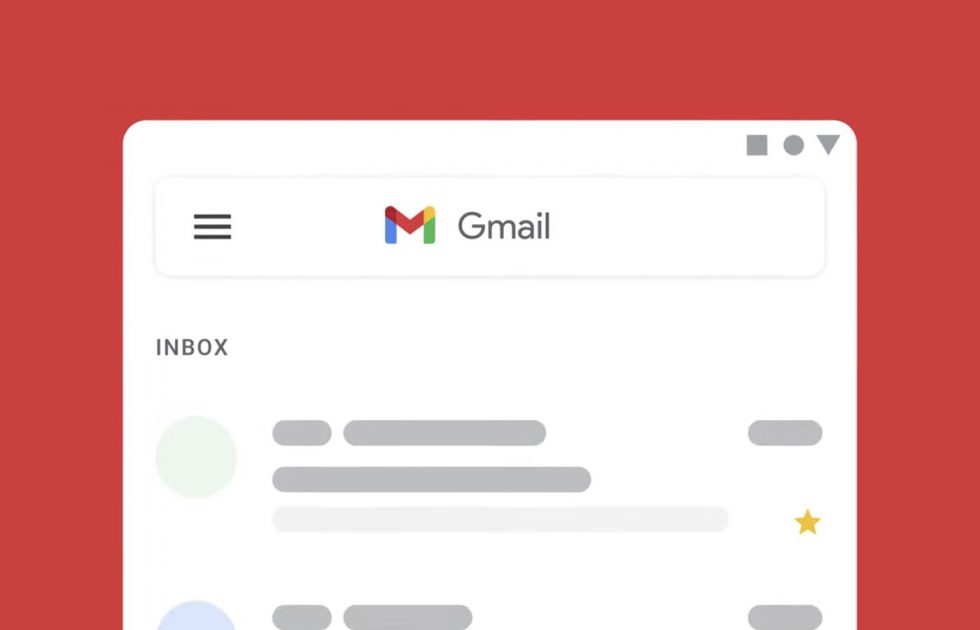
Prepare yourselves, the icon set for all of your most used Google apps will soon change to a much more colorful design. There’s actually a lot more to this story, but for most of you, that’s the takeaway.
The rest of the story is that Google has renamed G Suite to Google Workplace. Workplace, for those not familiar, is Google’s paid suite of Google apps that companies use as the productivity suite for their employees. That means Gmail with a custom domain, admin controls over the features you have access to in apps like Calendar or Drive, etc.
With this name change, which is a much better name to explain their paid services than G Suite was, Google is trying to bring “everything you need to get anything done, now in one place.” Well, that’s the new slogan for Workplace, anyways.
In the near future, Google plans to issue a bunch of new features too (outside of the new Gmail we got a few months back), with things like:
- Chat: dynamically create and collaborate on a document with guests in a Chat room
- Docs, Sheets, Slides: preview a linked file without having to open a new tab
- Meet: Meet picture-in-picture in Docs, Sheets, and Slides
Cool, right?
New Google icons
All of that paid stuff aside, let’s get back to icons. Yes, with this Workplace name change you will all get fancy new icons that are very much inspired by the colors of Google. Below, you can see the new Gmail icon, as well as those for Drive, Calendar, Meet, and Docs. Sheets and Slides will be blessed as well. Google says to expect them all in the “coming weeks,” probably as a slow, always-frustrating, rollout.
Alright, that’s it.
// Google | Google Cloud


Collapse Show Comments12 Comments