The Microsoft Surface Duo has been in my hands for 72 hours and I can’t bring myself to use it much longer. After just three days, this will join the Motorola Razr on the list of the most deeply unpleasant devices I’ve ever touched, though there is a touch of hope here that the Razr didn’t have.
The hardware, while pretty and premium-feeling, is so weirdly presented from a modern mobile device perspective, but the software might be the biggest problem area of all. There is a lot of bad going on here, some of which could be addressed (software), while a big portion (hardware) is stuck with questionable decisions made by its creators.
This isn’t a review, because this device needs a lot of work, so instead here’s what Microsoft should address before anyone considers buying a Surface Duo 2. That’s right, I’m already looking to the next generation device because this version should be skipped unless Microsoft turns into a magician with Android software.
Hardware trying to hide its many flaws
Since the software is the critical piece here because it can be fixed, let me first run through my thoughts on the hardware.
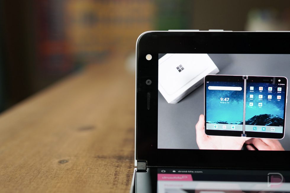
I think Microsoft will get a bunch of credit for building a premium device, but let’s be honest – this thing is by no means close to being perfect. Building a fancy hinge and surrounding it with thin glass and metal should not distract you from a handful of obvious flaws. The missing pieces should not be played down and Microsoft doesn’t deserve a pass for leaving out NFC or a real camera or stereo speakers or some form of a display on the front.
Designed like a laptop, which aren’t meant for hands
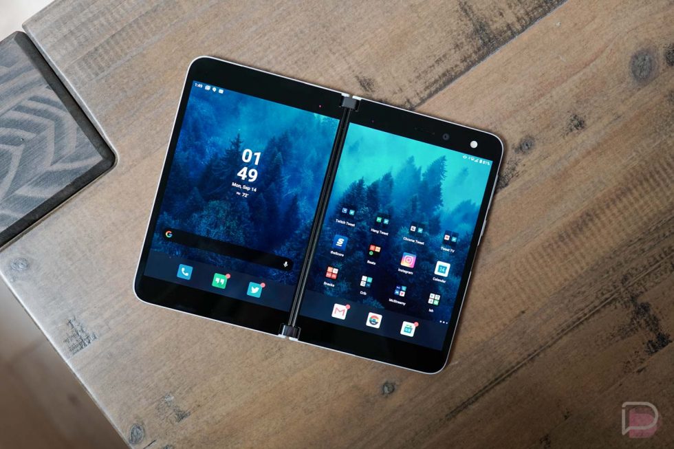
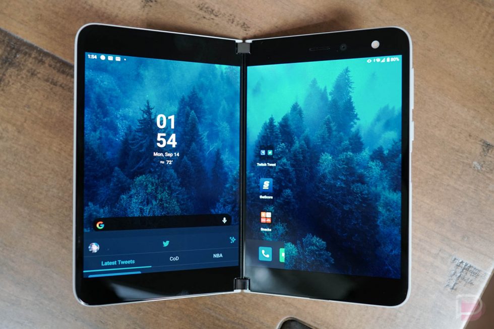
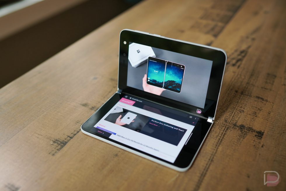
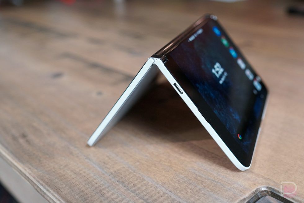
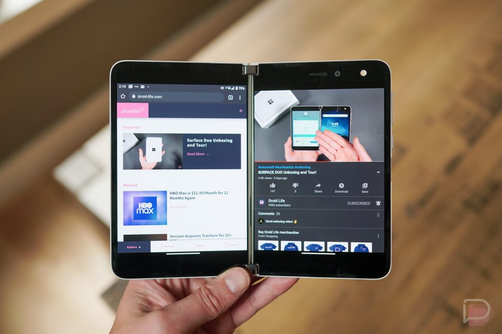
Holding the Surface Duo can be an elegant experience, when it’s unfolded and both hands bend its beautiful hinge system to the perfect angle, letting you dive into content on each screen as you settle into the couch. But when you need to get something done, which often means folding the phone back to get on a single screen, the design immediately lets you know that it wasn’t made for this.
Pick up your current phone and feel where the glass meets the metal side panels. It’s smooth, right? You can’t actually feel sharpness or the edge of the glass in most cases. On the Surface Duo, it’s all sharp glass edges no matter where you grip from the side. It looks like Microsoft glued each panel onto a metal frame in a way that I could probably slip a fingernail behind it and peel it off (I’m not going to try).
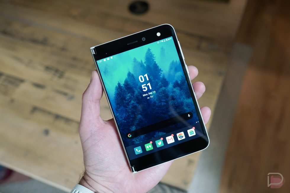
Outside of the glass, the hinge, when folded, is sharp as well. So again, if you are in one-handed mode, depending on the hand you have the device in could mean a squared-off point stabbing you in the palm. It’s pretty unpleasant. Now, you may think, “Kellen, you are supposed to use it open with both screens,” but you aren’t really. The idea here is a device that meets your needs and can convert into a shape or style at any moment depending on the task. Typing is easier when the device is folded back, and that’s something you do on phones a lot.
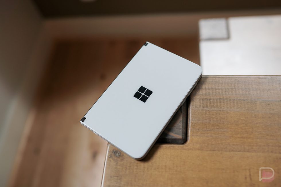
What Microsoft designed with Surface Duo is a mini laptop. Like, if you took a picture of this with nothing to reference the size, you’d think it was a Surface laptop of some kind. The problem with that is laptops aren’t meant to be held. They are meant for laps or desks or tabletops, so you get this odd shape that isn’t hand-friendly for use cases where you might need a phone or a device more manageable with a single hand. And good luck ever opening it with one hand.
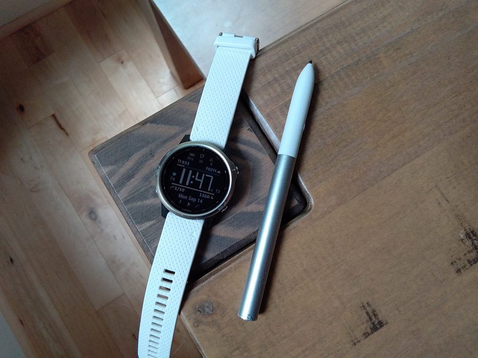
By designing a laptop, they also left out an external display, yet with an operating system like Android, you can’t really live without one. Notifications and always-on information are critical to staying productive with modern smartphones, but with Surface Duo, you almost have to buy a smartwatch to help keep you informed of your phone’s status since it can’t do it. I don’t know how Microsoft could have implemented a display that wouldn’t destroy their ultra-minimal aesthetic, but they certainly should have tried to figure out a way. I don’t get paid enough to do it for them.
Microsoft clearly worked so hard to make this device perfectly uniform, with matching interior and exterior glass placements, identical pieces on each side of the hinge, and no camera humps or exterior features, but that might have been a poor decision. This device is supposed to be functional in multiple ways, yet it struggles to do that because of its forced limitations.
It’s the worst camera I’ve ever used
As far as the camera goes, I never expected the Surface Duo camera to be any good, but I’m a bit shocked at how bad it actually is. This is low-level, 2012-esque bad. It actually reminds me a lot of the Essential Phone when it first launched, where you had this camera that could barely load, certainly couldn’t snap many pictures in a row, and processed like the summer intern was put in charge of imaging.
I took the Surface Duo with me for a short drive this weekend through smoke-filled Portland and attempted to take pictures from the car. I think I got two, both of which were so blurry I can barely make them out, while the rest were pictures of my lap, thanks to camera lag. The app is slow, the shutter button is never ready when you need it, and the image quality is unbelievably bad, as is the camera app.
The thing is, with the Essential Phone, we watched as they did their best to improve the camera in a hurry and someone ported the Google Camera app over for help. I’m not sure a Google Camera port would even help here.
I hate to hammer on the $1,400 price point over and over again, but Microsoft clearly sacrificed in one of the most important hardware areas of this phone so they can have a clean exterior with no humps and an interior that shuts completely flat. Sure, it looks minimal and pretty, but owning this phone means never being able to take a picture you are proud of in any lighting condition.
Surface Duo vs. Galaxy S20
NFC…
The NFC thing I just don’t get. It’s a simple, tiny chip that makes paying for items hands-free. It has been a staple spec in almost all smartphones for a number of years now at all price points. Now, I know that Microsoft was developing Surface Duo before COVID destroyed the world and scared us out of touching anything with our hands, but leaving out NFC is something we all hammered OnePlus for back in 2015. It’s 2020, and while I get that not everyone has fully adopted mobile payments, they more than likely will over the next couple of years. If you buy this $1,400 device (!), you’ll never be able to make them.
Anything good about the hardware?
Of course! The AMOLED displays both look great, battery life is way better than I expected (easily full day), the fingerprint reader is quick and handy, and that hinge really is spectacular. I love the weight of Surface Duo and being able to adjust the setup to various angles to let me consume content or stay more productive. Microsoft has certainly done some praise-worthy things here, they just seem to have gotten caught up their own quest for extreme minimalism.
Software they should be embarrassed by
Oh boy, this isn’t going to be fun.
Before we dive in, know that my unlocked Surface Duo is on software version 2020.812.86. This is the update that I picked up straight out of the box and is currently showing from Microsoft as being the newest and most stable. While I haven’t looked at many reviews of this device, it sounds like this update was pushed to reviewers at the last minute and turned the device from unusable to the state I’m in now, which is still bad. I can’t imagine it being worse than this. Good lord.
Jank, lag, jank, lag, jank
When you first fire up Surface Duo, you want to dance between screens, run two apps at once, drop some in the middle to see what happens as they expand across both, and throw as many tasks at it as possible because no other device is setup the way this one is. Unfortunately, in this current early software, nothing works smoothly or enjoyably.
The animations are rough, jittery, and inconsistent in how they take you in and out of apps. I’d blame the 6GB RAM or the Snapdragon 855, but it seems more like Microsoft hasn’t tuned or optimized the OS properly or paid attention to little details.
I can’t tell you how often I wake the phone and it forces me to wait several seconds for it to be ready for use. Or when I swipe between home screens and I see this noticeably slow jitter as it makes that move. Or when only one screen wakes initially after opening and the second screen leaves me wondering if it’s dead or I’m going to need to reboot. This stuff happens all of the time.
There are other little issues too, like in how poorly the home gesture is implemented. For example, Google does this cool thing with the Pixel Launcher on its own phones where you exit an app, and if that app has a home screen shortcut, the animation zooms out back into that app’s spot. I bring that up because Microsoft sort of emulated that with folders that do open in and out from the same spot, yet the apps as you head back home have this weird mind of their own that is only enhanced by poorly done animations.
If that sounds like nitpicking, it is a bit, until you realize how deliberate Microsoft was with a bunch of other animations. They clearly spent a lot of time making the bottom navigation tray app shortcuts slide from right to left as you move between screens or open apps or the app drawer. The full home view preview animation that pops-in as you long-press on a home screen is also quite nice. It’s obvious that Microsoft wants everything to be pretty and precise, it’s just that in some of the most important areas they have fallen so short.
Gestures trying to do too much
One of the key features for Surface Duo is its gesture navigation because this is the way you move apps from screen to screen, expand an app to two screens, and navigate Android. For the most part, Microsoft has a good plan for how this should work, they just need to fine-tune it in several ways.
For one, the swipe up gesture to go home is wildly unpredictable. Sometimes it swipes an app to the next screen when you meant to go home, sometimes it (obviously) wanted you to swipe up further and leaves the app open, or it might not even register what you tried to do.
The navigation area also creeps up too high and often impacts app experiences. Instagram is the best example I have, where a good portion of the bottom navigation bar within the app is unusable at times because the system navigation area overlaps it. Often times tapping on home or the search button won’t do anything because the system thinks you are initiating a swipe gesture.
Because Microsoft turned the side-to-side swipe into a gesture that moves apps from one screen to the next, they killed off the quick app switch gesture from Google. In other words, there’s no easy way to get back to your most recent app except for swiping up and holding to go into the app switcher. That’s not the worst idea, but it’s one of the slowest and most stuttery parts of the OS.
Like the animation situation, Microsoft can fix this (I think), it’s just going to take time.
Notification area needs work
For a device with two screens, it shouldn’t be hard to nail the notification experience, but this has been one of the most frustrating areas. Microsoft will hopefully learn very quickly how important notifications are to Android.
For one, the notification swipe down requires that you reach the top of the status bar and swipe down. You can’t do the middle of the screen swipe down like almost every other phone maker has implemented at this point. Instead, a middle screen swipe brings you into a universal search. That’s fine I guess.
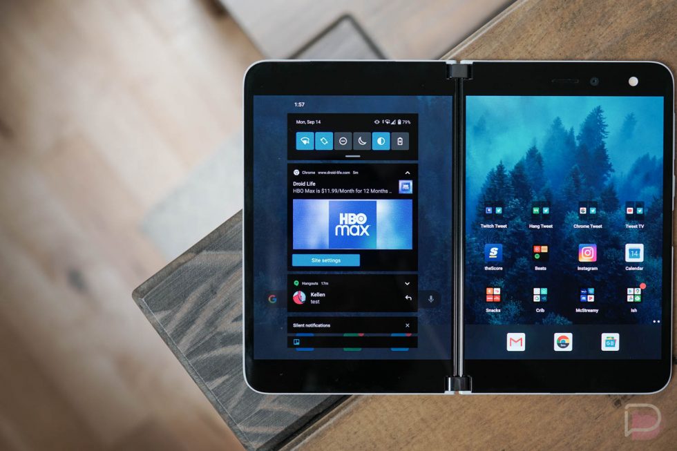
Once in notifications, though, it’s a baffling setup. Microsoft gives you these two huge screens to view everything on, except they made the notification pulldown tiny and skinny so that your notifications don’t show enough info. Look at this image and tell me why they wouldn’t expand this pulldown by a half inch or more on each side.
Microsoft also changed a core interaction with notifications, where tapping on them doesn’t directly open the associated app at first. Instead, if the notification can expand, a first tap does just that – expands it. For Gmail, if you have multiple email notifications stacked, each tap first expands each notification rather than opening that email. Google put a dropdown arrow in notifications to do that for you, so I’m not sure why Microsoft went around this. As someone who is used to the way Android notifications work, the extra taps aren’t welcomed.
I’ve even had issues where no notifications show until I swipe down the area and realize there are several up there waiting for me. Of course, not having any sort of outer display has meant not getting notifications or realizing I had any until I grabbed the phone and opened it.
This is Android and so you have got to nail the notification system. It’s the lifeblood of the OS.
I hope they can fix the touch responsiveness
This could be a hardware issue, but not since the Essential Phone (2nd reference!) have I used a device that felt this behind each swipe or that failed to register this many touches.
Dragging apps across the screen (which is a key feature!) always feels like it’s not properly tracking with your finger. Tapping on apps and waiting for them to open only to realize the device didn’t recognize your touch is a frequent thing. The device missing your gesture swipe up, back gesture in, or notification swipe down happen more times than I can keep track of.
The device also does this move where you fold one half back and flip it over, so that you can switch displays. It’s cool and I’m assuming it uses the gyroscope/accelerometer in the device, but the problem is that it then asks you to double tap on the screen to make that switch. It works the first try like 1 out of 3 times.
It’s just weird to see such a flaw. It’s too bad too, because the displays look great.
So many bugs
A few of the other issues I’ve regularly stumbled upon are slow typing experiences in both Swiftkey and Gboard, OS lock-ups where the gesture navigation breaks, apps often weirdly appear on top of each from one screen to the next, the wallpaper has disappeared and turned to black, the auto-rotate has a mind of its own, and I have had to reboot several times because the system fails to respond to much.
Features I need today or yesterday
Stepping away from those issues, there’s a couple of features I think Microsoft needs to work on immediately to improve this experience.
For one, this device needs an always-on display or double-tap to wake right now. Because they didn’t put a display on the outside, I’ve found myself wanting to unfold and set it on a desk or in a stand to give me easier access to notifications, the time, act as a bedside clock, etc. But Microsoft didn’t do either of those things, so as notifications roll in, the entire screen fully lights up briefly and then it goes back to being dark and locked.
Microsoft also really needs to work with developers to get more apps into the dual-screen mode. None of Google’s apps that I tested work in split screen or across both displays. As someone who doesn’t really use a single Microsoft service, this basically eliminates one of their biggest demo features. I couldn’t even test it. I’m guessing I won’t ever, unfortunately.
It feels bad, man
I hate doing write-ups like these because I see the potential with Surface Duo. In fact, when I’m chillin’ on the couch at night and need only to watch Twitch or YouTube TV or browse Twitter or look at Instagram or catch-up on news, it’s pretty great. Having two screens this close to one another that move around with a really cool hinge system is an experience I could totally get used to. Using it to cook this weekend was fun, letting my kid play games and watch shows on it in play forts he had built all weekend was cool, and whipping it out just to fold and unfold is satisfying in ways a pen click will never top.
The problem here is that Microsoft shipped a device that isn’t close to being ready for prime time. They made far too many sacrifices with the hardware, the software probably needs a half dozen updates of straight bug fixes to be decent, and we need more features in there too. If this was a developer-only device that few had access to, all of that might be somewhat acceptable. Well, that might only be acceptable if it wasn’t Microsoft who built it. I’m quite shocked that they even let this device out the door, but appalled that they did and also want $1,400 for it.




Collapse Show Comments110 Comments