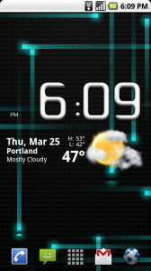
The developer behind the HelixLauncher and HelixLauncher 2 has asked for Droid Life readers’ input as to the overall look of the latest installment which will work on the stock 2.1 Droid. After showing off the beta version of Helix 2 over the weekend, we saw some mixed reviews on the new placement of the app drawer button.
So here you go DL readers, your input matters on the development of one of the best apps on the market. Should the app drawer button be in the new spot on the right or return to its original middle position?
Pretty cool that the developer would come to us for input right? Feel free to back your answer in the comments!

Collapse Show Comments66 Comments