The “New Facebook.com” has arrived. While I don’t find myself going through my Feed as much as my mother probably wishes I did (sorry, Mom!), we at DL do use Facebook daily to post our latest stories to our page. Feel free to give it a follow. This week, the site is receiving a major UI overhaul, and as Android users, there’s one big change that I’m sure all of you will love and enable.
The overall appearance of the site is a bit more bubbly, with Facebook highlighting the ease of searching for new things and its speed. For us Android folk, though, it’s all about the new Dark Mode!
You can see it highlighted in the header image above, but essentially, the entirety of the site goes dark and the whole thing just looks so much better. Now I just have to do something about those people from high school I’m “friends” with for some reason.
Enabling New Facebook and Dark Mode
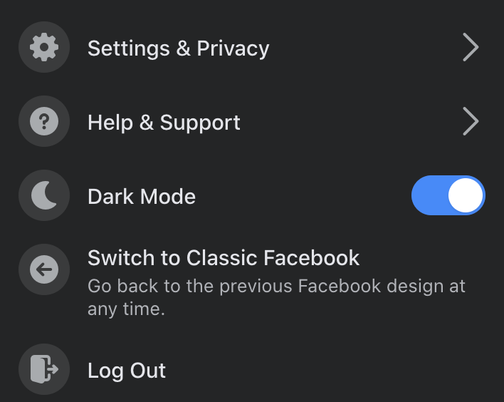
To enable the New Facebook UI, press on the little arrow in the top right of your window. In the drop down menu, hit “Switch to New Facebook.” Once you have the New Facebook, you’ll be asked if you want the Light or Dark theme. If you chose Light and want to switch to Dark later on, head into your Settings again and you’ll see a dedicated toggle for Light and Dark mode.
Honestly, this looks great, but I don’t think it’ll get me to use the service. How about you?


Collapse Show Comments