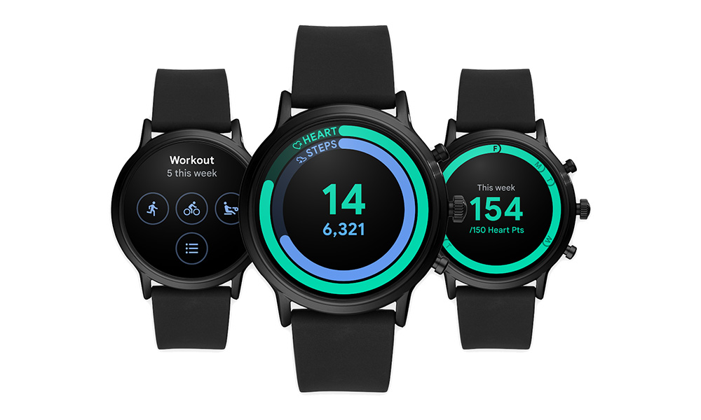
Google Fit, the Google fitness tracking service on both phones and Wear OS, is receiving a visual makeover this week. The updated UI will feature bolder text and brighter visuals, while Wear OS gets new tiles for you to utilize. The other big change puts a focus on steps instead of active minutes.
The first thing you’ll notice in the images here are those tweaked visuals. Fonts are certainly cleaner and bolder, and everything is easier to read, with goal progress as clear as can be. Having glanceable health tracking information that you can easily digest should be the approach for all fitness apps.
The second thing to care about are the Wear OS changes that better show progress for the week and day, as well as the new tiles for firing up workouts and checking your weekly heart points. These new tiles are for Wear OS watches running Android Wear 2.0 and above.
And finally, Google Fit will now pair heart points with steps going forward instead of heart and active minutes. Google says they now recognize that steps make more sense to people than active minutes, especially for those looking for an easy starting point on a health journey.
The new updates are available immediately to some, but the rollout is expected to take place for everyone throughout the week.


Collapse Show Comments