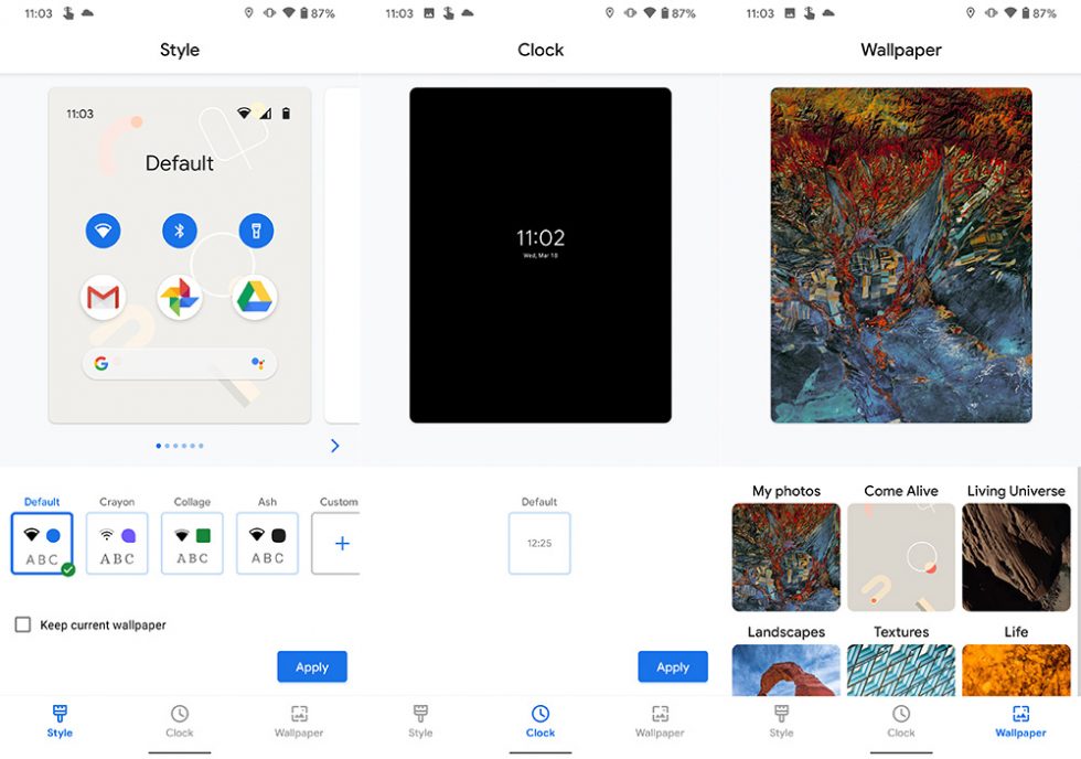
The Styles & Wallpapers section of Google Pixel phones is getting a revamped UI in the latest Android 11 Developer Preview 2. The new look introduces a new “Clock” section and a cleaner appearance for the wallpaper picker.
Previously, the Styles & Wallpapers theming section had just two areas: Style and Wallpaper. Now, in Android 11 DP2, you get a new “Clock” column that appears to be a preview of what’s to come. As of today, there is a single “Default” clock option, but since it looks like a lockscreen clock setting, I’m just going to assume this means a more customizable lockscreen is coming to Android 11 and Pixel phones. Clock options would be fun!
Oh, does this sound familiar? It should! We first talked about this idea of lockscreen clock customizations back before Android 10 was released and still in beta as Android Q. Clearly, this option didn’t make the cut, but has now with Android 11 in this middle stage of its development. Will we see the clock options from those Android Q days? I sure hope so.
The other change here is to the wallpaper picker, where we get a UI that matches the Style and Clock tabs. It’s a big change from the wallpaper picker of old that was first introduced with Google’s Wallpapers app. We now see smaller tiles of wallpapers that take you into a preview of what your phone might look like.


Collapse Show Comments