With Android P Developer Preview 4 (Beta 3) now ready and rolling out, it’s time for another “What’s new?” post. We’ll continue to update this post as we dive in and look for changes from the past preview.
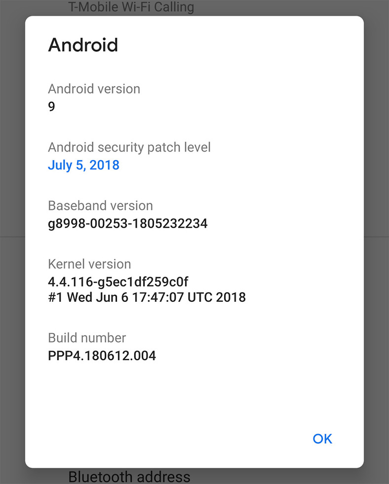
Again, this is DP 4 (Beta 3), arrives as build PPP4.180612.004, and is available to Pixel, Pixel XL, Pixel 2, and Pixel 2 XL. You can grab it right away for manual flashing or can sit back and wait for the Beta to push out.
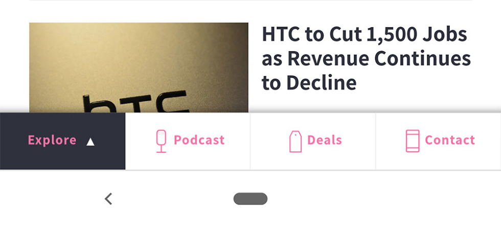
New Back button!
This may seem silly, but the navigation gestures that were introduced with Android P that are quite controversial, have an updated back button. It used to be an enclosed triangle and now it’s a back arrow. That’s it. It looks slightly nicer, though!
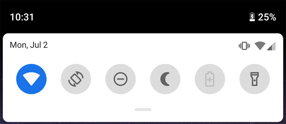
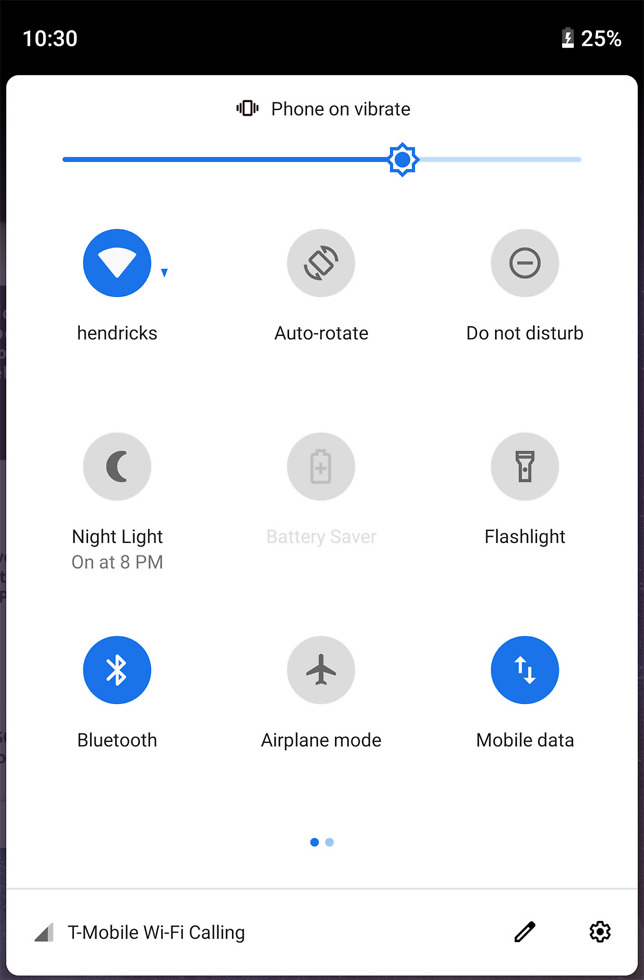
Styling tweaks in notification shade
This is another subtle change, but the icons in the notification shade have all changed slightly. Most of the icons are now outlines (battery saver, flashlight, DND, etc.) rather than filled in. The Settings button and Edit button are too.
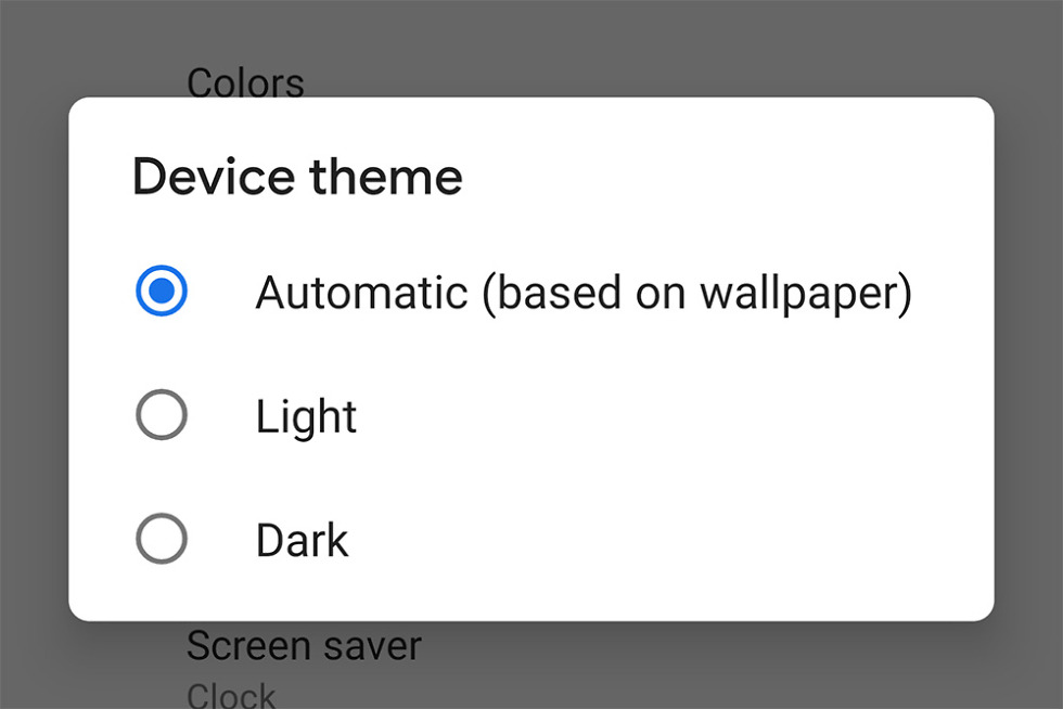
DARK THEME CHOICE!
If you head into Settings>Display, you’ll find a Device Theme option that lets you manually toggle to a Light or Dark theme. Previously, you had to choose a dark or light wallpaper in order to make that flip. We knew this was coming and it’s awesome!
Software info
Here are the details, by the way.
New look to the rotate button in the navigation area
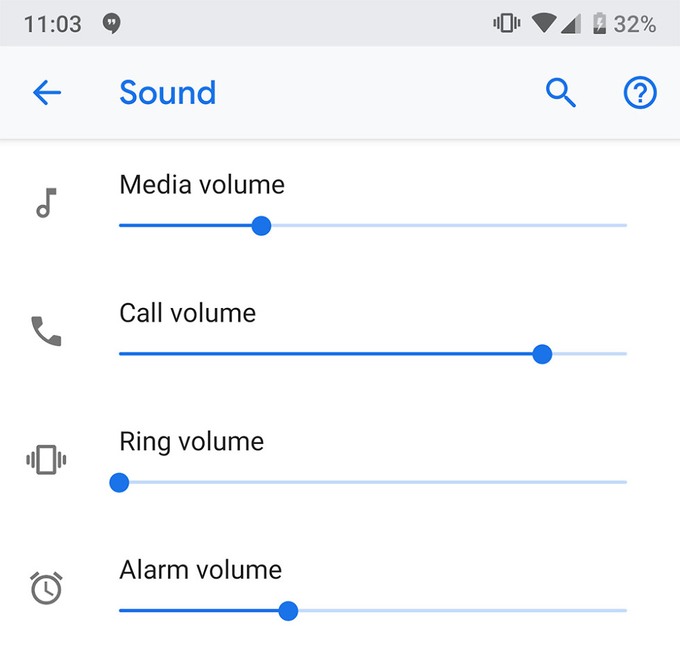
Separate Call volume control
Google has added a separate Call volume control in addition to Media, Ring, and Alarm volumes.
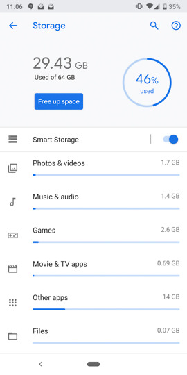
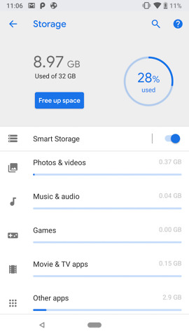
New icon theming throughout the UI
DP4 vs. DP3
You can see that Google is trying to be more consistent with icon theming throughout. In the storage settings, we now have those outlined icons in DP4, just like in the notification shade.
Updated app switcher UI
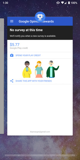
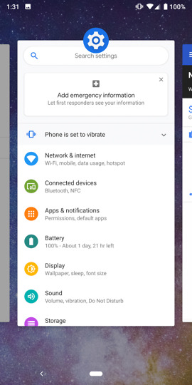
The gesture navigation that pushes you into the app switcher, has been tweaked slightly. The cards are now bigger, the scroll bar at the bottom to get between cards has been lengthened, and the quick gesture (swipe right once) now shows close-to-full-screen previews in the animation.
Updating…


Collapse Show Comments135 Comments