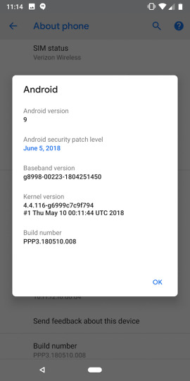
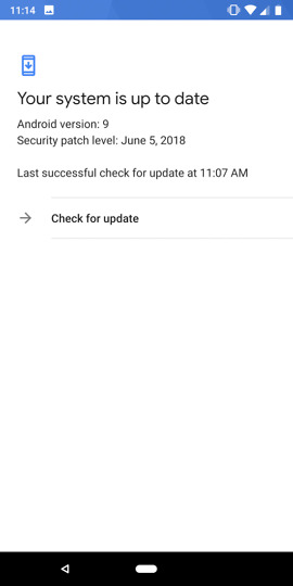
Now that the Android Developer Preview 3 (Beta 2) has dropped and we’ve had a few minutes to start diving into it, we figured it was time to start sharing any of the changes we’ve come across. In this post, we’ll continue to update it with tweaks, big and small, like the first one, which reveals which version of Android that P will be.
Android P is Android 9
Yep!
App Switcher Gets Clear All, Tweaks
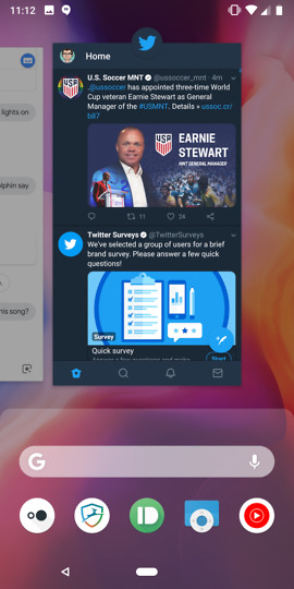
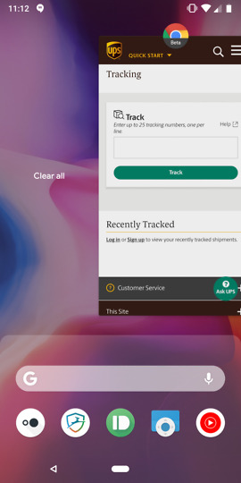
The app switcher UI has changed some from that last preview, which was the original major overhaul to the new gesture UI. You still swipe up on the home pill to get into the app switcher, but if you scroll all of the way to the left, you’ll now find a “Clear all” button. I know, contain yourselves.
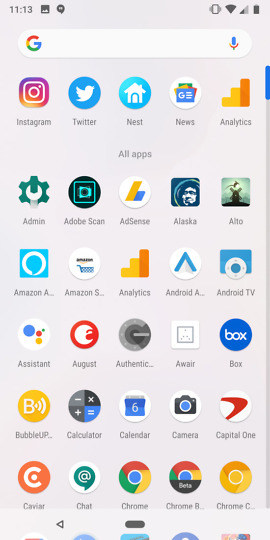
In addition to that addition, the UI now shows an app drawer background that should look familiar to those of you who jumped on the first Android P Developer Preview. The UI also seems to pop preview cards into place as you swipe up too, there’s a subtle vibration as you do so, and the entire gesture animation in general feels smoother.
Oh, the app drawer is also less transparent now.
Preview 2 vs. Preview 3
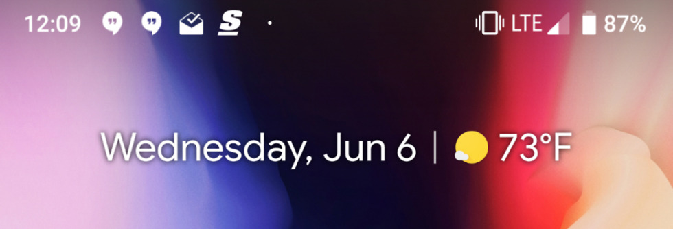
Weather showing in Always-on Display
This one showed up for some on the Android P Developer Preview 2 (Beta 1), but I’m just now seeing it with the Developer Preview 3. What about you?
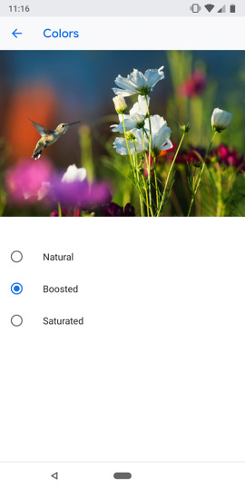
Display color profiles get preview (Updated)
In the display profile settings, Google has added a preview image to show you what to expect from one profile to the next. (UPDATE: Google included a picture in the previous preview, but they changed it to this hummingbird for DP3.)
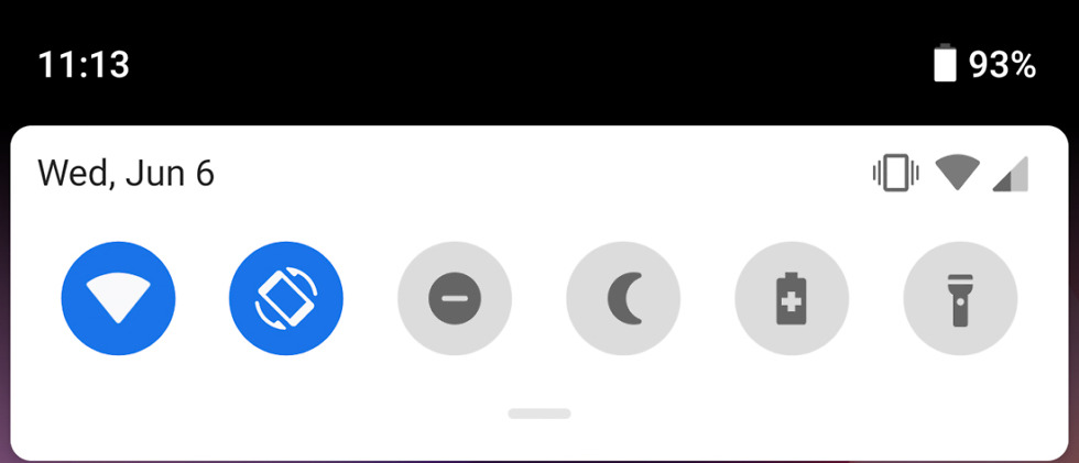
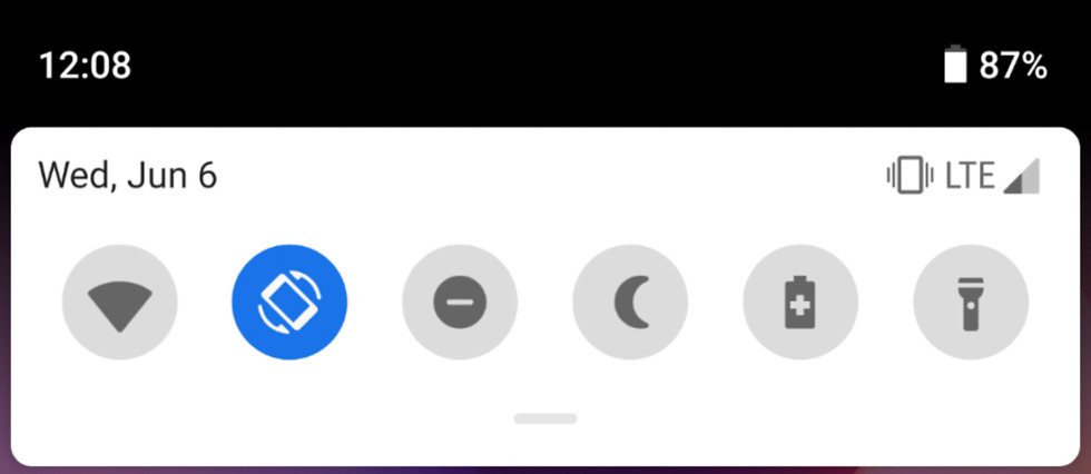
The date moved…
It’s no longer next to the time and is instead in the top white settings shortcut bubble.
Other UI and layout tweaks to DND, Night Light, Security
Developer Preview 2 (Old)
Developer Preview 3 (New)
That LTE icon…
The LTE logo in the DP2 was a bit wild in size. It appears to have been trimmed down some in Preview 3.
Still updating!


Collapse Show Comments177 Comments