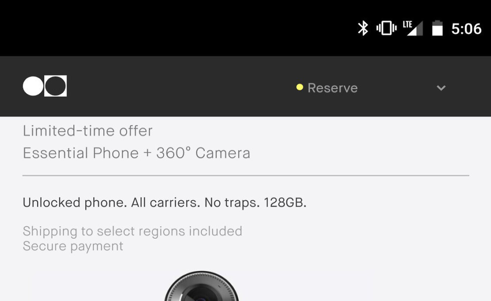
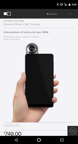
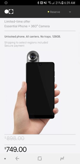
The Essential Phone is still apparently a real thing, and we know that thanks to Jason Mackenzie (former HTC, current head of sales at Essential), who shared a screenshot we can only assume is from an actual, live device. That screenshot, shared to Twitter, shows umm, an interesting implementation of the Android status bar that is likely an adjustment to the phone’s front-facing camera situation.
It’s thick af, to put it plainly.
Because the screen wraps around the front-facing camera, I’d imagine that Essential needed the status bar to match the width of it (or expand beyond it?) in order to not block content when you have apps open. Of course, that makes for an awkwardly wide bar that will potentially just show a thick black area depending on the app, rather than the full-screen experience seen from the main home page. It’s obviously meant to color match apps or show transparent here and there (see image), it’s just that it stands out when you see it with a dark background.
Of course, it might not be all that bad in real world use, but that extra width appears to have created an unnecessary amount of unused space that could take away from the viewing experience. We’d know if the phone was available.
Or here it is next to the Galaxy S8.
Essential Phone vs. Galaxy S8
// @JasonBMac24


Collapse Show Comments53 Comments