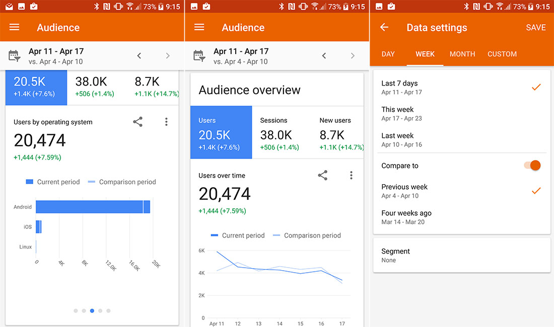
Google Analytics, an invaluable app for website owners that never seems to get the attention it deserves, received a major update today on Android. Not only is it a big Material Design overhaul, but Google is throwing in enough orange to rival Google Play Music, alongside a new logo and icon.
The update, overall, is much cleaner and less grey than the previous version. Google has added a quick stat sharing action to info screens as well. Yes, there is lots of white space, but the boxes with your data, like real-time traffic, overall sessions, users, etc., all take up less space for the most part. With that said, Google has taken out all of the dropdown lists from the slideout menu and tossed everything into swipe-able boxes in each category page and box. I don’t know if I love that idea yet, to be honest. I guess once I get used to it, it could be OK, but I’m so used to years of that slideout menu. We’ll see.
As I mentioned in the intro, a new icon and logo accompany the update. I didn’t notice at first, but when I went to find Analytics in a home screen folder, I couldn’t and that’s because Google is completely replacing the app as far as I can tell.
Here is that icon:
You can grab the update on Google Play or sideload it with the .apk below.
Play Link | Download Link (.apk)


Collapse Show Comments4 Comments