The BlackBerry Priv is, in my opinion, the most important phone of the year. That’s not something I say lightly. The Priv gets so many things right and has a uniquely beneficial experience that you can’t get on any other device, but like every other phone there are flaws. Is the Priv the phone of the year or just another nail in BlackBerry’s (née RIM) coffin?
This is our BlackBerry Priv review.
The Good
The Display
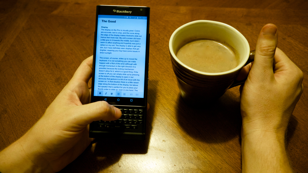
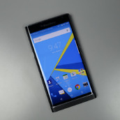
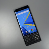
The display on the Priv is visually great. Colors are accurate, text is crisp, and the curve along the edge of the display makes Android’s slide out menus feel more real. My unit’s screen did have a little give in it towards the middle, but it didn’t seem to affect anything and hopefully was just a defect on my unit. The display is able to get very dim, but I have definitely seen displays that get brighter, meaning you may have some issues in direct sunlight.
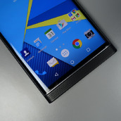
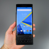
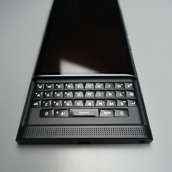
The screen, of course, slides up to reveal the keyboard. It is not something you can make happen with a flick of the wrist (although with enough momentum in the right direction it is possible) because the locking mechanism doesn’t allow for it, which is a good thing. If the screen is off you can simply slide up by pressing at the bottom of the display to open it, but obviously that gesture is a bit of an issue with the screen on. In that situation there is a little raised edge along the bottom of the display, but above the speaker that is perfect for you to place your thumb under to slide up, even in one hand. The vertical slider isn’t a new form factor, but it is good to see a company execute it well.
My only complaint with this implementation is that you can’t slide down the slider to end a call. I have vivid memories of friends hanging up calls on their LG Chocolate feature phones. It seems like an obvious thing to add, but like the Pre, it isn’t there. Oh well.
Hardware Design
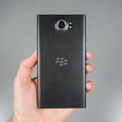
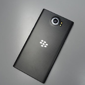
The Priv feels like a tank. A plastic tank, but a tank nonetheless. That’s not a bad thing, but don’t expect the Priv to delicately slide into your pocket. I actually found myself favoring placing the phone in the back pocket of my jeans while walking around. While the Priv is thick by today’s standards (and thin by 5 year ago’s standards), it is by no means unwieldy. The Priv always felt solid in hand and the grippy back made me feel very confident to hold and use the device in one hand. The body looks downright handsome in its stealth black paint. Where other phones look delicate with their bendable aluminum bodies and glass backs, the Priv feels like a solid, well constructed pocket computer.
The right side of the phone has the volume up and down keys and in between them is a button to switch between Do Not Disturb, Priority, or Normal notification levels. Unfortunately, repeatedly pressing the button does not cycle through the options nor can you use the volume keys to cycle between them. Also, the button doesn’t work with the screen turned off, so it’s really just a slightly faster way to get that screen up before you have to reach up to touch the display again. That said, the buttons do feel pretty solid if a little wobbly.
The power button is on the left. It too feels a little wobbly. I don’t know why BlackBerry didn’t put the power button on the right and the volume on the left like most manufacturers are doing now. Maybe the CEO is left handed? Regardless, double tap to wake is here and unlike the HTC A9 it works consistently.
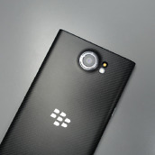
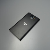
The body of the Priv is curved to match the sloping glass on the front, but the middle edges are flat so that the phone is easy to grip. There are two logos, one in the back with just the logo and one at the front top of the device with the logo and the word BlackBerry. Both are in silver and are relatively unobtrusive, but I do wish manufacturers would stop stamping their names on the front of the phone. Like almost every other flagship phone there is a camera hump, but I rarely noticed it.
The bottom of the phone has a micro USB port (shame) at the center and the headphone jack on the right. It looks downright sparse and I love it. The placement of the headphone jack makes it relatively easy to find with a cursory brush against the bottom of the device.
The top of the phone features a micro SD card tray and the SIM tray. For whatever reason the SIM card needs to be placed on the bottom of the tray (facing the back of the phone) instead of on the top. This isn’t a big deal, but it is an odd design that was confusing at first.
The Keyboard
The keyboard on the Priv is probably my favorite thing about it. Can I type faster on a software keyboard? Yes, but I can’t help but feel more productive on the Priv. If you have never used a phone with a hardware keyboard then it might take you longer to adjust, but I found that by the end of my first day with the Priv I had restored my old habits again.
My favorite use for the keyboard, though, isn’t typing. It’s scrolling. When I’m in Talon or Instapaper I adore being able to scroll with the keyboard. I find it’s akin to scrolling through text on a tablet where you have as much screen real estate that you can scroll with your thumb in the margin without noticing it’s there or, or course, to scrolling with a mouse. You can also use the trackpad to move the cursor around by double tapping and holding and then swiping to wherever you want the cursor. It’s not an easy to find gesture, but it’s better than the software version of pecking at the screen until it moves the cursor to the right spot. I do wish the trackpad feature was a little more robust so I could use it to swipe between panels in an app like Tweetings, but it goes a long way towards making the overall experience with text much better. If you’re able to focus on typing, though, it can be a wonderful, focused experience.
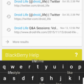
As you’re typing suggestions will pop up just above Android’s navigation keys. You can select these suggestions by tapping on them or by swiping towards them on the keyboard. Most Of the time I found myself just backspacing a correcting a typo when I saw it if autocorrect didn’t get it on its own, but for one handed typing it is useful. There is a dedicated symbol key that pops up a keyboard window with symbols that are then mapped to the physical keyboard, but I found it faster and easier to access this menu by simply swiping down on the keyboard instead of hitting the dedicated button.
As long as you’re using the stock launcher you can also set shortcut keys for individual presses or long presses on the keyboard. These shortcuts can be actions (like call so and so or turn off WiFi or add a new contact) or to launch apps. For example, I have T set to launch Talon, I Instapaper, G Inbox, M Apple Music, and K to speed dial my wife. I found this to be incredibly geeky and lovely. This is why nerds like us loved devices with keyboards.
Another related feature that I loved was the ability to jump to the top of an app by pressing T on the keyboard or the bottom by pressing B. Strangely this didn’t work in Chrome, but it did work in Instagram and Twitter apps like Talon, Fenix, and Tweetings. Being able to jump to the top of a list has been built into iOS for years, so having a hardware shortcut that works in many apps is nice to have.
The software keyboard is about as good as any other, although the lack of swipe support will make it a tough sell for some. Rather than suggestions lining up above the keyboard words are placed all over the keys. Once you find the word you’re trying to type you swipe up over the word to insert it. It’s an interesting design, but I found most of the time it was faster for me to just type out the word.
I’m definitely faster at typing on the software keyboard that BlackBerry provides than on their hardware keyboard. Does that mean the whole conceit of the phone is useless? Absolutely not. It isn’t just about being able to type on the device, but rather about what kind of experience that affords. I love being able to look up at the screen and confidently type on the physical keys. I do that on a software keyboard all the time, but having that physical feedback still feels more reassuring. I do wish the keyboard had some of the improvements I mentioned, but the lack of those features is not a deal breaker at all. The Priv gives you options that you can’t find on any other flagship; that’s pretty surprising in 2015.
The Software
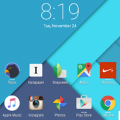
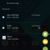
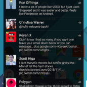
The Priv runs an almost stock version of Android 5.1.1 (that’s right, no Marshmallow on the most secure phone in the world), but there are a few changes to note. Notifications can be bundled by app, so if you have a ton of new notifications, but you really just want to see your emails you can tap on your email app icon and only see those in the notification shade. BlackBerry includes a Peek menu on the edge of the display to quickly see your calendar, favorite contacts, messages from Hub, and tasks. You can adjust the transparency of the menu and switch it to the right if you prefer or turn it off altogether. I did like being able to quickly see calendar events and favorite contacts quickly, but most of the time I forgot it was there. There are also little tweaks to the launcher like the ability to launch an app’s widget from the home screen by swiping up over it or a long press of the home button letting you swipe into Google Now, BlackBerry Hub, or Device Search.
BlackBerry Hub is an app that summarizes your communications for you. All of your emails and texts and calls and even social media bits can be found in one place. I can see this being really helpful for someone who either needs or wants a summary of their day regularly or who wants a notification center to go to because they find the notification tray too limited or lacking context.
Device Search is a limited replacement for Google Now that allows you to search your device or, if you don’t find what you want, you can tap a button to search the web or Drive or any other app listed under Extended Search. When you’re on the home screen if you start typing on the keyboard it will ask if you’d like to use Device Search or Google Now. Normally I’d say you should select Now, but that depends on the kind of searching you do. If you’re usually just wanting to search for an app or a contact then device search is fine. More importantly, if you use Now with the physical keyboard from the home screen you’ll find a frustrating delay. If I start typing my wife’s name, Katelyn, device search will type the whole thing. With Now, there is a delay between the first character and the app launching so that it misses the next two characters and types ‘Kelyn’ instead. If you wait for the app to launch after typing the first letter or your query then you’ll be fine, but that annoying delay led me to use Device Search for local searches and then launch Chrome for a Web search.
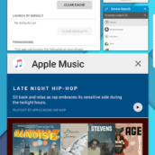
One change that I love on the Priv is the layout for multitasking. Instead of showing a vertical stack of cards, BlackBerry designed multitasking to show a grid of apps in varying sizes. Think of it like the Windows 8 Start menu for apps you already have open. Hitting the multitasking button and then thumbing through the list of apps on the keyboard’s touchpad feels like magic. Compared to the stacked card interfaces of Android Lollipop and Marshmallow and iOS 9, Blackberry’s implementation is a breath of fresh air. You can see more than one app with its preview clearly. It’s one of the biggest things I’ll miss when the Priv goes away.
Somewhere-in-the-Middle
Security and Privacy
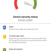
One of the things that BlackBerry prides itself on is security and privacy. The Priv is one of the worst devices of the year with regard to these two features for three simple reasons.
The first, and most important, is that the Priv lacks a fingerprint scanner. The Nexus 6P, Nexus 5X, HTC One A9, Galaxy S6, and Note 5, all feature fingerprint scanners without being advertised as “secure” or “private” devices. Seriously, BlackBerry, what do I need to do for the privilege to have a fingerprint scanner to secure my device in 2015? It’s neat that I can type in my password or pin on a keyboard, but I’d much rather just wake and unlock my phone with a quick scan of my thumb and only type in that code at boot.
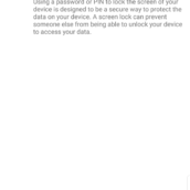
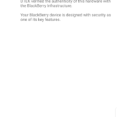
The second is that DTEK thinks it’s secure for me to have a password or PIN that locks my device after 10 minutes. If I were to allow that setting then I could, in theory, unlock my phone to check Instagram and then set down my phone. From that point there is a ten minute window for someone to steal my phone and gain access to all of my accounts because he or she has access to my email. BlackBerry should not be giving that default setting a passing score. I also love that DTEK has a section that says that my device is secure because it is a BlackBerry.
The third is that the Priv runs Android 5.1.1. While this shouldn’t be too upsetting for users considering Marshmallow is only just over a month old, from a security standpoint it is a bit of an issue. Maybe BlackBerry will be quick with updates, but there’s a good chance that unless BlackBerry picks up the pace the OS itself will become a security issue.
Performance
Performance on the Priv was great. Between the Snapdragon 808 and the 3 GB of RAM apps launched quickly, ran well, and stayed in memory for plenty of time. The device does run hot when under the stress of a game (which shouldn’t come as a surprise considering this year’s Snapdragons) and battery life definitely takes a hit. That being said, the Priv took everything I threw at it with aplomb. If you live in a cold area and like having a warm phone with a physical keyboard then the Priv makes for a nice solution.
Audio
The front facing speaker on the Priv is great to see. It’s not a Boom Sound speaker or anything, but it’s plenty loud for speakerphone calls or listening to music in an otherwise quiet room. I put The Beach Boys on while washing dishes and I could hear Brian and the gang perfectly well. I do wish the volume got louder with headphones, though. With headphones the audio is certainly audible, but my iPhone and the Galaxies are able to get several clicks louder.
The Not-so-Good
Pricing and Availability
The BlackBerry Priv is available right now at AT&T for $24.67 per month on a payment plan or $249.99 on a 2 year contract. You can also buy the Priv directly from BlackBerry for $699.99. The model from BlackBerry will work with AT&T or T-Mobile. Verizon has promised that they too will carry the Priv, but I wouldn’t expect to see it until sometime next year (February is my guess). This isn’t the best availability we’ve seen on a phone, but my guess is that BlackBerry got a little kickback for being exclusive with AT&T for a bit. I’m also not a huge fan of the pricing, but remember most top tier phones have been within $50 of this price point until very recently. The reality is BlackBerry knows they aren’t going to reach Apple or even Samsung sales with this phone, so their average selling price needs to be higher in order for them to stay in business. I think that’s a fair tradeoff for those who want a BlackBerry (those people are still out there, trust me).
Battery Life
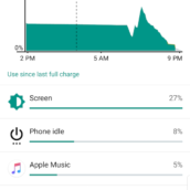
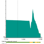
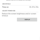
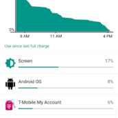
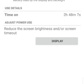
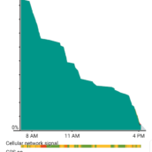
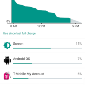
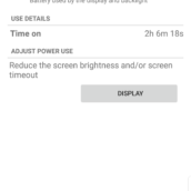
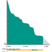
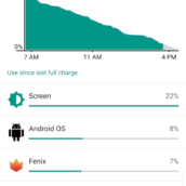
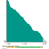
Battery life on the Priv was less than stellar. Like most of the phones we’ve seen this year, fast charging is a nice workaround for the same problem. The Priv actually has a decent sized battery in it and compared to its thickness I expected better results. On my first full day with the phone it lasted until 3:30 PM when it was around 10%. That morning I caught up on Twitter, streamed music to work, and worked on this review. On my second full day the phone was at 25% by 3:15 after some Twitter, gaming (Spider-Man Unlimited), taking some photos, checking Instagram, and working on this review. On the third day I managed to get to 4:15 before the phone hit 15%. As the week progressed I continued to get similar battery life, meaning you will almost certainly need to charge in the afternoon unless you don’t use your phone much. If you’re interested in the Priv the good news is that this news probably won’t dissuade you from getting the phone seeing as battery life is a problem on most Android phones.
Cameras
The front facing camera on the Priv is good in bright light. In anything other than bright conditions you’re going to want someone else to take your selfies for you unless you love blue/green hazes over your photos. The fact that BlackBerry shipped a front facing camera this bad in 2015 just goes to show how little they care or know about what people want in a smartphone.
The rear facing camera on the Priv takes good shots. The dynamic range was surprisingly good in shots where the light differed and it performs well enough in low light situations. I loved being able to frame a shot and pressing the spacebar on the keyboard to fire the shutter. That led to an experience a bit more akin to shooting with an actual camera and I felt like I was able to stabilize the shot better than I can if I have to push in a volume button or peck at the screen.
The frustrating and ultimately disappointing part about the camera is that it is downright slow. If you have children and don’t use a dedicated camera like a Fuji X100T to take pictures of them, don’t get this phone. For more relaxed shots like those in the gallery below it’s more than capable, but you will miss everything from your daughter’s basketball game with this camera. If you press down on the shutter (software, volume, or space) then you can shoot a burst of photos that will capture the moment (here’s a GIF to show how fast burst shots are), but there is always a bit of a delay that almost certainly ensures you’ll miss whatever you were hoping to capture at first and then everything after. In short, if you want to shoot photos of fast moving things be ready at any moment or do the responsible thing and get a better camera to capture those important moments. One other issue is that there can be some glare in shots with more direct sunlight (as seen in the image below with the Christmas tree), but that’s to be expected with most cameras. All in all I think the Priv’s rear facing camera is up to snuff to be your daily camera unless you take pictures of fast moving objects like children or dogs.
Full Resolution: 1 | 2 | 3 | 4 | 5 | 6 | 7 | 8 | 9 | 10 | 11 | 12
Video
[responsive_vid vid_url=”Yb7vR1FhSPc”]
Gallery
The Verdict
In so many ways the Priv feels like everything the Palm Pre would have become. It makes me wonder if Palm would have done better if they had bet on large screens instead of tiny ones. The Priv features a lot of really good software ideas with interesting hardware, but the lackluster battery life and poor camera performance make it hard to recommend to anyone but the biggest keyboard nerd. If you don’t use your phone to take a lot of pictures and you don’t mind having to charge your phone then the Priv is worth looking at. This is heartbreaking to write because the Priv does so much so well and, most importantly, actually offers something you can’t get on any other Android phone.
As the year ends we like to look back and think about what phone was the phone of the year. I think the Nexus 6P is the clear answer for Android phones, but as I think about that answer it feels so boring. What makes the 6P the best phone? It has a good camera, runs stock Android, features a great fingerprint scanner, has good battery life because it is the size of a human baby, and features a premium design. Those are great reasons for it to be phone of the year, but there’s nothing really special about that. It’s the best because it does what every phone should do in 2015, but most still don’t.
The closest runner up is probably the Galaxy Note 5, but that’s not because of the Note’s main differentiator: size and stylus. The size of the Note 5 is in some ways a detriment because that size doesn’t translate into phenomenal battery life anymore and the stylus, while somewhat useful, will remain in its silo for most people either because they inserted it the wrong way or because they just don’t have a use for it.
If the Priv had a stellar camera and a fingerprint scanner then I think it would be a shoo-in for phone of the year, even with its mediocre battery life. Why? Because the Priv actually offers something that is different from any other phone (like the stylus on the Note), but it actually does some really useful things. Being able to quickly launch apps with shortcuts or call contacts is nerdy, but it’s easy to teach and incredibly useful. The multitasking menu is a breath of fresh air that looks nice and places function over form without sacrificing the other; something Apple and Google appear incapable of with their implementations. Being able to scroll over text isn’t the best thing since sliced bread, but it creates a less busy interface that helps the user focus on the content instead of trying to read around their thumb.
This is what differentiation is supposed to look like. It isn’t just making the software look different like we saw every OEM trying to do in the beginning of Android (and Windows Mobile) and it isn’t tacking on hardware with limited function. Don’t get me wrong, I liked the stylus on the Note 5, but it was nowhere near as functional or helpful as the keyboard on the Priv. Should every Android phone have a keyboard? Nope, but I would love to see manufacturers take inspiration from BlackBerry and actually try to differentiate their devices with interesting hardware that is focused around helping people use their devices better.
I’m really glad that BlackBerry made the Priv. I hope they sell enough devices to keep in business and keep trying to innovate themselves out of the hole they made for themselves. I never thought I’d say those words, but it’s true. We need better competition in Android because we don’t all need black slabs that do the same thing with slightly better battery life or slightly better cameras to differentiate. I want to see more than that, and I think the Priv is a great first step towards that reality.





Collapse Show Comments160 Comments