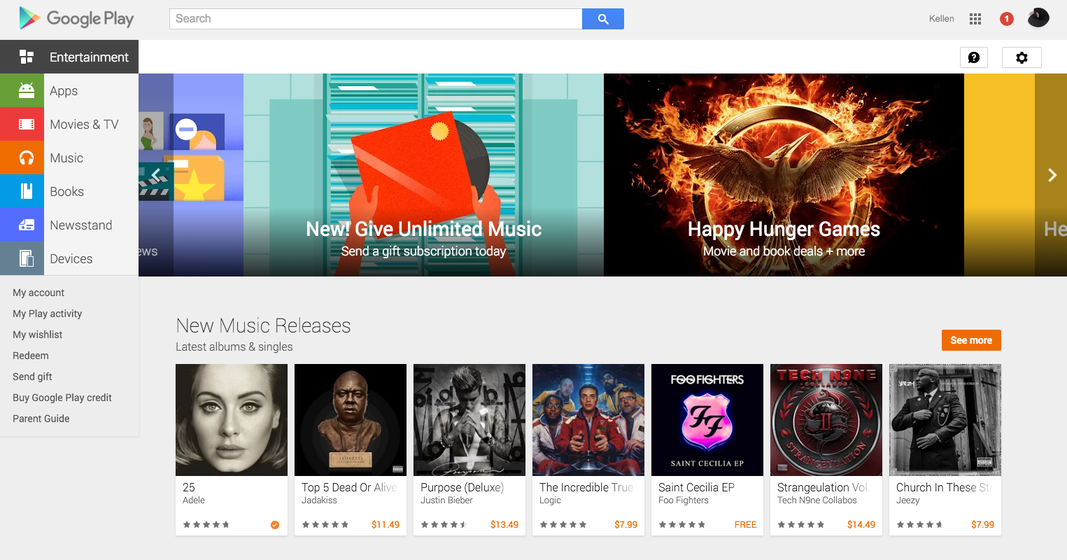
Remember that new Google Play UI that was teased back in early October, the one we said was starting to rollout the next day? Turns out it didn’t really rollout to many for a good month. But on Friday or Saturday of last week, and continuing on through today, everyone seems to be getting the new look, which features separated front pages for “Apps & Games” and “Entertainment.”
You can see the new look above, but also through this original post.
On a related note, the web version of Google Play is also getting a mini-makeover to match thee new mobile app version. The Google Play web store is now defaulting to an “Entertainment” section, with sections dedicated to music, movies, books, comics, etc. instead of apps and games like it used to. In order to access apps, you have to slide over and click the “Apps” button on the left side.
The new UI also features a carousel at the top for current promotions running or other highlighted products from Google.
Everyone seeing the new update?


Collapse Show Comments39 Comments