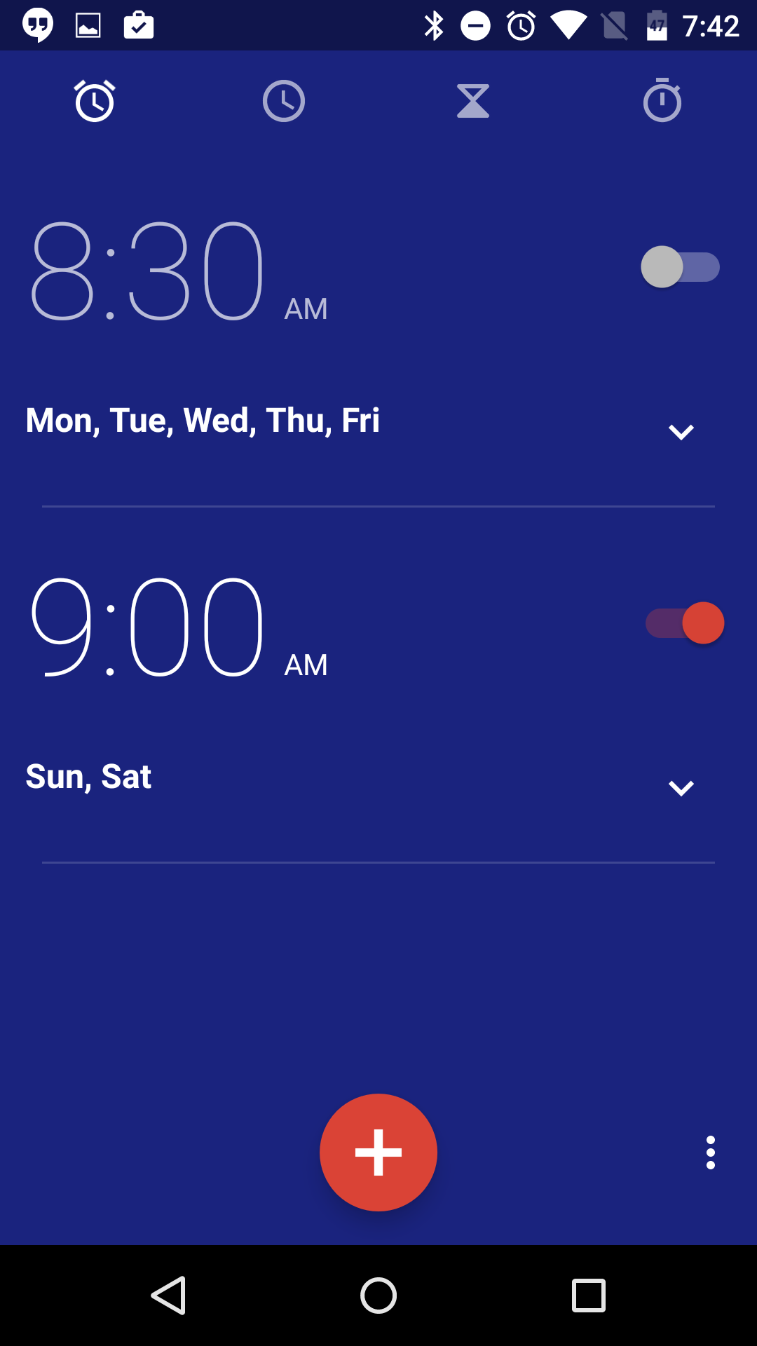
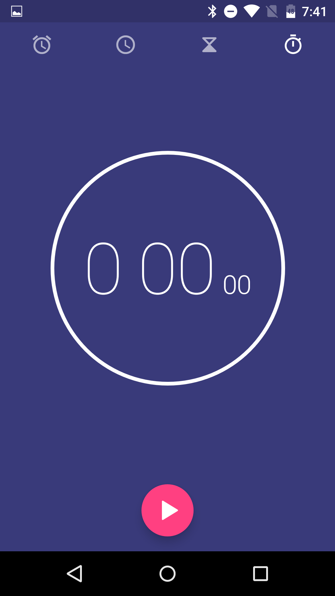
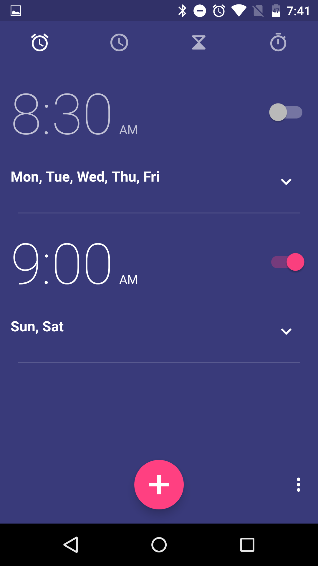
The Google Clock, which just recently decoupled itself from stock Android to nestle-in to the Play store, received an update this week that introduced “more neutral colors.” I’d call them dark blue and bright as hell red, but neutral works too, I guess. Below, you can see the differences between the new and old colors.
Along with the new color scheme, Google fixed a “duplicate provider installation” issue and another that involved the timer button.
The update drops in as v4.0.2. The update should be live now for all to download.


Collapse Show Comments32 Comments