When I look for an Android Wear watch face, I try to find those that remind me of traditional watch faces or at the very least, fit nicely onto a round display to make the device on my wrist feel less futuristic and more classic. It’s not that I don’t appreciate the technology behind a smartwatch, it’s just that I want the watch on my wrist to look like a watch first before getting to all the extra notification, fitness tracking, and other stuff.
Once I find a watch face I like, I tend to stick with it for a while because I feel like there are few really classy options out there on Android Wear. I don’t know why, but watch face makers seem to want to cram as much crap into these things as is possible, when they really should be doing the opposite. A watch, at least an analog watch, should show you the time and date, and then maybe a battery percentage to keep you informed throughout the day. The rest of the stuff is just getting in the way of a great looking watch.
So after spending some time recently to see what’s new in the Android Wear watch face world, here are five I think you will appreciate.
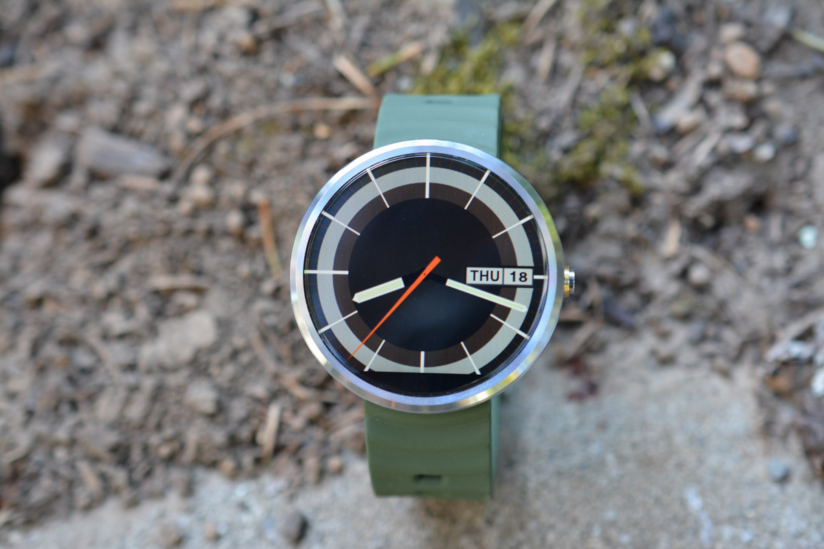
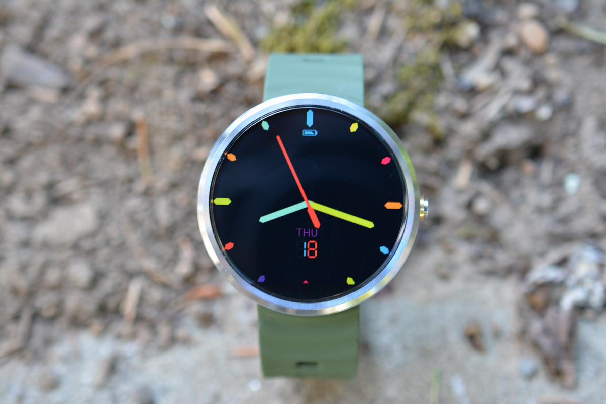
This watch face is called 70s, and it is without a doubt, my favorite watch face of the moment. There aren’t a bunch of fluffy options to tweak, it just looks great as an analog watch. It has hour, minute, and second hands, along with right placed day-date ticker. There are no digits on the markers, as this is a true analog experience where you actually have to know how to tell time.
It comes in orange, green, blue, or purple, but I keep finding myself settled into this orange version. It’s 100% free.
Play Link (free)
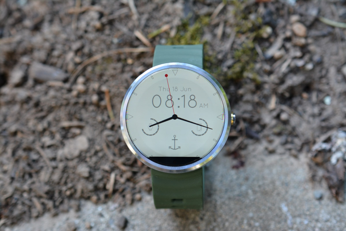
Mustache is probably the most feature-rich of the watch faces I’m listing here today, but those features are all actually quite good. Mustache shows you both digital and analog times (though I wish you could turn the digital clock off), along with battery meters for both your phone and the watch. You can change it to a light or dark theme, or even have it automatically switch from one to the other depending on the time of day. You can select from a number of badges (I went with the anchor), chose a 24H clock, and tell it to show bigger digits when in ambient mode.
This is a great minimal watch face that still manages to pack in the right kinds of features for a smartwatch.
Play Link (free)
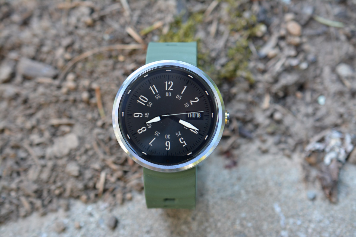
This watch is called SpecOps because I’m assuming it is based off of a military-style watch. I like it because it’s clean, has hour and minute markers to help you quickly tell the time, but also includes a day-date ticker. It has dark or light skins, but I prefer the dark based on the location of the day-date. Like the 70s clock, this doesn’t have a bunch of special features, it just tells the time and shows you the date.
Play Link ($0.99)
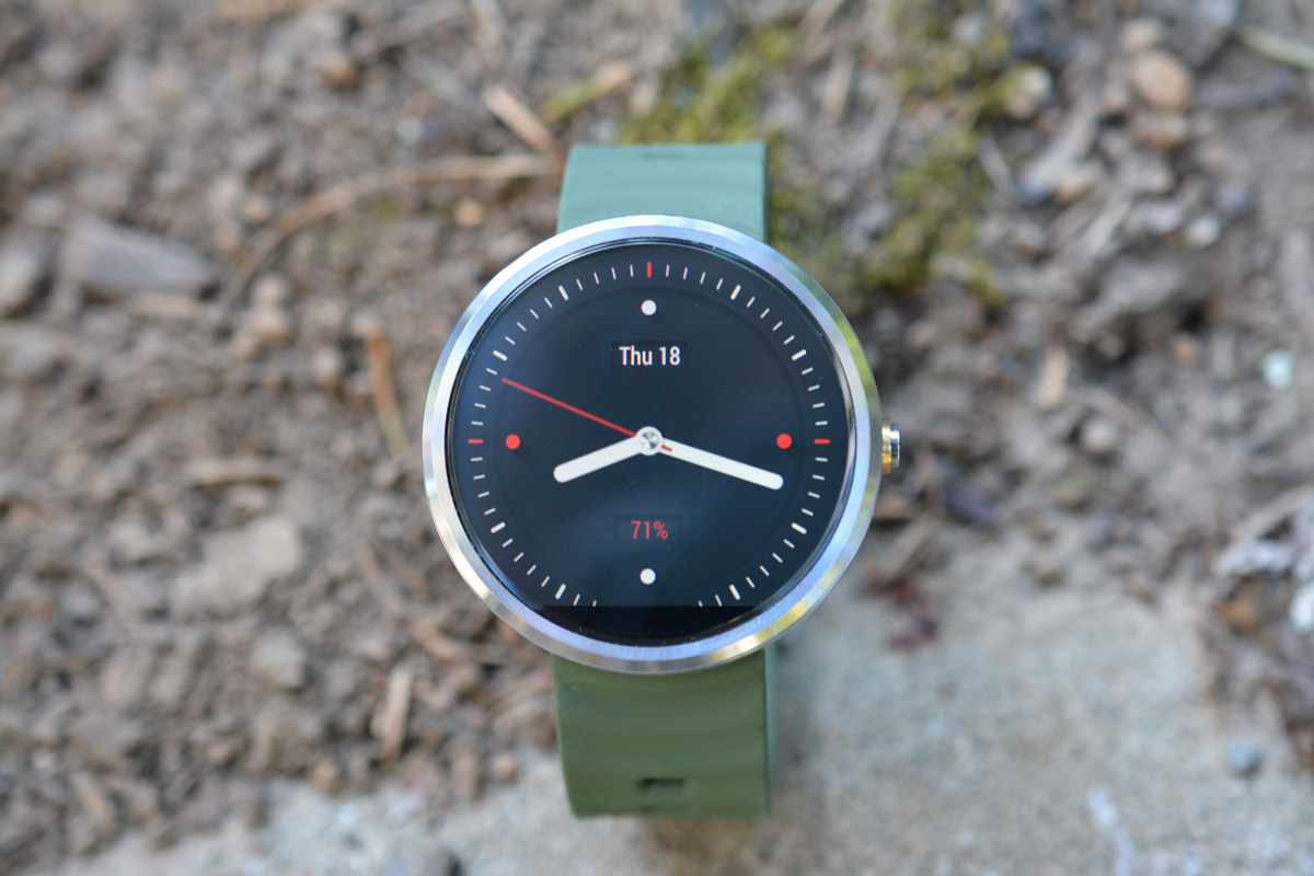
MinMo has been a great watch face for months now. It has both dark and white themes, though the white faces on the Moto 360 never seem to look great to me, so I tend to stick with the darker options. This is a minimal analog clock, but does show you battery percentage and day-date to add some depth. You can also tell the second to hand to sweep or tick, depending on how you like a watch to look.
Play Link ($1.49)
Candy Shop is kind of a silly, but some times you just need some color in your life. It has both digital or analog faces, dark or white themes, and options for battery and day-date. As colorful as its markers and hands are, it still looks really clean.
Play Link ($0.99)
Any other favorite watch faces we should try?

Collapse Show Comments45 Comments