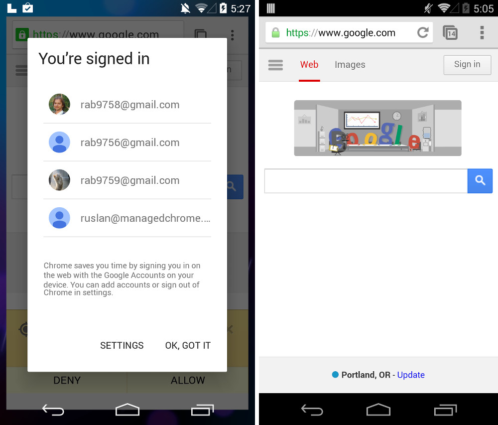
The crew over at reddit found an interesting set of screenshots in an Android related issue over at the Chromium bug tracker. Are you seeing the goodies in the image above? There are a couple of things that should immediately stand out. If not, there are more below.
Note: Before I could even get this posted, Google removed the issue thread for this bug.
First, is that an “L” in the notification bar showing that the phone is plugged in with USB debugging enabled? If it is, then this would be the first time we are seeing a device running the “L” version of Android, which has not yet been announced by Google. If you’ll remember, Kit Kat devices showed a “K” or a key lime pie for USB debugging up until Android 4.4 was officially announced, which then caused the switch over to the Kit Kat bar icon.
So is that an “L” icon? It’s so simple, that you really can’t tell. It could be an icon from another app that we just haven’t seen before. I’ll let you decide.
If that isn’t an “L,” which could be the case, then at least we have a potential new version of Chrome to talk about. As you can see, in the screenshot at the top of this post, along with the comparison shot below of the current Chrome Beta (right) to this potential new build (left), there are a number of differences. First, Chrome seems to be floating on the home screen, rather than being forced to be full-screen. You can see the background or wallpaper in the notification bar and on the sides of the Chrome browser. Is that happening because of this sign-in pop-up? All I know is that the current version of Chrome takes me to a sign-in page in Chrome when I click “Sign in,” it doesn’t pop-up a box like this while making Chrome appear to float.
All of that aside, there are some new UI elements going on here as well. The lock icon has changed in the URL bar, as has the action overflow or “menu” button next to the tab toggle. In the new action overflow button, we are seeing rounded dots, like we have in Google Play. The top navigation bar seems to be less dark to me as well, maybe lightened slightly.
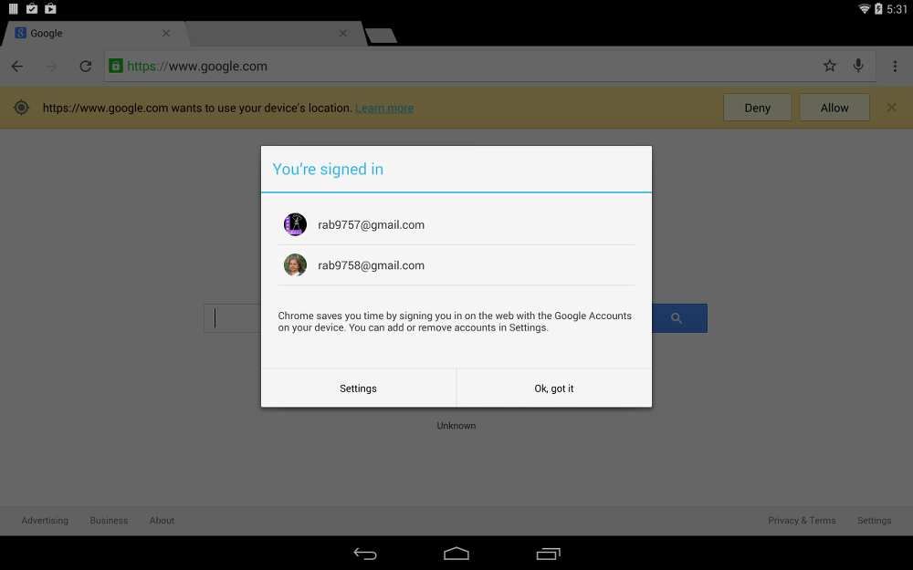
Finally, here is one last look at this build of Chrome on a tablet that appears to be running Kit Kat. You will notice it isn’t floating and the debugging icon has changed to the one found on Kit Kat. So what was that whole floating thing about? You got me.
Update: In the screenshot showing Chrome on the “L” version of Android, Chrome is taking advantage of Android’s translucent navigation feature, which can’t be said on the tablet that is still running Kit Kat. Also, there is a new icon in the notification bar that looks a lot like the bell from Google+.
Interesting stuff indeed. Any thoughts? Anything we are missing?


Collapse Show Comments81 Comments