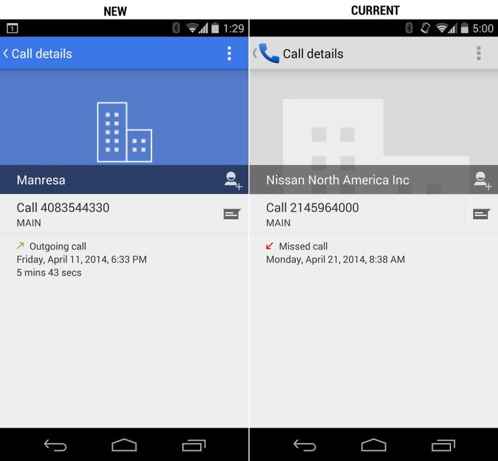
Did the official @GoogleNexus account Tweet an image of an unreleased Dialer while responding to a question on Twitter? Perhaps. In response to a Nexus user who was looking for help finding call duration time, the official account included an image of the call details page that doesn’t look like the current call details page on my Nexus 5 running Android 4.4.2. It won’t look like yours either. No sir, this appears to be new.
We have included the image below, along with a comparison shot to the current call details page in the Dialer. As you can see, we have a pretty new blue color scheme, missing phone icon, and a shrunken building graphic. The layout remains the same, but the subtle detail changes are certainly noticeable. In fact, the blue is quite refreshing when compared to the drab grey that Google has used in so many of its apps over the last year.
So where did it come from? Well, it could be from a new version of Android. There is also a chance that Google is pulling the Dialer out from Android and placing it on the Play store for quicker updates, though that seems a bit unlikely. I don’t know that we have ever seen an OEM pull out the dialer and place it on Google Play, even though we have seen things like Touchless Control and Google’s new Camera. Could it be from Android 4.4.3? Maybe.
The image is currently still live through the @GoogleNexus account, so Google doesn’t seem to be in a rush to remove it. If we find out more, we’ll be sure to update this post.


Collapse Show Comments39 Comments