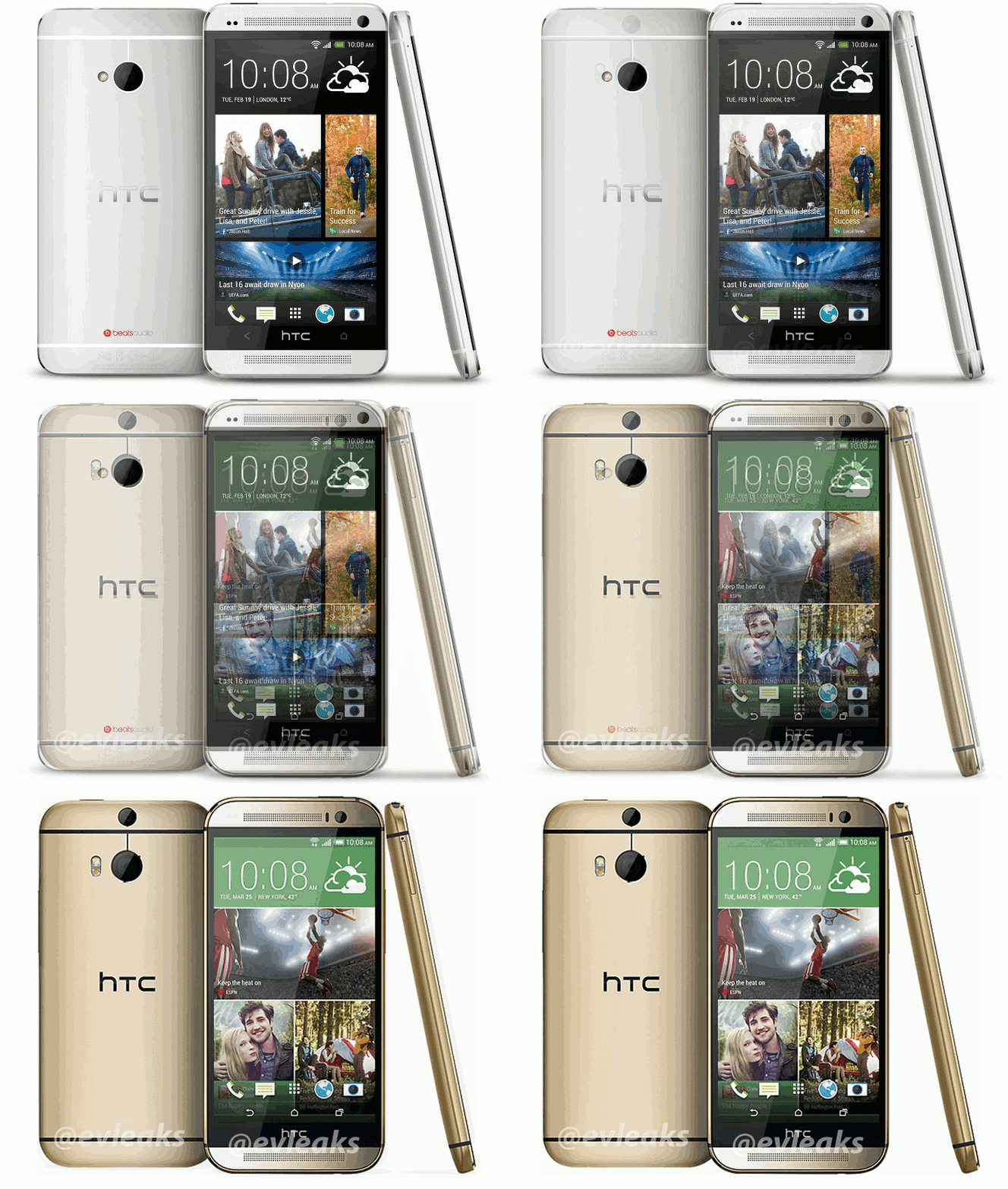
After seeing the press render of a gold HTC One (2014) that was leaked this morning – we have no reason to believe this isn’t the real deal – we thought, why not see how similar this device really is to its predecessor from 2013. Our initial reaction, after taking a quick look at the device was, “Wow, not much different here in terms of appearance.” Seriously, it really is tough to tell what’s different outside of some rounder corners, that secondary camera on the back, a slightly slimmer profile, and the move from capacitive navigation buttons to on-screen.
I’m not saying that simple minor changes in appearance are a bad thing, because Samsung and Apple have been doing this for years. And remember, the design of the original One was universally praised by almost every single person whoever touched it. It was about as premium as it gets in terms of build quality. We’re just wondering if a device this similar to last year’s is enough to make HTC start the slow crawl back towards tech relevance.
To give a better representation of the transformation from 2013 HTC One to the new 2014 model, take a look at the GIF we quickly put together below.


Collapse Show Comments90 Comments