With a stack of smartwatches having sat on the corner of my desk for the last three or four months, it’s finally time that we start running through reviews of them all. The stack is only going to grow over the coming year, so it’s probably best that we give you something to compare the new stuff to. These will be “quick” reviews that cover the basics and also offer my opinions on what I like and don’t like.
First up, is without a doubt my favorite of the moment – the Qualcomm Toq. I know what you are probably thinking, and yes, it’s overpriced, oversized, and was originally supposed to be just an outlet for Qualcomm to show off their Mirasol display. But I’m actually loving it.
Let’s talk about why.
What I Like
Battery Life
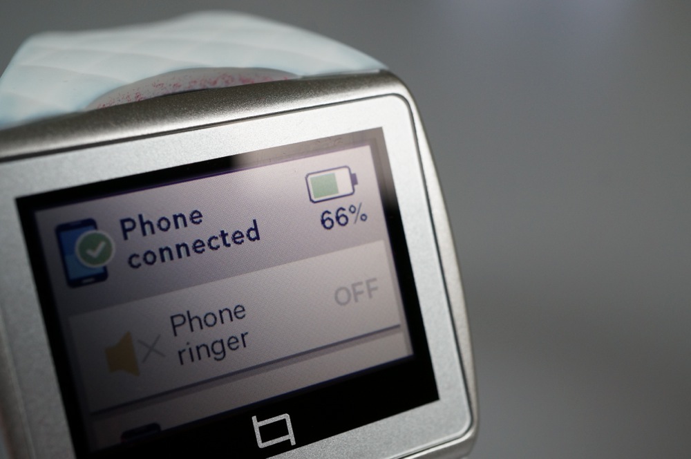
A smartwatch shouldn’t need to be charged every day or even every third day. My regular watch doesn’t need to be. Sure, my phone, tablet, and laptop do, but I don’t want to add another item to that list. With the Toq, you are looking at days and days (anywhere from 3-6 depending on use) without needing to use its awkward charger. The Mirasol display sips power, even though it displays in full color.
Display
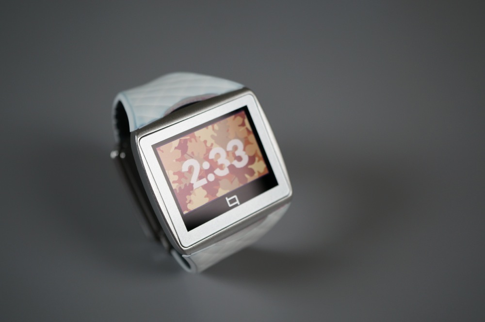
Speaking of display, Qualcomm used its Mirasol display tech that we hope more companies adopt for wearables. It displays full color, is easy on battery life, and actually gets more visible in sunlight. Mirasol uses light around it to make it more visible, so it’s actually easier to see in the brightest hour of the day than it is at night. Thankfully, there is a light that can be triggered during those dark hours.
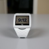
The 1.55-inch display is also touch sensitive, but more importantly, is on all of the time. In other words, you don’t have to flick your wrist or tap a button to see what time it is – the Toq is always on, yet still lasts for days on a single charge.
App
If you have ever used the Galaxy Gear or Pebble (pre 2.0) apps, then you’ll know how terrible they are. The Toq app, on the other hand, is fantastic. The UI is simple, but still has all sorts of settings that can be tweaked. You can select which apps you’d like to see notifications from, setup multiple weather/world times, decide on music apps, pick clock and icon styles, choose calendars, and even tweak things like light duration.
It’s a solid watch companion app that is also used to push through updates.
Design
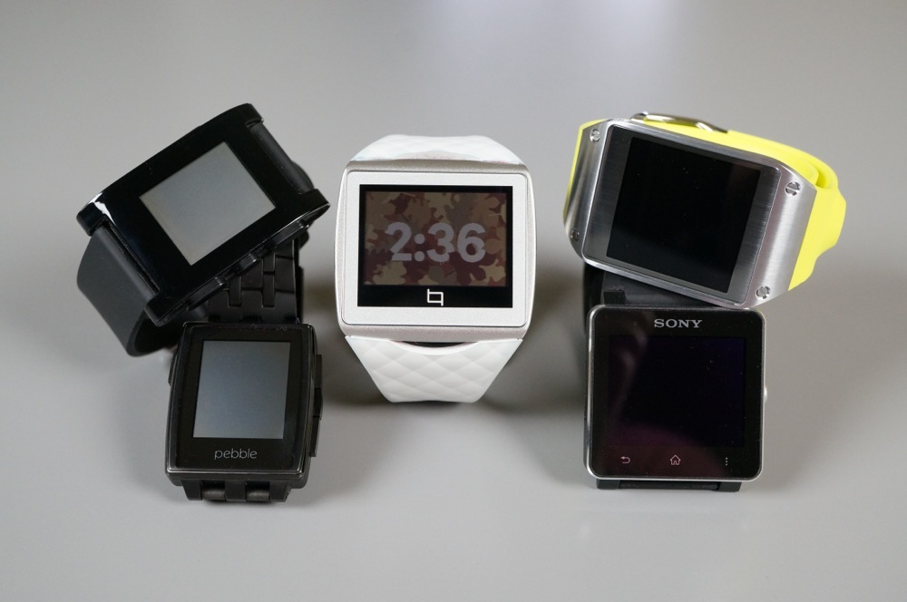
I actually really like the look of the Toq outside of its size. Appearance is something that can be debated for days, but the combination of metal, rubber, and plastic make for a premium feeling watch. It certainly feels a lot nicer than both Pebbles and the Sony Smartwatch 2.
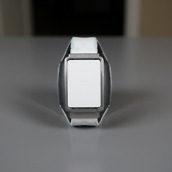
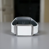
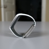
Even though it is quite large, the watch head isn’t as thick as some other smartwatches. The white coloring of mine allows the watch to go with almost anything you are wearing, plus it all contours quite nicely around your arm. There are no off-putting buttons, just a big face and a couple of cutouts at the wrist strap. It reminds me a bit of a Diesel watch.
It does require that you cut the band to size, something that makes it yours for keeps and is quite the confusing move.
Notification Handling
Unlike the Samsung Gear watches, the Toq works with every Android device (Android 4.0.3+) and also lets you tell it which notifications from which apps you’d like to receive. As notifications arrive, they show in mini-previews that give you just enough info. You can’t really act upon any of them, so like with other smartwatches, you have to head over to your phone to do the real work. But the fact that the Toq lets you pick and choose from all of your apps, and then shows you real info in your notifications (like Pebble) does, makes this a “like.”
Clock Styles
As I write this post, Qualcomm has included 19 watch or clock styles that can easily be changed on your Toq. They actually did a great job designing most, as well, with styles ranging from a simple clock with a colorful background to those that have date, location, weather, or calendar appointments. You can easily flip between them using the black touch-bar on the bottom of the display.
What I Don’t Like
Size
The Toq is huge. It’s bigger than every other major smartwatch on the planet, including the Sony Smartwatch 2, Galaxy Gear, and of course, Pebble. I can get down with it, but I often find that I take it off throughout the day to give my arm a rest. It’s so big, that doing a little shimmy with your wrist and long-sleeved shirt some times doesn’t even unveil the whole watch for time or notification checking.
Navigating the UI
The navigation of and around the Toq takes some time to figure out. There is a touch sensitive area on the wristband just under the display that brings you into your apps. It’s hit or miss whether or not this will work each time you tap it. Once in your apps section, you can swipe right to get into your favorite apps or scroll up or down through a list of the rest. From within an app, a swipe right takes you back one screen, but you can also swipe along the black bar at the bottom of the display, though it is completely inconsistent in what it wants to do. Some times a swipe left will get you into previous notifications, while at other times it does nothing.
I’m telling you, I’ve had the watch for a couple of months, and it still doesn’t make sense to me. I stick to my favorite apps, dismissing notifications, and switch clock faces from time to time. That’s it.
Cutting the Watch Band
Qualcomm couldn’t figure out an adjustable watch strap, so they ask that you size it yourself, and then cut off excess in order to wear the Toq. I’m serious. They actually ask you to cut your watch strap with a pair of scissors within the first few minutes of owning their few hundred dollar watch. If you cut it too short, well, good luck!
I got mine right the first time, but you can imagine how many people could get this wrong. Woof.
Price
The Toq originally debuted for $350, which as you can imagine, is way too steep of a price. It is now available for a much more reasonable $250 in both black and white. At $250, I’d argue that the watch is worth it, though not everyone can justify a cost like that, especially for a watch that was really made to showcase a display tech. I’ll just say this – if Pebble can sell their new Steel for $250, then the Toq is well worth it since it is a much better watch (in my opinion) in terms of features and build quality.
Other
- White version discoloration: I own the white Toq and have already started to see some discoloration in the watch band after only a month or two of use. The band is made of white rubber, but if it’s happening this soon, I can’t imagine how bad it might look in a year from now. You may want to consider the black version.
- No camera: While I do not care that the watch doesn’t have a camera built-in, many others today do. If you want a camera on your smartwatch for creepshots, the Toq is not for you.
- Battery enclosure: I’m pretty sure that the battery is housed in the enclosure of the the watch strap of the Toq. That’s unfortunate, because it adds bulk to the underside of your wrist and can be uncomfortable at times.
Video Overview
[responsive_vid]
Gallery
Specs
- Smartwatch Weight: 3.2oz
- Wrist Band Size Range: 6 inches to 8.7 inches
- Display Size: 1.55in
- Display DPI/PPI: 222ppi
- Display Technology: Qualcomm Mirasol: I.M.O.D.
- Touch Screen: Yes – Capacitive
- Smart Phone Software Compatibility: Requires Android™ version 4.0.3; Jelly Bean and above preferred.
- Battery Life: Multiple days between charges
- Charging Technology: Qualcomm® WiPower™ LE – Magnetic Resonance Charging
- Battery Capacity: 240mAh
- Bluetooth: BT 3.0
- AllJoyn™ Enabled: Yes
- Vibration: Yes
- Airplane Mode: Yes
Final Thoughts
The Toq, as of today, is my favorite smartwatch because of a combination of its design, the fact that it has a touch-colorscreen that is on all of the time, shows notifications from whatever apps I choose, works on almost all Android devices, and doesn’t need to be charged but once a week. The price doesn’t make it the cheapest watch around, but the premium build quality and experience have made it worth it to me.
Links: Qualcomm Toq deals on eBay | Amazon

Collapse Show Comments30 Comments