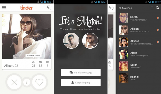
The Tinder team pushed version 2.0 to Google Play last night, complete with a fully redone user interface and performance optimizations. For anyone confused as to what Tinder exactly is, it’s where people anonymously creep other people’s pictures by swiping “Nope” or “Like.” If the person Likes you back, you can then chat with that person, and as the saying goes, the rest is history.
Not only did the app receive a major facelift, but matches can now be filed under lists, which allows users to not have just a long list of random matches to scroll through. It’s perfect for filtering out the spam. To top it all off, you should get more matches thanks to an improved recommendation engine. No more “forever alone” memes for you.
What’s New:
- A whole new look for Android.
- Now you can organize all those matches into custom lists.
- Improved recommendation engine.
- Fixes, optimizations, and much more.

Collapse Show Comments31 Comments