We knew that when the LG G2 arrived, it would be a smartphone more powerful than any we had seen before it. LG teased it for weeks, even announcing the phone’s Snapdragon 800 processor, display tech, and name before it ever took the stage to make the phone official. So when we finally got our hands on it, our concerns weren’t about the display quality or performance, they were going to be about the ecosystem that LG was trying to create with its new app suite, whether or not the camera could live up to its fancy spec list, and if those oddly placed volume and power buttons could win us over.
For the most part, I can easily say that LG has won us over on a number levels with the G2. The display is insanely good, the camera might be our favorite to date, and the UI over the top of Android isn’t as awful as we thought it would be. Let’s talk about all of that and more, to help you decide if the G2 is your next phone.
The Good
Display
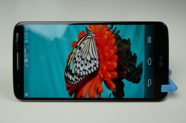
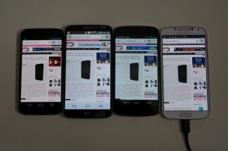
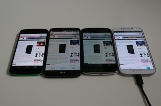
The 5.2″ IPS LCD display on the LG G2 is gorgeous. At a resolution of 1920×1080 with 423ppi, the sharpness, accuracy of color, above average viewing angles, and clarity are unlike almost any other smartphone display I have ever seen. When you first boot the G2, you will more than likely be blown away by its beauty. Videos look like true 1080p on a small screen should, games are full of amazing detail, and to the touch, it feels almost soft as you swipe, gesture, and tap. The panel itself leans slightly to the cooler side of display temperatures, whereas the AMOLED in a device like the Moto X clearly comes off warm. In the shots below, you can see how the 1080p display reproduces a variety of colors when compared to that of the Moto X, Nexus 4, and Galaxy S4. It’s viewing angles aren’t quite as good as those with AMOLED displays, but it’s whites are certainly whiter.
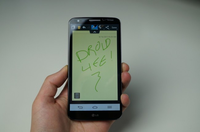
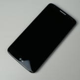
What takes the experience even further over the top, is the absence of bezel around the front of the device. When you talk about a full-screen experience, the G2 beats everyone, and it’s not even close. The side bezels are almost non-existent, the top and bottom areas are small enough, and you truly feel like you are holding nothing but one giant smartphone panel in your hand without any extra fuss.
If you were looking for the best display a smartphone has to offer at the moment, I’d say that you can stop looking now that the G2 is out.
Specs
LG tried to create the ultimate powerhouse with the G2 and succeeded. To power it all, you have the latest quad-core Snapdragon 800 processor from Qualcomm clocked at 2.26GHz with an upgraded Adreno 330 GPU. Then you add on the 5.2″ FHD display, 2GB RAM, 13MP camera with OIS (optical image stabilization), 4G LTE, 32GB of storage, and 3,000mAh battery all tucked into a frame that is only 8.9mm thick, and you have a smartphone that few will come close to matching for months (which is an eternity in smartphone terms).
We talk a lot about “future proof” phones that can last you the life of a contract without slowing or becoming obsolete or behind-the-times – the LG G2 may last three or four years before it shows signs of aging. The screen is as good as it gets, the processor is the most powerful on the planet, and the camera includes the next movement in mobile photography. When you think about the ultimate specs list, LG checked all the boxes with the G2.
Performance
Thanks to the quad-core Snapdragon 800 processor clocked at 2.26GHz and 2GB RAM, the G2 is buttery smooth no matter what you are doing. While running a suite of benchmarks that tested out items like GPU performance, you rarely see the phone’s frame rate dip below 50 fps, even on the heaviest of virtual 3D environments. If you want to multi-task, the G2 won’t even hiccup. If you want to shoot pictures in an instant, you can without hesitation. And if you want to out-duel your friends with benchmarks, they’ll struggle to keep up. It’s a beast, folks.
Camera
So far, Tim and I have had nothing but great things to say when it comes to the 13MP Sony IMX135 Exmor sensor in the G2. In my testing, I’ve found the camera to be quicker than any other smartphone camera to date, while still being able to produce completely acceptable results. We’re talking instant shutter with very few reasons to ever need to re-take a photo. At 13MP and with 9-point autofocus, you should see plenty of detail and not the over-processed and de-saturated photos we saw the Moto X take during our testing period.
With the G2’s camera, you have options for most manual settings like focus, brightness, ISO, and white balance, but LG has also included pre-set modes for Burst, Beauty, Dual camera, etc. Unlike the Moto X where the game is all about simplicity, LG has tried to combine a simple UI with features that will satisfy both photogs and casual users. While I’m still a fan of Motorola’s incredibly minimal approach to smartphone camera UIs, I still like to have some of the options that LG and Samsung include in their camera suites – manual settings for one.
In most situations, you’ll find yourself in full auto-mode, which will get the job done. Taking the G2 from extreme low-light to sunsets to macros returned impressive results (at least to our eyes) without having to adjust a thing. Thanks to OIS (optical image stabilization), you’ll snap photos in the darkest of areas, but also see much less shakiness and blur during video recording or when zoomed in. Other than a bit of artifacting here and there in our low-light shots, OIS shined as an important piece of smartphone camera tech that will be tough to live without.
We have a handful of samples below, but hope to continue to test out the G2’s camera. It just feels like a 2-week period is enough to fully appreciate what LG has done here.
Full resolution: 1 | 2 | 3 | 4 | 5 | 6 | 7 | 8
Battery Life
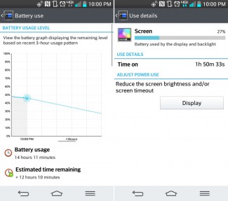
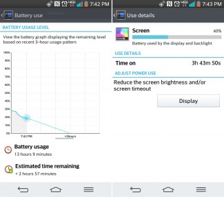
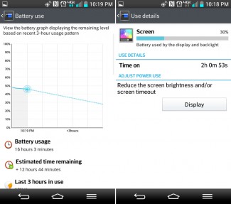
Thanks to a 3,000mAh battery tucked inside the svelte 8.9mm frame of the G2, I ran into zero battery scares. The day I pushed it the hardest, I easily cleared 13+ hours and still had 20% or so left. The rest of the days, with 4G LTE only and light-to-medium use, I almost always cruised through 15 hours with another 10+ to spare (according to the device). If you aren’t hammering on the device, you’ll have the opportunity to get through more than a full day’s use – I’m talking 24 hours. If you are putting in heavy work (gaming, lots of messaging, video watching, etc. with 3+ hours of screen-on time) you should still see 14-18 hours of battery life.
Availability
The trend in mobile for 2013 has been the release of flagships by the top manufacturers on all of the major U.S. carriers. We saw Samsung do it with the Galaxy S4, Motorola with the Moto X, and now LG with the G2. As of the posting of this review, you can currently buy the G2 on Verizon, AT&T, and T-Mobile, with Sprint availability coming in late October. Availability may seem like a small thing that most consumers won’t care about, but it’s a big deal for LG. It’s a hell of a lot easier to sell phones and hammer home your brand when you can produce a single design, and then make it available to almost everyone. Even Verizon couldn’t completely botch the G2. They are one of the first to sell it, and have also only made a couple of minor changes to the design. The Big Red variant has wireless charging, and a slightly tweaked button arrangement that keep the G2 very G2-like.
Software Suite
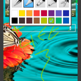
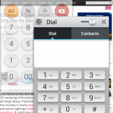
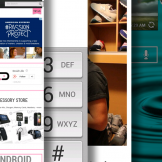
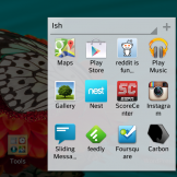
LG is trying to turn the G2 into the ultimate productivity tool. They have included apps like QuickMemo, QSlide, and Slide Aside that all want you to be able to accomplish multiple tasks at once. With the long press of the volume up button or the quick swipe up from home, you can get into QuickMemo to take down notes. With the pulldown of the notification tray, you can jump into a variety of QSlide apps that hover as mini apps over whatever you are doing. You can change their transparency to see through to your background task and even open more than one at a time. With Slide Aside (my least favorite of the three), LG wants you to use a 3-finger swiping gesture while in an app to hide it off to the side. You can stack up to three apps to the side, accessing them again with another 3-finger swipe. It’s unnecessary since Android already has a multi-tasking app that can be accessed with a long-press on Home and shows much more than your last three apps.
The apps aren’t all great, but the inclusion of them shows that LG is attempting to innovate and continue to make your smartphone smarter. A lot of this stuff reminds us of what Samsung is doing, but when you are the underdog trying to catch someone like Samsung, sometimes copying or closely mimicking is the way to go. Just ask Samsung how that worked out.
We’ve demoed all of these features in a video included below that I highly recommend you check out. It’s a solid 13-minutes of G2 software goodies.
Somewhere-in-the-Middle
LG’s UI
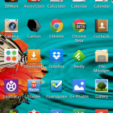
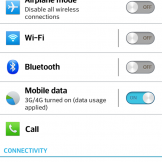
You can see Samsung’s influence in LG’s Android skin before you even leave the lock screen. There are water effects, a crowded notification pulldown, and a cartoonish design that probably makes minimal design enthusiasts queasy. With that said, it’s actually a lot prettier than the Gingerbread-ish scheme that Samsung has chosen to continue to use with its TouchWiz. LG has instead taken the Android color scheme of blues and greys, and then incorporated swiping gestures, mostly useful software add-ons for enhanced multi-tasking, and even gone with on-screen navigation buttons to give you the full Android experience. While LG has skinned everything from the dialer to the calendar to the calculator, most of it doesn’t look terrible. Sure, it might not be as pretty as HTC’s Sense 5 or stock Android, but again, it looks like a beautiful cityscape compared to the junkyard that is Samsung’s TouchWiz.
Plus, LG lets you customize almost everything. We’re talking full control over icons, colors in folders, the settings menu, navigation button arrangement, lock and home screens, and more. You can almost think of LG’s skin as a fully-equipped 3rd party launcher that you may find on Google Play. There is no OEM out there doing customization like LG, which we will gladly applaud them for.
It’s not all amazing, though. You do feel at times as if you are a bit overwhelmed by all of the things that LG is trying to accomplish. They take multi-tasking in far too many directions, remove easy multi-select in things like the gallery, have an excessive amount of sound and vibrate options that will certainly confuse the average consumer, and try to push a really terrible voice-action system called Voice Mate as a Siri and S Voice competitor. Everything just seems so excessive when you look at something like the Moto X, which clearly took the opposite approach to enhancing Android.
Design
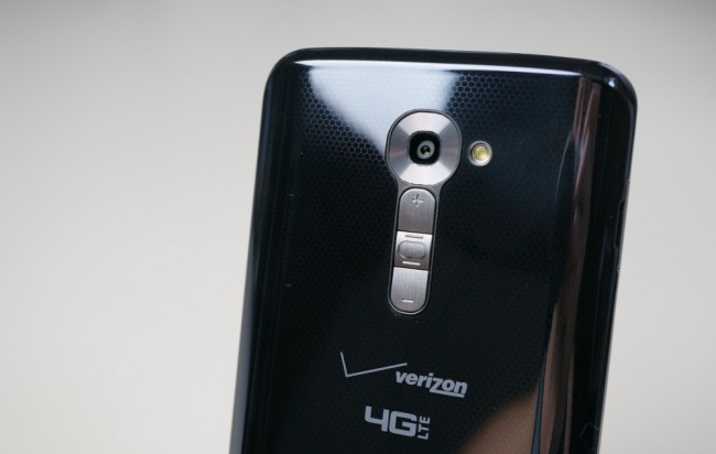
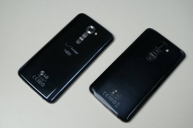
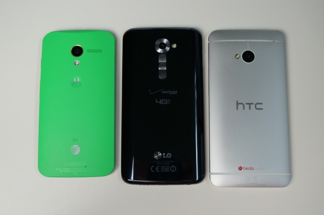
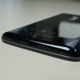
I personally am not a fan of the design of the G2, as it comes off completely uninspired and frankly, boring. Last year, we saw LG create an innovative design technology called Crystal Reflection that was featured in both the Optimus G and Nexus 4, yet they moved completely away from it in 2013 as if it never existed, instead choosing cheap plastic backsides that are glossy, fingerprint magnets. The G2 is really nothing more than a big black slab with no distinctive design characteristics or memorable pieces outside of the display. For many, that may be enough since the display is that good, but in 2013, I think we should be doing more with smartphone designs than simply copying Samsung’s oft-criticized plastics. We’ve talked a lot about the design of the Moto X over the last couple of months, praising it for its in-hand feel. The G2 doesn’t feel bad by any means, thanks to its subtle outer curves. However, the combination of gloss, plastic, and size can’t help but leave us feeling that it deserves more, especially with the rest of the premium parts used. I’ll get into the rear button arrangement in a minute, but it’s certainly not something LG should be bragging about either.
The Not-so-Good
Physical Button Arrangement
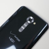
Before I get into this, let me just say that there are few faults with the G2. Two of the “not-so-good” items here are simply my personal opinions and preferences that you may completely disagree with. With that said, I cannot stand LG’s decision to move the volume and power buttons from the traditional side placements and stuff them in the middle of the backplate under the camera lens. Pressing them often feels completely unnatural and regularly confusing. Most of my griping is directly attached to the Verizon version, though. Big Red changed up the button setup from being a subtle bump for the power, with flush volume buttons above and below it. They chose to make separate buttons out of the whole situation, which leaves you unable to tell by touch which button you are trying to press. In fact, I’ve now resorted to flipping the phone over each time before use to make sure I’m hitting the correct button. Thankfully, LG included KnockON, so you don’t necessarily need to press the power button in order to wake or sleep your phone (assuming it works regularly). The international and AT&T variants are also much easier to figure out.
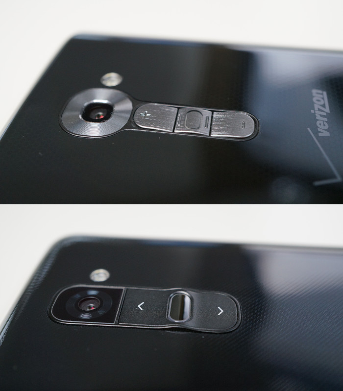
This is something that almost anyone could more than likely get used to if this phone became theirs for a 2-year period. It’s just such a drastic change for someone like me that uses a traditional button setup after traditional button setup, that I couldn’t get over it. By no means should this setup deter you from considering the G2, I’m just making sure you are ready for a semi-frustrating opening experience.
If you want some positives for the button setup, I’ll give you three – LG made long-pressing volume down a quick launch shortcut for the camera, and long-pressing of volume up a quick launch shortcut for Quick Memo. They also made volume down a shutter button or zoom for taking selfies or regular pics.
Glossy Plastics
Ugh, glossy plastics. Look, I get that plastic is probably much easier and cheaper to work with than glass or metal, but if you are going to use it, at least go with a matte finish. The G2 and DROID ULTRA are now battling for champion in the 2013 “Fingerprint Magnet of the World” competition. There is nothing redeeming about a black slab of shiny plastic that needs to be wiped a minute after using it so that it doesn’t look like the Cookie Monster’s buttering slab. And trust me, during this review, I’ve had to wipe the phone at least a dozen times in order to make it presentable enough for the camera. If you buy the G2, invest in a case…like, now.
Holy Bloatware
I counted at least 20 bloatware apps on the Verizon variant of the G2. Tim found at least 18 on his AT&T variant. I think the G2 is now the record holder. Thankfully, their app drawer allows you to hide unwanted apps and Android at a system level lets you disable most.
Other Notes
- KnockON: I couldn’t find a proper spot to mention this, but one of my favorite features on the G2 continues to be KnockON. A simple double knock or tap on the screen quickly wakes the device, while another knock with the screen on will put it back to sleep. Since I can’t stand the button arrangement, KnockON has become my best friend on the G2.
- Call quality: I’ve had no issues with calls on the G2 (Verizon’s version), but have already received emails from readers and forum threads where users are experiencing a hissing noise. Something to keep an eye on.
- GPS issues: This could be my location and the lack of a Verizon tower, but I noticed regularly that the GPS on the G2 was flagging Google Now to give me directions to my “work.” It other words, it had issues pinpointing my “work” location, which is actually my house since I work from home. No other phone has ever put me a mile or two away on a regular basis like the G2 has. That said, I used it a couple of times with Google Maps navigation and it performed just fine.
- Buttons: Not sure if I made this clear or not, but the rear-placed buttons of the Verizon version are far worse than the international and AT&T G2 variants. The gentle slope of the AT&T version makes it fairly easy to figure out which button you are about to press. Since Verizon had LG separate both volume keys and the power button into 3 separate buttons, it’s a disaster.
- Wife test: The G2 did not pass the wife test, as it was too big, greasy, and the button arrangement was confusing.
Gallery
Video
Unboxing and Hardware Tour
Software Tour
The Verdict
I can safely say that the LG G2 should be on your short list of devices to consider for the foreseeable future should you find yourself in need of a new smartphone. With some of the best specs a smartphone has ever seen, an unmatched 5.2″ display, impressive 13MP camera, and availability on all major carriers, there is so much to like here. My only negatives for the G2 are pretty minor, and can easily be overcome. Cases can cover cheap plastic, and your fingers can learn to adjust to buttons. If you can get past those two things, you are looking at one hell of a smartphone.
Nice job, LG.
Links: LG G2 deals at eBay | Amazon







Collapse Show Comments338 Comments