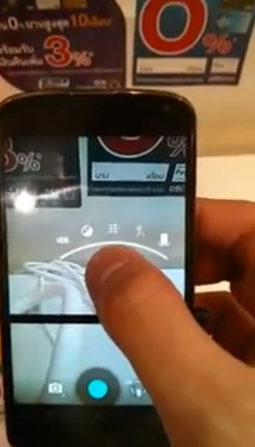
After we got our first sighting of Android 4.3 this morning, information continues to flood in. We were able to spot a tweaked UI to the camera in the original set of pictures, but this video gives you almost every little detail that has been changed. The biggest is obviously the change to a settings UI that isn’t covered by your finger.
In the old UI, once you long-pressed in the center of the camera, a ring would appear around the focus with options, many of which couldn’t be seen because your finger was in the way. With this, Google has moved the settings menu to above the circle and builds on top of itself as you enter new menus. If you don’t want to interact with the menu in the middle of the camera UI, you can tap the settings circle in the bottom right, which then pops up settings over top of the shutter button. We’re also noticing a new timer option that I’m not able to find on my Nexus 4 running Android 4.2.
We wish that the man behind the camera would have tapped on the camera menu to see if anything has changed in terms of video, Photosphere, and panorama, but that didn’t happen.
Notice anything else?

Collapse Show Comments30 Comments