The Samsung Galaxy S4, aka the most anticipated smartphone of the year, is finally here. After showing itself at a questionably comical press event in NYC on March 14, many of us have been counting down the days to its arrival. There were so many new software features on display during the phone’s unveiling that only some serious time spent with the phone could allow us to digest even a sampling of what Samsung and the Galaxy S4 have to offer. But there are some serious questions that need to be answered with this phone as well. Is it a big enough jump from the Galaxy S3 to get anyone to upgrade? Is it better than the HTC One? Are all of these new software features gimmicks that no one will really ever use? Is the overall package enough of a jump to keep Samsung relevant?
We’ve had a review unit in hand for a week now, thanks to Samsung, and are more than ready to share as many answers to those questions as we can. Stick with us, it’s going to be a long ride.
The Good
Hardware
In terms of hardware and specs, Samsung has done something pretty remarkable with the Galaxy S4. They managed to pack the latest and greatest mobile processor, display, camera sensor, and larger battery into a body that is actually slimmer, lighter, and smaller than its predecessor. We’re talking about a 1.9GHz quad-core Snapdragon 600 processor, 5.0″ FHD Super AMOLED display (441ppi), 2GB RAM, 16/32/64GB internal storage options, microSD card slot, 13MP rear camera, 2MP front camera, and 2600mAh removable battery, all tucked into a body that is 7.9mm thick and weighs just 130g. You can argue all day long about this being a minor bump from the Galaxy S3 and whether or not you like the design, however, on paper, it’s really not that close.
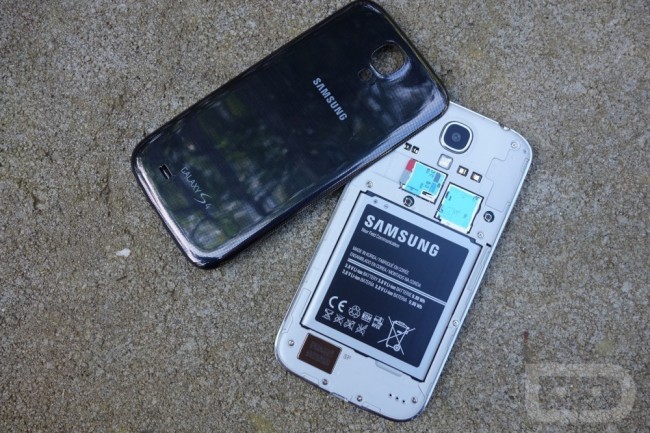
On a related note, during a recent meeting I had with Samsung, they pointed out the fact that at this point in the smartphone game, they are really the only OEM putting microSD card slots in phones and allowing for removable batteries. As the industry moves away from each of these items, Samsung and their top selling phones all continue to feature them. While I wouldn’t necessarily say these are the two reasons for their massive success and the rest of the industry’s decline, they certainly are worth a mention. People like extra storage and they like to have backup batteries.
Design
I’m tempted to toss out the “you either love or hate Samsung’s plastic phone designs,” but in truth, it seems like the minority actually aren’t fans of it. Samsung is the top selling smartphone manufacturer in the world, and yes, they make their phones out of plastic that people tend to label as “cheap.” At this point, I’m not sure that the majority of people really care if their phones are made of plastic, aluminum, or glass as long as the price is right, there are software enhancements that cater to their lives, and the phone is thought to be the hot tech product of the moment. Since Samsung fits all of those categories once again with the Galaxy S4, I don’t see there being much of a fuss over its similar build quality to previous Samsung releases.
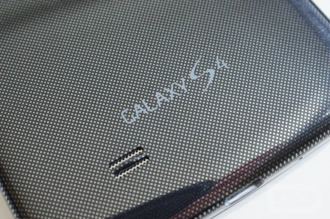
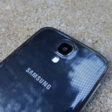
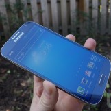
With the Galaxy S4, you get a similar package to what you had with the Galaxy S3, yet everything has been upgraded into a smaller body. Most importantly, you have more screen real estate on the front with less bezel, so you almost have a full-screen experience when interacting with the phone. The design sports a dotted patterned backside, and even subtler dotted pattern on the front trim. The Galaxy S4 is much squarer than its predecessor, but it still has rounded edges in all the right places to make it fit nicely in hand. I’d actually argue that the Galaxy S3 has a better feel in hand thanks to its pillowy curves, but the GS4 doesn’t necessarily feel bad by any means.
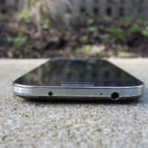
In fact, the overall design of the GS4 is much more appealing than the GS3. Gone is the incredibly cheap-looking wave-like side metallic band – in is a much more conservative and uniform band that stretches around each side of the phone. I believe it’s still plastic, but at least it looks metal. I even like the speaker placement better, as it matches up to the two-slit opening on the Note 2, rather than the fake metal grid found on the GS3.
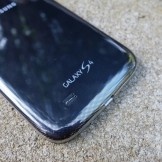
The Galaxy S4 comes in both Black Mist (pictured in this post) and White Frost, though my Black Mist version tends to look blue-ish more often than black.
There aren’t a lot of stand-out design features with the Galaxy S4, but that’s not necessarily a bad thing. It still looks great, Samsung just didn’t take any risks.
Display
The Galaxy S4, to our knowledge, is the first in the world to use a Full HD (FHD) 1080p Super AMOLED display. Weighing in at 5.0″ and with 441ppi, it’s nothing short of stunning. The AMOLED displays used in many of Samsung’s devices tend to blow out colors more vibrantly than their LCD counterparts, show deeper blacks, and for the most part, take the opposite approach to displaying anything the way an LCD does, which is to look less natural. I tend to love AMOLED displays, because I like the somewhat cartoonish look you get at times. At this point in the game, though, I don’t know that you are going to find that big of a difference between either the new LCDs used in phones like the One or this new FHD Super AMOLED, but I’ll throw some thoughts out there anyway.
Color reproduction on both the AMOLED of the Galaxy S4 and the LCD of the One is excellent to me. With that said, I feel like you get deeper colors which in turn means greater detail in whatever you are viewing with the AMOLED on the Galaxy S4. For example, at full brightness and indoors, the HTC One’s LCD display appears washed out to me, while the Galaxy S4’s AMOLED display only gets better the brighter you go. I think Samsung plays to their strengths in the UI by offering up stock wallpapers that accent the great blues that an AMOLED can display, but it’s not just there that I’m seeing the benefits. From icons to Google Maps to this website, the colors all match what my naked eye sees on any other display or in reality.
Macro shots for fun.
Full resolution: GS4 icons | vs. HTC One
But again, you can’t go wrong with any of the current display technologies being used in high-end phones. The pixel densities are so outrageous, that you’ll never see a pixel even if the pixel arrangement appears to be odd. Take the Chrome logo macro shot I’ve included above, which if I’m not mistaken, shows some sort of diamond-like matrix arrangement from the AMOLED on the Galaxy S4. It’s not necessarily pretty under a macro lens when compared to the traditional arrangement on the LCD of the One, but none of our eyes see in macro. So as usual, we’re doing this for fun because to the naked eye, it’s a great display.
I will say that whites on the AMOLED are not as clear or bright as the LCD on the One. They look too grey for my liking, but by no means is that a reason to dislike this display. The only way you’ll really notice, is if you are sitting at a desk like I am, with both phones next to each other cranked to full brightness.
Software Enhancements
Thanks to an ultra-successful and innovative feature-set that was introduced with the Galaxy S3, we knew from the beginning that Samsung would try and drastically outdo themselves with the GS4. The jury is still out on whether or not they did, but we found a number of their gesture and Air View style add-ons to be quite useful. Samsung expounded on their previously introduced hover and movement capabilities in the Galaxy S4 by allowing you to navigate and perform a variety of tasks without actually placing even a fingertip on the device.
If you have used a Galaxy Note 2, then you are likely familiar with Air View, which utilizes the tip of the S Pen to hover over items on a phone and then return actions. For example, you can enter the gallery and hover over thumbnails to view a bigger version of the image without actually entering into the full-screened view. You can hover over text in the browser to magnify it, over dialer shortcuts to see which numbers have been set, or even over calendar items to see a breakdown of your day. The beauty of this tech with the Galaxy S4, is that you no longer need an S Pen. All you need now is a finger that can be hovered.
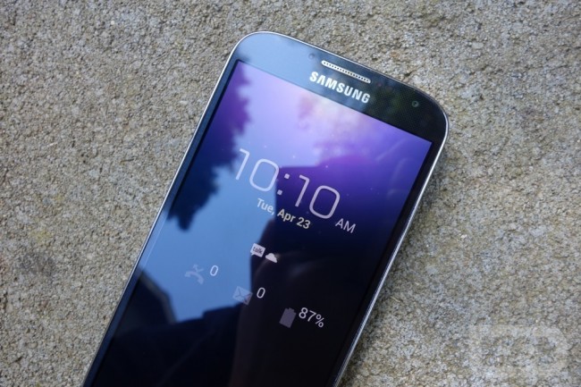
Samsung also built in a number of new gestures that can be activated with a simple air swipe of the hand over your display. If you would like to wake your phone to a minimal overview of your device’s current state (includes battery level, text messages, calls, etc.), simply wave a hand over the top portion (where the sensors are located) and your phone will briefly wake itself (pictured above). If you are thumbing through gallery pictures, yet find yourself with greasy fry fingers while at lunch, wave your hand from right-to-left or left-to-right to change photos. This also works in the browser to change tabs and scroll through web pages, as well as in the ringer to answer calls.
All of these gesture and hover-based features can be enabled or disabled in the phone’s settings, so don’t feel like you have to use them. Also, most only work in Samsung-built apps, which is pretty disappointing. If you were hoping to gesture swipe around Chrome or hover in Gmail, it’s not happening. I asked Samsung if they had plans to open up these features to developers, and unfortunately, it doesn’t sound like it’s in the program at this point. They are working with specific app developers like Flipboard, though.
Battery
Battery life on the Galaxy S4 has not been an issue for me in the week that I’ve had the phone. I should note that I’ve had the Sprint version and live in Portland, so the device has been running on 3G CDMA the entire time, not 4G LTE. While I wish I could give you definitive battery tests with LTE running all day, that wasn’t in the cards this time around. As I get my hands on LTE versions (AT&T and Verizon), I’ll be sure to try and update this section should these numbers change in any way.
In the screenshots below (from left to right), you’ll see my battery life results from my first three days and three charges. In day one, I’d put usage level at moderate-to-heavy because of the setup process of the phone and traveling time. In the second screenshot, this was definitely my highest usage day, that included a solid 30-45 minutes of gaming. On the third day, I used the phone as I typically would throughout a day – WiFi on, grabbing it for a call here or there, checking some emails, updating apps, etc. By no means are my typical days “heavy.” During all three days, never once did I have to charge the phone in under 10 hours of use.
The good news, which I mentioned earlier, is the fact that the Galaxy S4 has a removable battery. Should you be a heavy LTE user, Samsung will eventually give you the opportunity to buy replacement batteries, potentially even an extended battery to help get you through a day. It’s a feature that Samsung has no plans to move away from.
Expandable Storage
Samsung continued their trend of including microSD card slots in flagship phones with the Galaxy S4. Should you choose to buy the 16GB model of the phone, understand that you can toss in a microSD card up to 64GB to expand that. It’s a minor detail, but it’s one that only Samsung continues to pay attention to. The rest of the smartphone world is trending towards not having SD card slots, yet Samsung is fully aware that its customer base is all about removable storage. For someone like me, who is constantly testing phones and never has to worry about storage limits, even I can see the benefits to having SD card slot support, especially for those who are attached to a phone for the life of a contract.
Camera
The camera section of this review is pretty far down the list of “good” things for a reason – it’s pretty good, but not great and definitely not bad. As you’ll see in the sample shots below, the 13MP sensor in the Galaxy S4 is capable of taking some (what I would consider to be) stunning photos in the right light. The picture of the Paulaner beer I consumed this weekend in particular, is one of my favorites. The color accuracy, white balance, and ability for the camera to adjust correctly to what I would assume to be a macro setting while on “Auto” seemed to play off perfectly. I also liked the sausage picture (consumed with the Paulaner) because it grabs a ton of detail, yet still doesn’t give off the oil-painting effect that I saw far too often with the HTC One’s camera.
Full resolution: 1 | 2 | 3 | 4 | 5 | 6 | 7 | 8
Obviously, it’s not all good for the Galaxy S4 camera, since I dropped it down this far. In low light, the camera is not great – actually, it’s not even good. The picture above of a glass of whiskey was in a decently lit lobby bar at a hotel in San Francisco and came out looking subpar and mushy (technical term) when compared to the previously mentioned photos taken with great outdoor light. The real killer here, though, is the HTC One comparison I took while in a dark storage room in the upstairs of my house. The Galaxy S4 wasn’t even able to capture anything other than a corner of a pillow – the rest is blackness. The HTC One on the other hand captured almost the entire room.
I’m also not a fan of the size of 13MP images in general. While I’m well aware of the fact that I can adjust that down to 8MP in the camera settings, by default, these things are enormous and almost impossible to share with social networks or via email. Most of the photos I took with stock settings started at 2.4MB and climbed all the way up to 4.4MB.
Low light comparison shot to the HTC One.
So again, the camera on the Galaxy S4 is pretty good, it’s just not great. With that out of the way, let’s talk software, since Samsung added a bunch of new features that may come in handy from time to time.
Camera Software
Samsung packed all sorts of new goodies into their camera software. The most notable change upfront is the UI, which they told us was tweaked to mimic that of the Galaxy Camera since they received such positive feedback from that product. It’s simple if you want it to be, plus the layout is easily managed while taking both photos and video. But along with the new UI, they added in camera modes like Drama (merge together action shots), Animated photo (lets you create GIFs on phone), Sound and Shot (record audio with photos), and Eraser (removes unwanted moving objects from photos). Most of these won’t get steady action from you, but the point is to have them there just in case. Call them gimmicks if you want, but to me, they are add-ons that will come in handy from time to time, and there is nothing wrong with that.
One of the bigger features Samsung is pushing with the camera is their picture-in-picture modes for both video and photos. You can really have some fun with this setting, but I wouldn’t be surprised if some of you even find practical uses for it. Using both front and rear cameras, the Galaxy S4 is able to record video at the same time or capture stills, no matter what you are doing. You can theme up the in-picture shot, go fully split-screen, or adjust the size of the box to your liking. It’s certainly silly and seems incredibly limited in its uses, but again, it’s there if you need or want it.
Overall, the camera on the Galaxy S4 has to be considered a positive just for the fact that it packs in so many features while still being able to produce great stills under the right circumstances. You could argue that even with all of the fluff it’s still not as versatile as say, the camera on the HTC One, and I wouldn’t fight you on that point. But no matter what, it’s serviceable.
Android 4.2.2
The Galaxy S4 is one of the first Android phones in history to launch with the most current version of Android. That version is Android 4.2.2, which Google only unleashed upon us back in February. There is a chance that Google releases an even newer version at its I/O developer conference in mid-May, but for the time being, Samsung is up-to-date. This may sound like something that should happen with all new phones, but manufacturers can’t seem to keep up even after years of practice. So in a way, this is an even bigger deal than putting in a 13MP camera or 1080p display.
Accessories
One thing Samsung has done over the last year and a half that we absolutely love, is release phones with one size and shape on all carriers around the globe. This allows accessory manufacturers to provide you with more accessories than you can possibly absorb. No longer are they forced to create special versions depending on the carrier – with the Galaxy S4, it’s one size fits all. Your choices will seemingly be endless, once this phone arrives, assuming accessory makes have begun prep work.
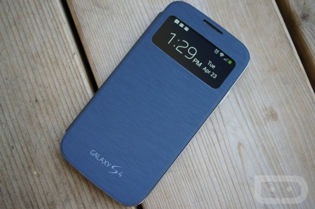
Outside of third party accessory makers, Samsung is planning to release their own suite of accessories for the Galaxy S4, ranging from variants of their popular Flip Cover to health accessories to universal docks to replacement batteries. Most will be available at launch, outside of the health accessories which will arrive later this year.
The Not-so-Good
Build Materials
Look, it’s 2013 and companies like HTC and Apple are making beautifully designed, high-end phones out of materials like aluminum, yet here is Samsung, pushing out another phone made entirely of plastic. Now, we’ve talked about plastic as a smartphone material and the fact that it serves a purpose, but at some point, shouldn’t Samsung try to step it up a notch? We can argue for days whether or not this new Galaxy S4 is a designers dream or not, but the truth is that it doesn’t even compare in style or build to what HTC did with the One. I’d be lying, as would anyone else, if they sat here and told you with both the One and Galaxy S4 in hand, that the GS4 is the higher-end or better looking of the two. It’s really not even close. The Galaxy S4 is a well made, plastic phone, it’s just not on-par in terms of design or build with the One. There are rumors floating around which suggest that Samsung has acknowledged this and will bring something new to the table with the Galaxy Note 3, but again, those are just rumors.
TouchWiz
In my HTC One review, I took HTC’s Sense 5.0 to task. I’m going to do the same with Samsung’s TouchWiz. As stock Android has grown into an incredibly polished and feature-rich mobile operating system, manufacturers continue to put their own spin on it with custom skins that tend to make things more difficult than they need to be. To be fair to the review process, I’ll also only pick five issues in particular that stood out to me as I did with the One, but like the One, I could probably go on and on.
First, creating folders is a mess as it almost always has been with TouchWiz. In order to create one, you need to grab an app and then drag it to the “Create folder” option that appears at the top of the screen. I can sort of understand how this might seem more user friendly to a novice user than the standard Android version of dragging apps on top of each other, but why did Samsung remove the traditional drag and drop altogether? Sure, once you create a folder using this “Create folder” option, you can drag items into it easily, but I’m still not seeing the point in removing the easiest way of all, which is to simply drag an app onto another app in order to create one. I can’t imagine that there is really some software restriction that is forcing us to do one or the other.
Second, the standard TouchWiz keyboard is the worst in the business. If you buy this phone, install Swiftkey or Swype or whatever other third party keyboard you like as soon as you can. Now, we should point out that Swiftkey’s technology is actually built into Samsung’s stock keyboard, but Samsung has still done their own thing with it. It doesn’t auto-correct as well in my experience with it, plus its key spacing gives me a headache when it comes to quick typing. It’s swipe-like or gesture typing isn’t half bad, but if you are a rapid-tapper like me, you may find yourself spending more time correcting errors than you are used to.
Third, the dialer application which is attached to contacts is essentially two separate apps, yet they appear to be one. What I mean by that, is as you enter the dialer, you’ll see tabs (which I’ll get to in a moment) for Keypad, Logs, Favorites, and Contacts. Should you press the Contacts tab, it actually opens up the Contacts app rather than a new tab, so there is a delay before it shows you anything as it takes time to process and open the Contacts app. Once in the Contacts app, the top tabs change to Phone, Groups, Favorites, and Contacts. That’s right, the tab that used to say Keypad, now says Phone. Can we get some consistency? Again, tapping “Phone,” then opens up the dialer app and takes an additional few seconds to load. It’s slow, clunky, and pretty damn ugly.
The settings menu in this new version of TouchWiz is quite confusing. Samsung decided that the vertical scrolling approach to the settings menu on any other Android device is not quite easy enough to understand. So instead, they created four tabs and their own categories for settings, which are mostly a jumbled mess. It has taken a week to figure out where certain items are that I visit on a regular basis because the organization is so random. Like, why is Accessory, Call, and Display in the “My device” section, but Storage, Battery and Date & Time are schluffed off into a “More” category. Don’t those items all have to do with “My device” as well?
Last, Samsung still designs apps and menus as if they were built in 2010 for Gingerbread rather than Jelly Bean. For example, in the settings menu that I just complained about, you have a tabbed few of categories, yet you cannot simply swipe between them. Instead, you are forced to tap each tab to enter a new category. And it’s like this all over the place, including in the previously mentioned dialer and contacts applications. Dear Samsung, we are in the era of Holo UI with swiping gestures, action overflow menus, and slideout navigation menus. Tabbed UIs are out.
The Galaxy S4 is yet another Android phone that needs a third party launcher (along with any other third party replacement application you can find) on day one.
Very Similar to the Galaxy S3
I know that I just spent an entire review trying to sell you on this being different than the Galaxy S3, but I couldn’t help but think time and time again over the last week that this is nothing more than a slightly bumped up version of last year’s flagship Samsung phone. It looks very similar and has mostly the same exact software outside of a few new feature add-ons that will eventually come to the Galaxy S3. When navigating around it, thanks to the exact same navigation setup and custom skin, a non-tech savvy person probably wouldn’t be able to tell the difference between the two. I mentioned at the top of this review that on paper, the GS4 is quite different, however, in reality for everyday usage, you could argue that it’s not.
Navigation Button Setup
Samsung going with a physical home button coupled with menu and back soft keys isn’t necessarily offending me as it used to. In fact, I’m completely comfortable with them after having used them for months on end. However, that doesn’t mean I’m a fan. What gets me the most, is having to physically press in a button to do the most often-asked-for task of returning home or exiting an application. I can get down with the soft menu and back keys, but I’m not sure I’ll ever be a fan physical buttons that protrude out from the bottom of a phone. Samsung seems to have found a way to upgrade this home button, as it presses much tighter than previous phones, but I’d still prefer they do away with it.
Other Notes
- Performance: I typically include a “Performance” section with my reviews, but since the unit I have from Samsung is technically running pre-launch software, I didn’t think it was fair after noticing some stuttering and other lag. At this time, with this device in its current state, the camera lags when taking pictures, I’ve noticed time and time again a lag in the folder animation, and jumping in and out of apps isn’t as smooth as one would expect. I’m also finding all sorts of bugs in Samsung’s take on lock screen widgets. So for now, until this phone gets an update or I hear from Samsung that this is actually final software, we’ll leave these notes here.
- WatchON TV app: When compared to the TV application on the HTC One, WatchON can be very frustrating. With the One, it took a couple of button taps and I had the device connected to every single piece of home entertainment hardware in my living room. With WatchON, I tried and quit after five minutes when the app started asking questions that I would have had to get up or research to find the answers to. It’s also not as seamless or user-friendly in terms of finding favorite shows and then making sure you know they are readily available to watch.
- HTC One comparison: Below, you’ll find a video comparison of the Galaxy S4 to the One, but we won’t be stopping there. In the coming days, we’ll have a full-on comparison that should give you our thoughts on which device will be sticking around the DL offices.
- Sprint’s network: I feel bad for anyone stuck with a contract on Sprint. I haven’t had to use a Sprint phone in some time, and now I know why. They have almost zero 4G LTE foot print in this country, but to make matters worse, only have a 3G CDMA network to fall back on. Coming from HSPA+ and LTE, this is like returning to the 90s and AOL free dial-up. Ugh.
Gallery
Videos
Hardware and Software Tour
Vs. Galaxy S3
Vs. HTC One
The Verdict
After all that, should you buy the Galaxy S4? Sure, why not. It’s a really, really good smartphone – probably in the top two or three at this point in the game. Should you decide to buy one, you’ll get a beautiful 5.0″ FHD Super AMOLED display, plenty of horsepower thanks to a quad-core processor, a serviceable 13MP camera, all sorts of interesting software features, a removable battery, expandable storage, and the most recent version of Android. There are few things to dislike about this phone. It’s also coming to every major carrier (including Verizon) and will have more accessory choices than any other phone on the planet aside from the iPhone 5.
With that said, the HTC One and its premium body is out there for the taking. As previously mentioned, you can’t go wrong with the Galaxy S4, but you also can’t go wrong with the HTC One (review) or even Nexus 4 (still my personal favorite) for that matter. It’s a great time to buy a smartphone. Go get them all in your hands before making a decision.
Links: Galaxy S4 at eBay | Amazon

Collapse Show Comments219 Comments