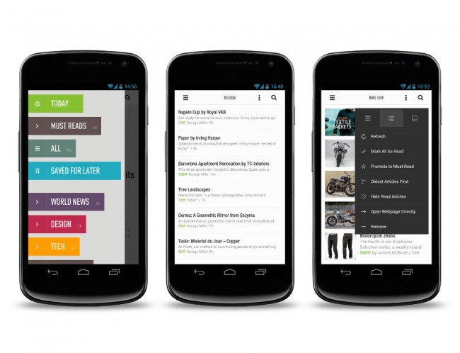
Feedly, the app that plans to take the RSS reigns from Google Reader when it’s retired in July, released a new version of its app on Android this morning. Over the last two weeks, Feedly has added some 3 million new users thanks to Google’s announcement, prompting the team to quickly upgrade their apps to be much more polished, stable, and feature rich. After spending the weekend with this new version in place of Press (my usual RSS reader app), I can easily say that I’m a fan of what Feedly is up to.
The UI of Feedly’s app is completely swipe and gesture based. If you want to access your folders or feed lists, there is a panel to the left side which can be accessed with a swipe. If you want to refresh your feeds in this panel, simply pull down to refresh. As you read through stories, a swipe left or right gets you to the next article in line. A swipe upwards from the bottom marks the item as read and takes you back to your list of articles. From your view of articles, a swipe upwards takes you to the next list of unreads. As you continue down, continuous swipes upwards will get you to the end of your list which then allows you to mark all as read. A swipe from the right side gets you into the brand new Feedly discovery engine, where you’ll have access to 50 million different new sources. As you can see, it’s all about swiping left and right or up and down.
The app also has night and day themes, color coded folders, different viewing options, quick share buttons for services like Twitter, Google+ and Pocket, and more. It’s a fully-featured RSS app that is certainly worth a look should you be in the market for something new once Google kills off Reader.
Here are the rest of the new features:
- A faster and more intuitive vertical transition model.
- Brand new widget.
- New layouts for Samsung Galaxy, Nexus 7 and Nexus 10.
- Better control over the list, magazine and mosaic views.
- Better Youtube integration.
- New explore panel.
Via: Feedly

Collapse Show Comments21 Comments