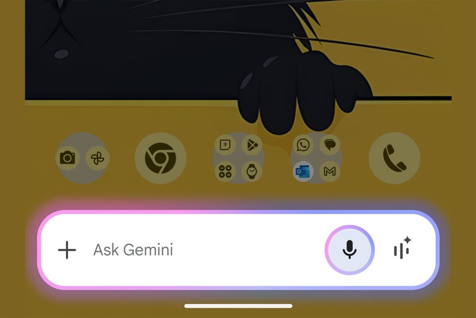
Google’s Gemini assistant on Android phones is getting a refreshed UI that appears to be rolling out to a bunch of people within the past 24 hours. The new UI simplifies the overall look, while bringing in a lot of the color scheme of Apple’s new Siri animation.
Folks over at reddit noticed the change and shared the image above. The UI has gone from the dark box you can see below, with a “Good morning” text, option to expand the window, and several buttons, to a simpler one-row bar and only a couple of items to click on. We also get a pink and blue glowing border (which is where the Siri comparisons come in).
I would love to tell you more about this new UI, but I do not have it. Google is doing that wonderful thing (that’s sarcasm) where it slow rolls out changes that not everyone gets at once. So we get to do this dance with our phones where we check for updates, force close things, swipe around in circles, and tweak settings in hopes that it’ll push through the changes. It almost never works, because this ridiculous system is life and has been for years.
Old Gemini UI
Of course, you could try to update the Gemini app or the Google App, whichever truly controls Gemini and see if that does the trick. I can tell you that being on Gemini Advanced means nothing nor does owning a Pixel 9 Pro. You would think those things might matter and that you would be in line to get things first (part of the Gemini Advanced sales pitch is “priority access to new features”), but that’s not the case here. Folks with all types of Pixel phones are seeing this change, even those without a paid Gemini subscription.
I guess in the end, this is simply a UI switch without any new functionality. Still, can we have new things Google? We’re literally paying for them.
Google Play Link: Gemini
This post was last modified on January 10, 2025 8:40 am


