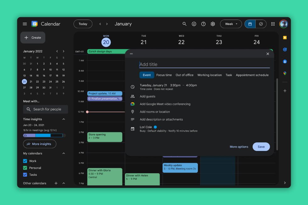
Google Calendar on the web is about to look a whole lot more swanky, thanks to a modernized aesthetic and the introduction of dark mode. After all these years of waiting, we are ridiculously pumped for this change.
Google highlights updated controls (buttons, sidebars, etc.), updated typography, as well as iconography. Essentially, the whole thing got reworked. Check out the full list below of what’s new.
What’s New in Google Calendar on Web
- Controls (like buttons, dialogs, and sidebars) are more modern and accessible
- Interface typography that uses Google’s custom-designed and highly-legible typefaces
- Iconography that is legible and crisp, with a fresh feel
- Introducing the ability to toggle between light mode, dark mode or device default theme options
These changes are starting to roll out today. To turn on dark mode in Google Calendar, hit the settings icon in the top right corner, then Appearance and select from Light, Dark, or Device default.
I shouldn’t be this excited about Google Calendar, but here we are.
This post was last modified on October 24, 2024 11:02 am


