The first Android 15 QPR1 Beta 1 release didn’t reveal much in terms of new stuff that we could all see and play with. As you can imagine, there was likely a bunch of stuff hidden, so for the new Android 15 QPR1 Beta 2 that dropped today, Google has decided it’s time to push behind-the-scenes stuff to the front.
We’ve only had the new Beta 2 on our Pixel 9 Pro for a few short minutes and the changes are already starting to show. We have a new settings design, keyboard switcher shortcut, and more.
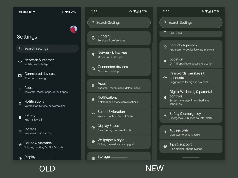
New settings design: When you head into Settings on your Pixel device with Android 15 QPR1 Beta 2, you’ll be greeted by the design below. Google is now grouping bundles of settings together in bubbles, sort of like Samsung does. They have also removed the shortcut in the top right to your Google profile and replaced it with a “Google” section at the top that takes you to a similar area. Of course, there is a massive “Search Settings” box at the top you can type in.
It very much looks like an unfinished piece of beta UI, in my opinion.
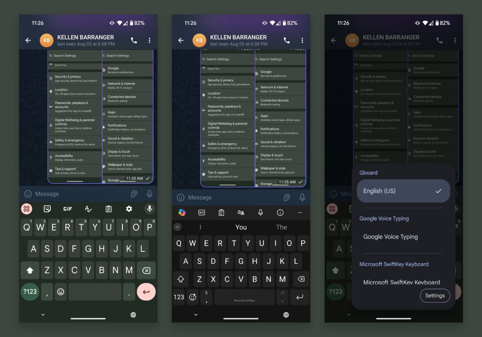
Fast keyboard shortcut switcher: If you are on QPR1 Beta 2 and jump into a text box, a new globe icon appears in the navigation area. This icon is actually a keyboard switcher that is very much like the one found in iOS. Tapping this icon will quickly switch you between keyboards (if you have multiple installed). You can also long-press on it to dive into additional keyboard settings or to manually pick a new keyboard.
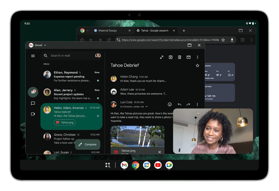
Desktop Windowing on tablets: As a part of Android 15 QPR1 Beta 2’s release, Google officially announced that desktop windowing has been introduced on tablets. As you can see in the image below, Android tablets can pop-out windows and let them float on top of each other, just like you would do on a PC with multiple apps or windows open.
In this scenario, the taskbar gets pinned at the bottom to show you which apps are open, so you can easily tap between them if they are hidden because of a bigger window. You can also pin apps in this taskbar for quick access. This windowing adds a header bar to the top of apps too, so you can find additional ways to control each window. Oh, of course, you can resize windows by grabbing their bottom right corners.
To access this experience you would need a Pixel Tablet running today’s Beta 2 build. Once on your device, you would press and hold the window handle at the top of the middle of a screen and drag it into the UI before releasing.
For more, see Google’s full write-up.
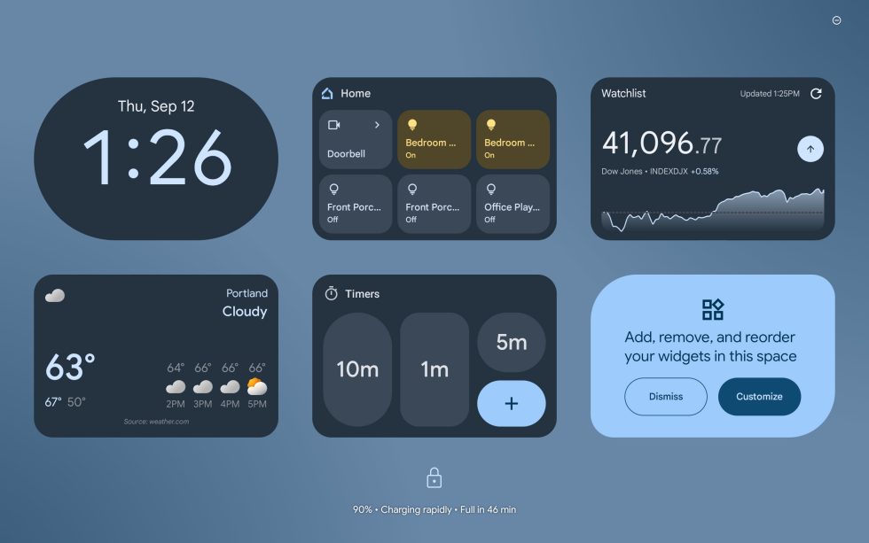
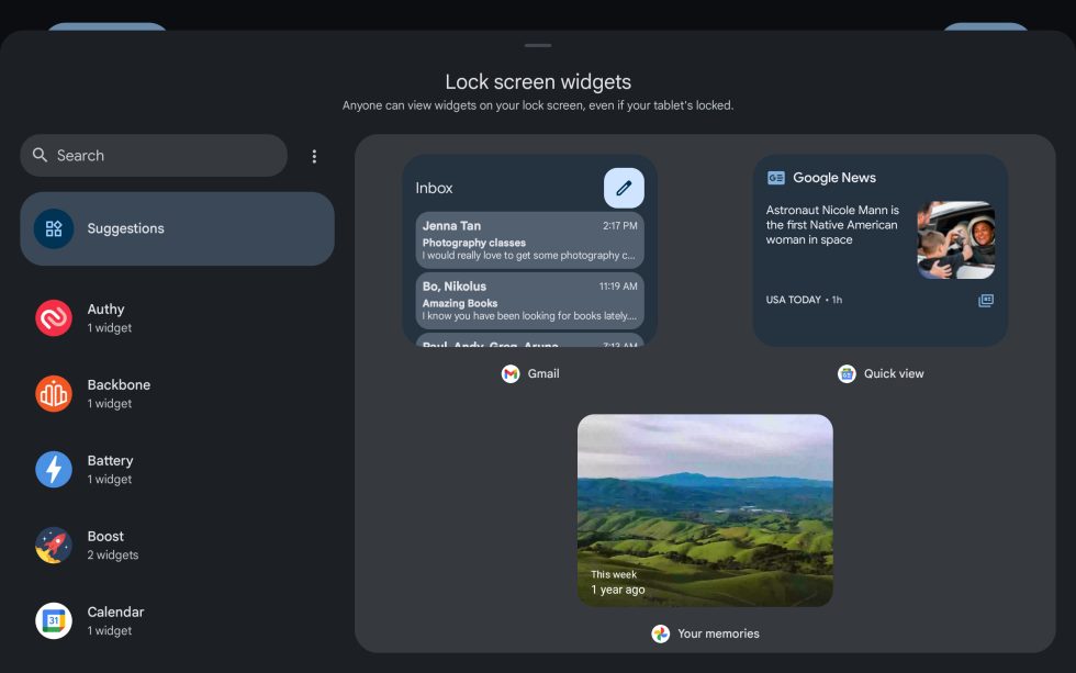
Lockscreen widgets debut on tablets: Lockscreen widgets were once a thing on Android and we were at one time a big fan. Google then removed them, only to watch as Apple re-introduced the idea and made folks fans once again as if the concept was new. Google is now deciding to bring them back, but for the moment, only on tablets with this QPR1 Beta 2.
To get started, you would update your Pixel Tablet to this new build and then you’ll start seeing them on the lockscreen. For our Pixel Tablet, once updated, there were several widgets already living on the lockscreen in an area off to the right of the main lockscreen. All you have to do is swipe from right-to-left to see them.
You can add, remove, or move widgets by long-pressing on the lockscreen and then hitting the “Customize” button at the top. From there, you can individually tap a widget before selecting “Remove” if you’d no longer like it there. You can also long-press on a widget to then drag it to a new location. If you press the “Add widget” button, a familiar widget screen should appear with almost all of your widgets available.
This still looks like a system that could use some improvements (like size adjustments). For now, it appears that the widgets are a 3×2 format, but it sure would be nice to be able to expand something like the weather widget or your home controls widget.
We’re updating as we find new stuff!
Collapse Show Comments1 Comment