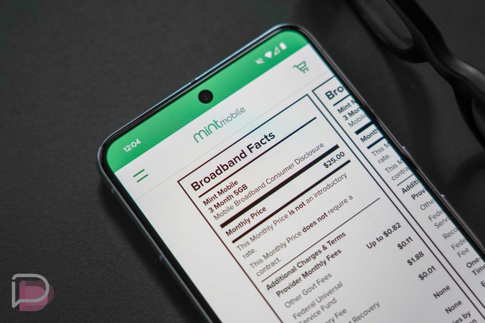
The FCC told broadband providers (both wired and wireless) that it wanted them to provide “Broadband Facts” for all of the plans they offered by mid-April of this year. These facts would provide a nutrition label-like lists of features, pricing, taxes/fees, and network info that shoppers could use to make better decisions when it comes to internet. These broadband facts have now been widely rolled out by almost every carrier I’ve checked on, with most showcasing the info on plan pages instead of deeper within their sites, like we first found after looking last month.
I love these new broadband facts or broadband labels, whatever you want to call them.
In recent days, I’ve looked at Mint Mobile’s site after T-Mobile finalized the acquisition of them, Cricket’s site because they said they have a new $15 plan, and Verizon’s site to see if they were finally put this info front-and-center. Finding the broadband facts readily available without any work at most of these places was so great to see.
Today, when you head to T-Mobile, Visible, Mint Mobile, Xfinity Mobile, and Cricket Wireless plan pages, their broadband facts are sitting there under their sales pitch for each plan (or there is at least a button getting you to them). In other words, you can ignore whatever angle they are using to sell you on the plan and can instead go straight to the facts to make a decision. It’s amazing.
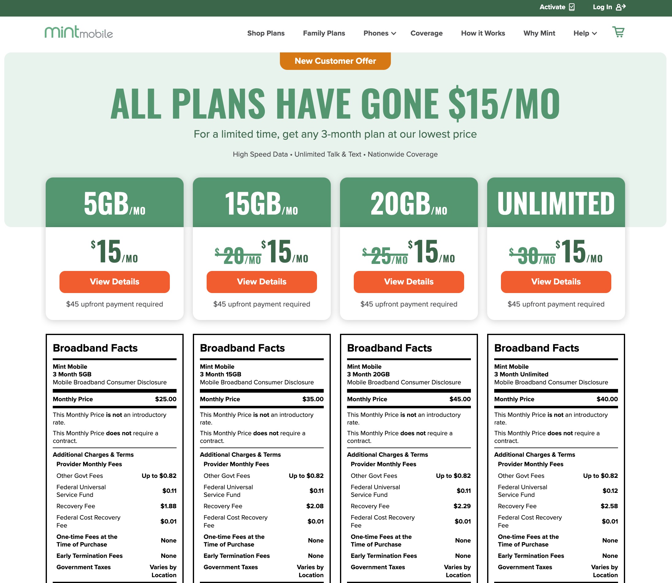
Below you can see that when you land on Mint Mobile’s site and click “Shop Plans,” you get a clear presentation of the plans available with broadband facts sitting right below them. It’s the same on T -Mobile, Visible, and Cricket sites too, with Xfinity first asking for your address.
The Mint Mobile page is one of the best examples of how useful this is because they are constantly running promos with pricing that could be confusing, since they offer at least 4 different plans. But if you look through their facts, they explain what the real price of the plan could be after the promo, how much data is included, if there is an unlimited amount, what the taxes might look like on top of the monthly price, if there are one-time fees, if a contract is needed, etc. It is all of the information you need when deciding on a plan that carriers used to try and make difficult to find or understand.
You’ll notice I didn’t say AT&T or Verizon and that’s because their facts are still hidden deeper in their sites. Their info isn’t just on the page for plans, which is a bit annoying. Verizon and AT&T are stilling burying their broadband facts behind a sales portal that you won’t see until you jump to a special page, add an address, maybe a phone, and more.
The thing is, these two carriers both have dedicated plan pages that you can view and look at details of without logging in or showing any real interest. These pages would be great for broadband facts to live. Instead, Verizon forces you to click a specific “Start with plans” button to get a sales process going before showing you the facts, while AT&T makes you walk through at least 3 major steps before showing you facts. They should do better and match everyone else.
But hey, they may never, so below is a list that gets you to all of the major wireless carrier and prepaid carrier broadband facts:


Collapse Show Comments9 Comments