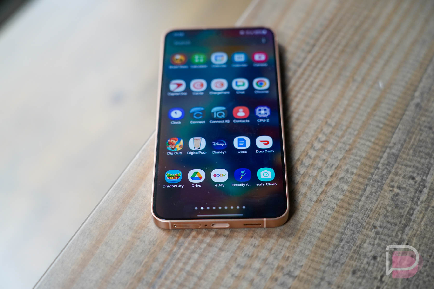
Every couple of years, we appear to bring back our begging for Samsung to give us what we need. Since they haven’t listened, for the launch of the Galaxy S24, we’ll go ahead and do it again. We’ll then do it again in another couple of years until our requests are finally met.
Give me a vertical app drawer, Samsung.
Samsung, vertical app drawer hater
Just give me a toggle at least. Let the weirdos who prefer their thumbs to work in the wrong direction by swiping side-to-side in that awful paginated way have their way, but also let me have mine. My thumb and brain work in a vertical manner on a phone, because it’s the proper way that even Google realized was correct back in 2015 – almost 9 years ago. Give it to me, dammit.
All I need is to be able to swipe into the app drawer, tap the little 3-dot menu in the top right corner, and then head into Settings. From there, we should find a toggle that says “Apps screen layout” with a choice to switch to vertical. There’s a freaking option to add the “Show Apps” button, something no one on Earth has used in almost a decade (because we swipe), as well as a “Rotate to landscape mode” button that feels incredibly duplicative, but Samsung can’t find a way to let me switch the app drawer.
And here’s the thing – we know Samsung understands that people might want this. They create Good Lock, the customization tool for Samsung devices with all sorts of options, one of which is a vertical app drawer. That version of a vertical app drawer is bad, because it adds an excessive amount of pinned apps in it, but it was there. Unfortunately, Samsung has removed that feature (or hasn’t yet released it) for One UI 6.1 and the Galaxy S24 it seems, so we can’t even have that. Supposedly soon, I keep reading.
Since the Android world has few meaningful players, it’s hard for me to sit here and say, “Everyone else is doing it, Samsung!” But really, everyone that matters is doing it. Google, as I already mentioned, did it close to a decade a go. OnePlus has had a vertical drawer for a long time. Motorola copies Google, so they are vertical. Even Apple’s newish and odd app drawer thing is vertical. It’s all vertical, yet Samsung is like, “Guys, we think we know better about how thumbs work and also that you don’t want to quick-jump by letter to other apps.”
At least add a quick search
Because I don’t want to just come off as a whiny blog bro who offers no real solutions other than a toggle that Samsung may never give me, I’ll give them another one that would make life easier. Add a quick search for the system or apps or settings or something, like Google and Apple have done.
For Pixel owners, you’ll know that you can swipe up into the app drawer and have the keyboard auto-launch to let you search for almost anything on your phone. A similar action works on iPhones, but it is instead activated by a swipe down on the home screen. As someone who primarily uses either a Pixel 8 Pro or iPhone when not reviewing devices, these quick search actions are things I absolutely cannot live without. I use them constantly and find it hard to adapt to new phones that don’t have this.
With Samsung’s bad app drawer, auto-launching the keyboard is essentially the first step Samsung should take before giving me a vertical toggle. Opening the app drawer on a Samsung phone flips you into wherever you last left it, with no simple way to get to any specific part of it. If you flip up into the apps that start with “P” and need one at the beginning of the alphabet, you then have to swipe for pages to get there. Sure, you could tap the search bar at the top, but that’s yet another unnecessary action that also means reaching to the top of your phone’s massive display before then shuffling your little fingers back down to the keyboard and then searching.
I could go on. I don’t want to.
There’s two ideas Samsung. Give me a vertical toggle in the app drawer or at the very least, give me a keyboard that auto-launches in your bad, horizontal app drawer, so I can search for things.


Collapse Show Comments33 Comments