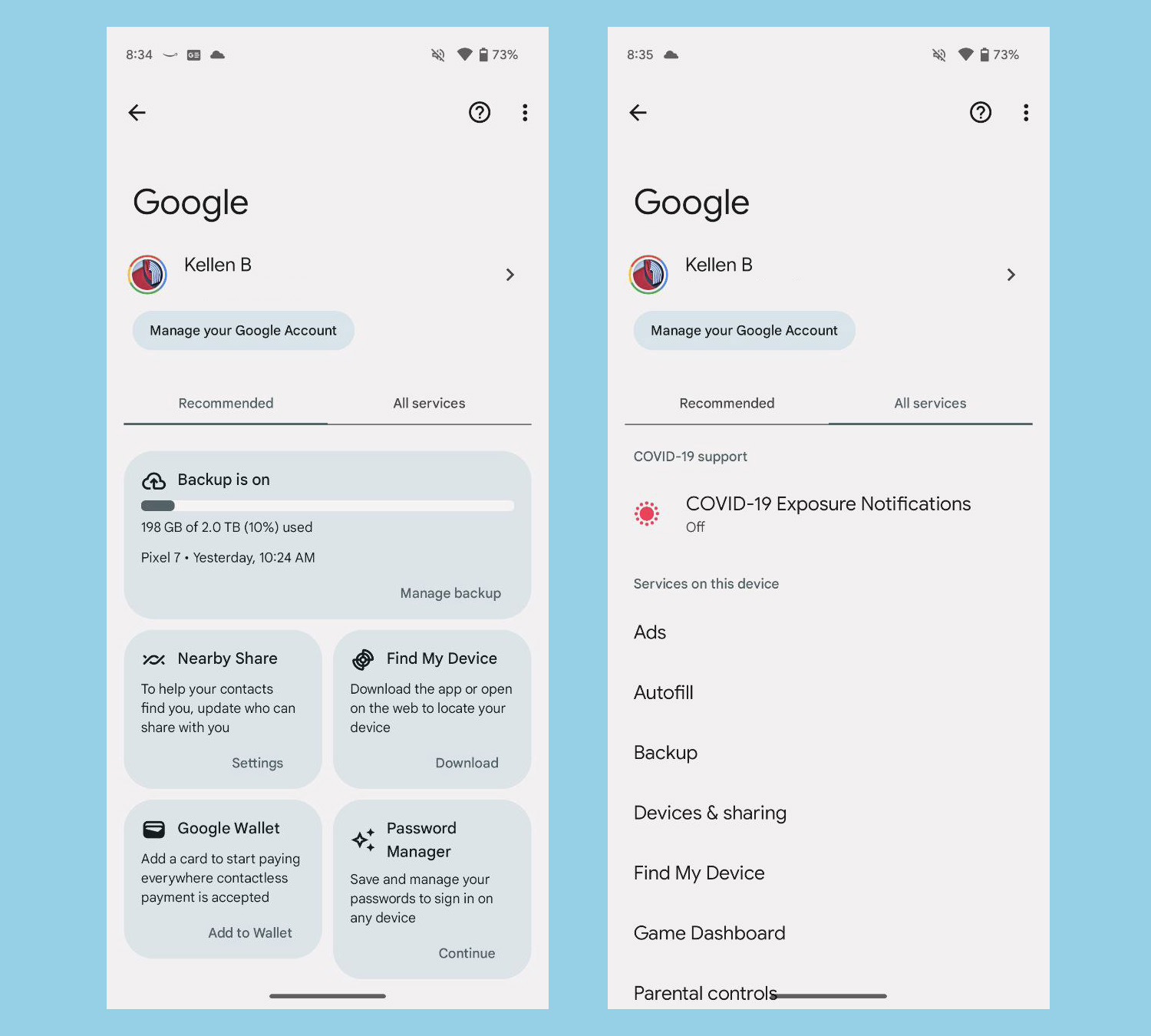
The “Google” section in your Android settings page is getting a makeover over night, without any sort of announcement from Google. Not that we needed one, but the new UI appears to be widely rolled out and can be accessed by you right away, potentially on any Android phone.
Now, when I say the “Google” section, I’m talking about the area you find within your Samsung or Pixel phone’s settings called “Google.” This is technically the Google Play Services area, but only us nerds would call it that. For almost everyone, this is just the Google settings area, where you’ll find shortcuts to adjust things related to your general Google account.
The new redesign shows a two-panel layout with a “Recommended” section upfront, along with an “All services” tab next to it. This Recommended area shows big areas related to things like your Backup (and how much space you have if a Google One subscriber), Nearby Share, Find My Device, Google Wallet, and Password Manager settings. Tapping into these big buttons takes you to apps or other settings ares to control those services.
If anything, it’s a cleaner way of showing you some of the most important Google settings on your phone.
I’m seeing the new UI on both my Pixel 7 and Galaxy S23, so this isn’t just a Pixel thing. Google Play Services is on all of your Android phones and that should mean getting this update. I am on the Play Services beta with version 23.32.55 seemingly the build that flipped the switch on this new look.
Google Play Link: Google Play Services
Google Play Services is starting to roll out a big redesign of its settings page. I'm referring to the page you access by going to Settings > Google.
Now, instead of showing the full list of settings by default, you'll get quick access to a couple of key settings in the… pic.twitter.com/zQs2bhAHb0
— Mishaal Rahman (@MishaalRahman) August 23, 2023

Collapse Show Comments3 Comments