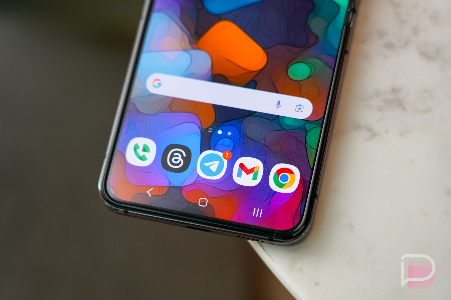
It’s wild to think that the current Android gesture navigation system has been around since Android Q, which eventually launched as Android 10. At the time of that system’s initial introduction, I was pretty critical of it as a step in the wrong direction, as Google looked to completely ditch its 2-button style, while pushing its 3-button setup to a second tier. The 2-button, was of course, my favorite of all time because it mixed both button taps and gesture swipes.
Having a take like I had 4 years ago seems like something that needs to be revisited to see if I ever came around to fully embracing Google’s gesture system. After all, the system hasn’t really changed much since it first launched and we have been through dozens of devices of all shapes and sizes to see if Google made the right choice or not.
Did they?
Better than Apple’s iOS gestures
Here’s one thing I can tell you as someone who has spent a lot of time in recent years with an iPhone – Android’s gestures are better than iOS gestures. And there’s a single reason why. Android has had a useful back action built into its system navigation and it is incredibly useful from almost any screen.
Google and Apple’s gestures actually work similarly in that they start with a bottom thin bar that you can make swipes from to go home, to jump into an app overview or app switcher view, or to quickly jump to other open apps. You could actually call them identical in this sense, as they work the same. Their UI choices once in that app switcher are different, but they both get you to similar places in a very similar way.
Where Android and Google take a step ahead is in that back gesture I just mentioned. Apple, because I know some iOS bro has been wanting to scream about the fact that iOS has a back gesture, does indeed have a half-baked back gesture. When you navigate around an iPhone, swiping from the left edge in will perform a back action, but it only goes back a single screen within an app. You can’t just back swipe whenever to go back. As an example, if you were in Chrome and tapped on a link, you could back swipe from that left edge to go back a page. However, you couldn’t open the camera app and then use that same back swipe to exit the app or go back another screen. It’s limited.
On Android, the back works to take you back a screen, to exit a text box and minimize the keyboard, to exit an app, to minimize a pop-up, or to hide the comments on YouTube that you just tapped into, etc. For the most part, the back gesture will work to stop whatever screen you are on from doing something or to go backwards. It also is available as a swipe from either edge, so if you switch hands, you can back swipe with either thumb without reaching across the entire phone. It is without a doubt the reason Android’s gestures are better. The back swipe is king.
But are gestures better than Android’s 3-button setup?
I do have to admit that I’ve come around to preferring Android’s gesture system after all this time. That’s mostly because gestures are (in my opinion) better than the 3-button option that is the alternative. I still think I might prefer the old 2-button layout that mixed gestures and buttons, but it has been retired and isn’t really worth talking about any longer.
What I do love about Android gestures is the usability when you are holding a phone in a single hand. Being able to use the back gesture from either side of the phone is quite handy and lets you perform a back action without reaching across the phone for a back button. They are also great at letting you quickly swipe between recent apps or into the app switcher in a speedier way than tapping a button could. And that’s mostly because you don’t need to precisely hit a button – you can instead reach for the general area at the bottom of the screen to then swipe where you need to go.
I do have some issues, though. These Android gestures forced apps to be redesigned away from side slideout menus that were a big part of Android’s design. Many apps still have those menus and gestures have made accessing them less easy. You now have to perform a two-finger swipe to get them out, an awkward angled slide downward, or you tap. And the apps that have redesigned properly now require taps instead of swipes, so we’re still doing lots if not more tapping because of system gestures.
Gestures can also still be wonky or confusing when you flip into landscape, when using a tablet, and when consuming media, because they hide and require a swipe or two to re-reveal them before they work as intended.
In the end, what I’m getting at is that the gestures do work quite well once you use them enough, but they probably won’t ever be perfect. There needed to be tradeoffs in order to implement them and for the most part, they have still been worth it. I would also hope that Google continues to offer 3-button alternatives because I can already sense the comments are about to explain to me how much better buttons are than gestures. Please do.


Collapse Show Comments72 Comments