If you saw something in the original Nothing Phone (1) that caught your eye, living in the US kept it out of reach. Nothing’s initial launch skipped this market to test the smartphone waters elsewhere without the heavy investment it requires to push something here. So we’ve been waiting patiently for Nothing’s Phone (2) to arrive to finally see if unique design, fresh software, and a familiar hype approach could deliver a new competitor in the US scene.
Nothing sent us a Phone (2) a couple of weeks ago to review, so we’ve spent quite a bit of time with it at this point. We’ll dive into the details below to tell you everything you need to know to help decide whether or not this is a phone to consider. In short, it’s a winner of a phone that gets so much right in an Android world where there seem to be fewer players worth looking at. Nothing’s software approach in particular deserves a ton of praise. The rest is just fun.
Let’s get further into all of that – this is our Nothing Phone 2 review.
What do I like about the Nothing Phone (2)?
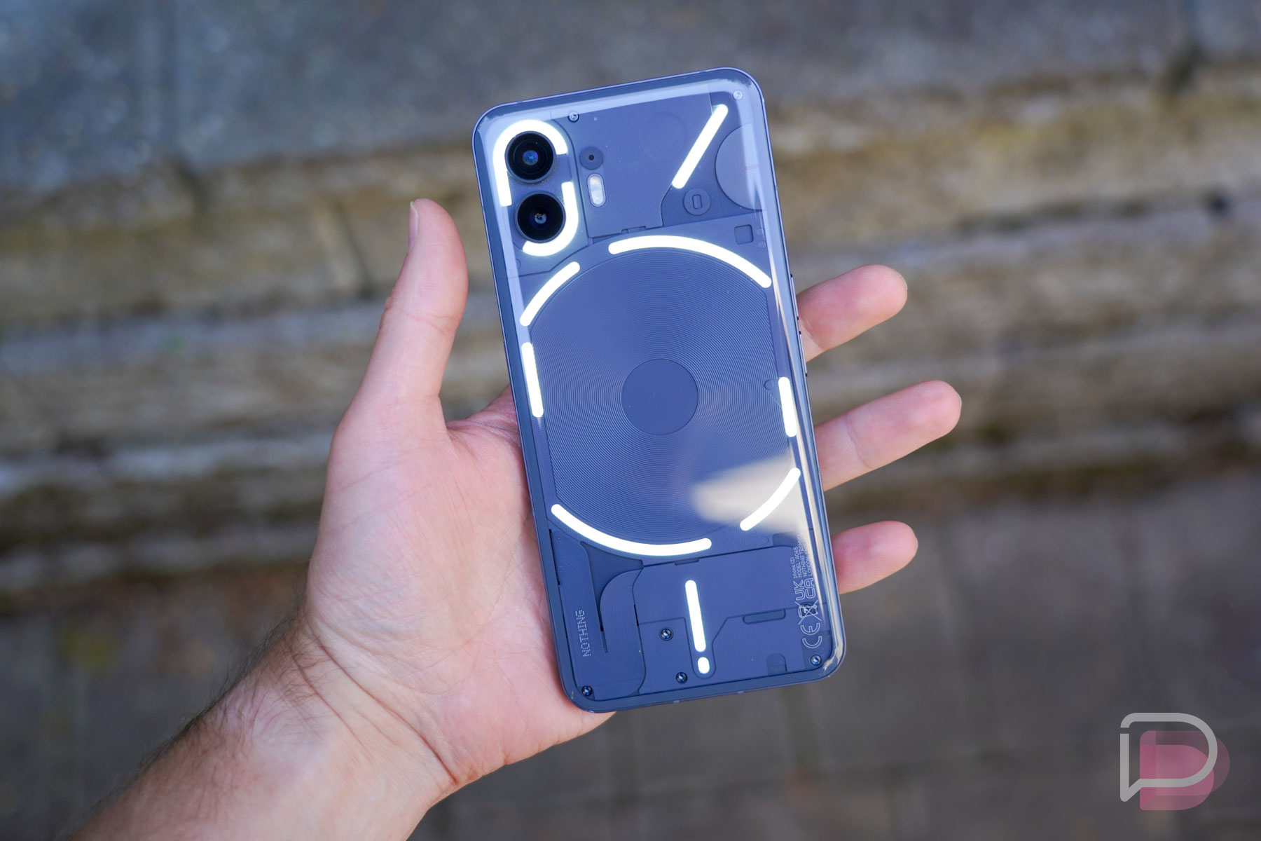
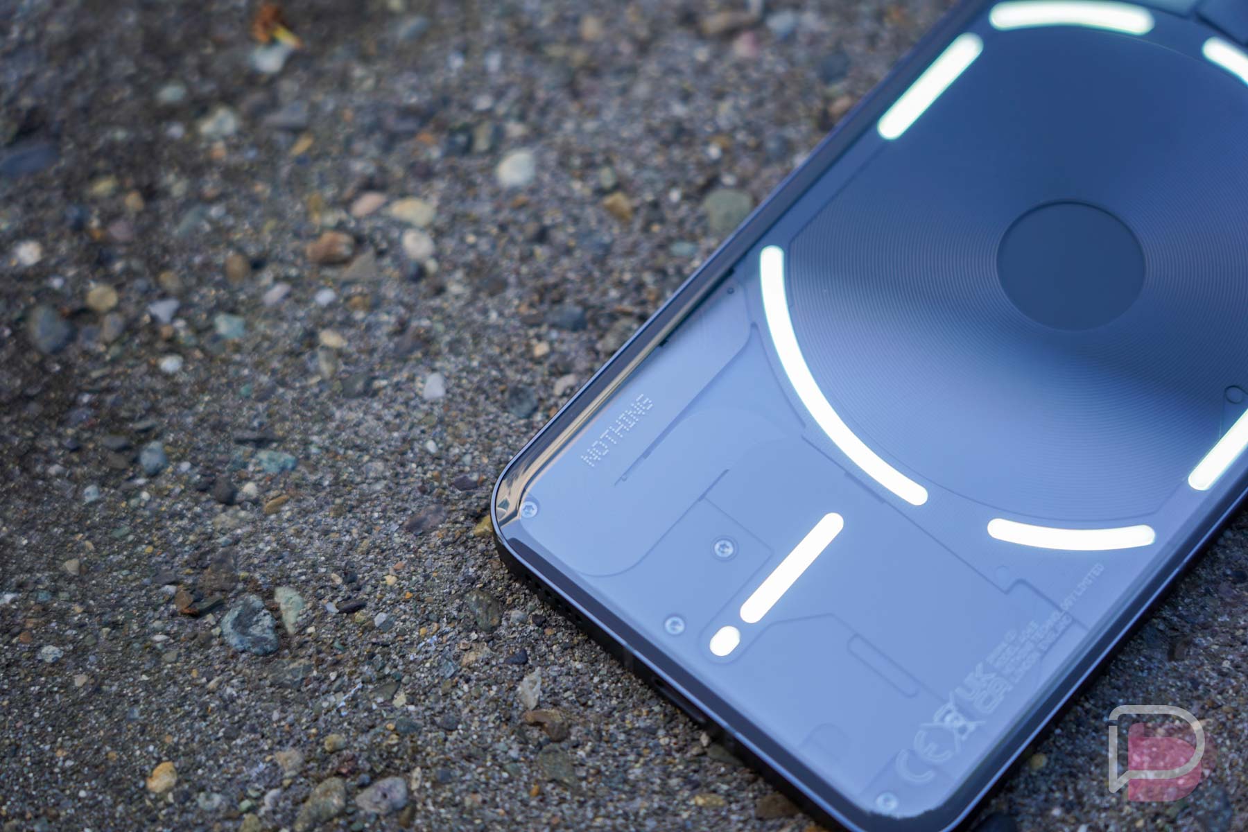
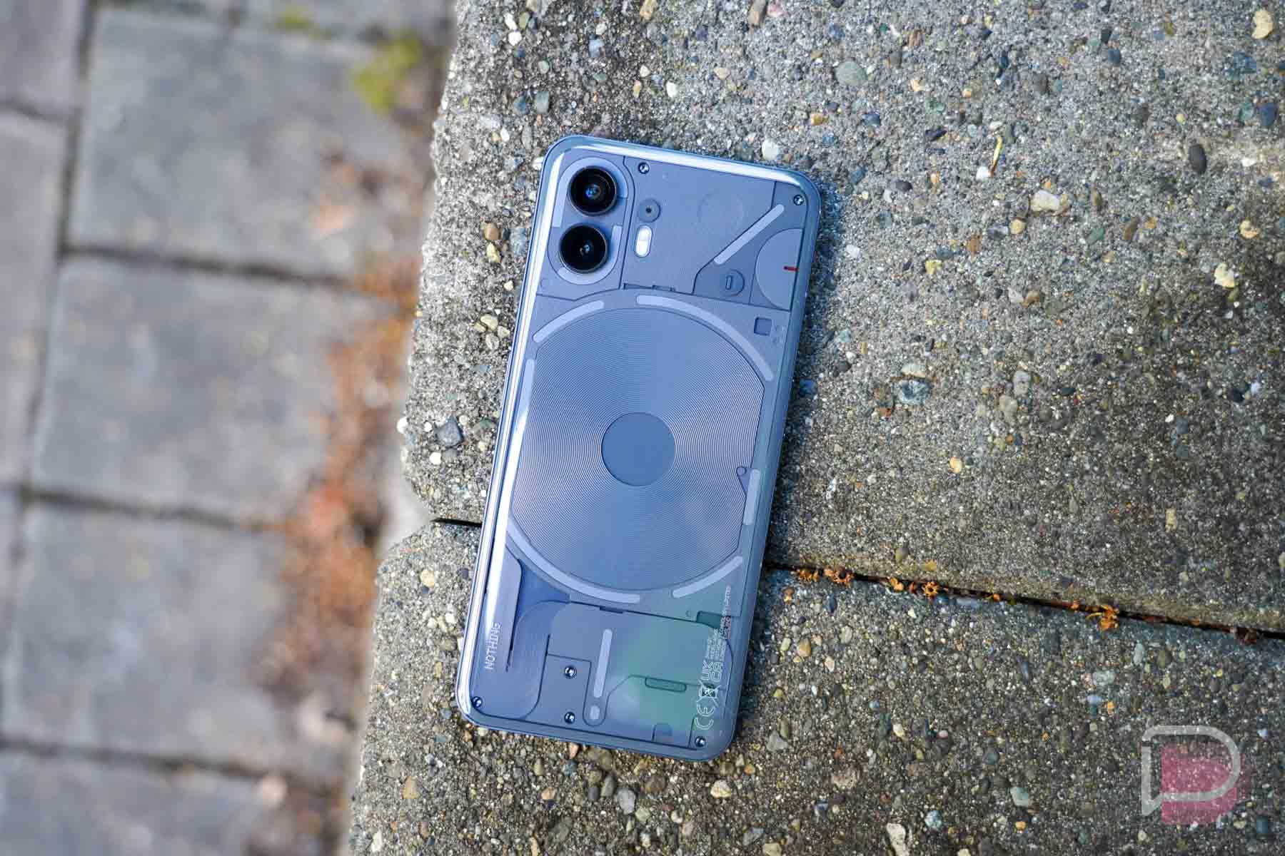
Design. When you look at Nothing’s phones (and earbuds), you can’t help but talk about the fact that they are clear or see-through. It’s a design choice that is meant to standout and help Nothing have an identity. And to be honest, it looks cool enough, especially in phone form.
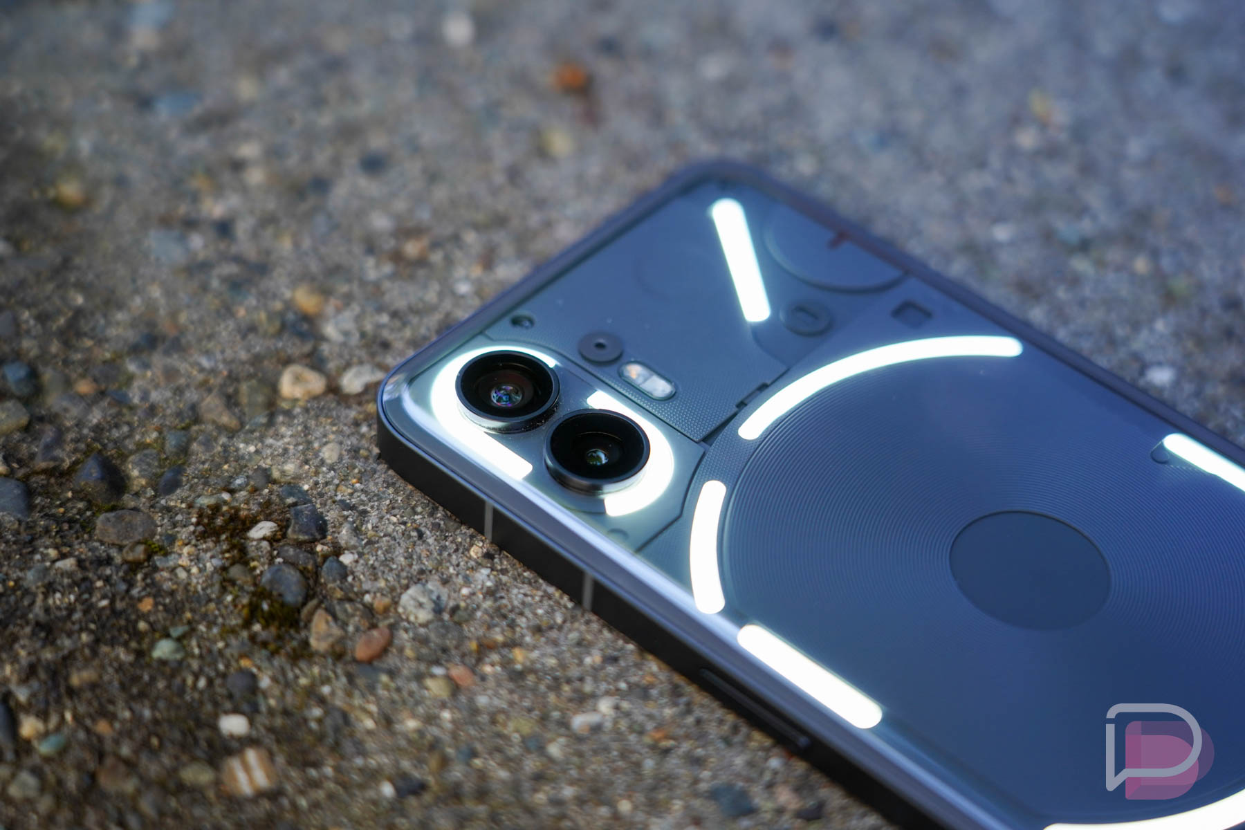
Of course, the clear backside allows for the Nothing Glyph Interface to do its light-up magic. Goofy name aside, the back of this phone can be both useful and a party trick to start conversations with. While I have yet to place my phone face down for more than 3 seconds because I’m not a psychopath, I can admit that it is a neat idea that certainly looks flashy and fun. My kid thought it looked cool, if that means anything.
If you go beyond the obvious, the rest of the Nothing Phone (2) design is what helps this phone shine. Rather than softly curving the metal sides and front display, Nothing has kept this phone almost unapologetically flat everywhere, like you might find in an iPhone. They did add a slight bulge to the rear for Phone (2) that gave the back glass a subtle curve to try and make the phone more comfortable to hold. It works, although I really liked the double flat design of Phone (1) and wish they’d kept it here. The fluffy back is my least favorite part of the phone.
But what you get from this design is a unique look on Android. The extra flat sides with a soft finish on the aluminum and the super flat front display are treats in a world of curves. Ports and holes and grills are all properly centered within the frame, plus the buttons have a really easy-to-find long and flat shape. Again, these are like you might find on an iPhone and they were good choices.
The Phone (2) is a bit big for my personal liking, but it’s about the same size as other flagship-level phones, all of which the world has told manufacturers it loves. Do I wish there was a small Nothing Phone (2) that was the size of the Galaxy S23? Yes, absolutely and I’d use it going forward as my personal phone. Maybe next year with Phone (3).
This might sound too early to say, but the fit and finish of this phone is beyond what almost all other Android phone makers produce. This phone feels nicer than the Galaxy S23. The materials feel more premium than Google’s Pixel phones. When you hold this phone, you’ll tell yourself that you’ve got a premium phone in hand and love it. And then you’ll light up some shit with Glyphs.
Battery life. Rarely do I find phones that survive the day and leave me asking, “Can I kill this thing?” And by “kill” I’m referencing the phone’s battery. With the Nothing Phone (2) and its 4700mAh battery, I found excellent battery life almost every single day.
After the first few days of testing, where you don’t typically expect good battery life, I essentially stopped tracking it because it was that good. Looking back through screenshots, I had one night where the battery had 36% left at 11:25PM with 3.5 hours of screen on time. On the next day, somehow, I had 54% left at 10:16PM with 4.5 hours of screen on time. On my heaviest day of usage, I had 17% battery left at 9:30PM with 5.5 hours of screen on time, but a full hour of that was walking around in the heat with my son playing Pokemon GO. Without the long Pokemon sessions, I can’t see this phone ever having battery issues.
On a charging front, you’ve got 45W wired charging and 15W Qi wireless charging. Both of those are probably fast enough for most people. That wired charging can only happen with a proper charger and Nothing does not give you one in the box, so you know. With those charging speeds, especially the 45W wired, you should be able to top up your phone on heavy-use days in a matter of minutes.
Performance. Nothing decided to include the Qualcomm Snapdragon 8+ Gen 1 in the Nothing Phone (2) and they are pitching it as the proper choice because it’s a tried-and-true performer that is super efficient. They are correct there, but let’s be honest, this is a year-old chip that probably helped them keep the price down without discounting performance. And I’m cool with that – this phone runs great.
My review unit is the Dark Gray version with 12GB RAM and 256GB storage. Nothing hasn’t specified the type of RAM and storage, but I’d imagine it is modern enough to help with the performance. When you couple premium storage and RAM with this premium Qualcomm chip, as well as the 120Hz display, you get fast and smooth.
As I always point out, we don’t run benchmarks during reviews. Instead, we use review phones the way we use all of our phones. We don’t bring along review units as secondary devices – we actually switch to them. If there are hiccups or stutters or something doesn’t load properly or there are heat issues, these things standout because they interrupt our usage.
For the Nothing Phone (2), I’ve got zero complaints. The phone unlocks quickly, opens apps quickly, transitions between apps quickly, snaps on gestures, handles any of the games I play, presents video like I need it to, etc. If we didn’t live in a world where having the newest of the new chipset was a talking point, you’d run this phone and not care that it is the 8+ Gen 1. And I don’t care. As I already mentioned, this phone runs as good as any for my daily grind of Chrome, Twitter/Threads, Instagram, reddit, Telegram, Gmail, Pokemon GO, Google News, and others.
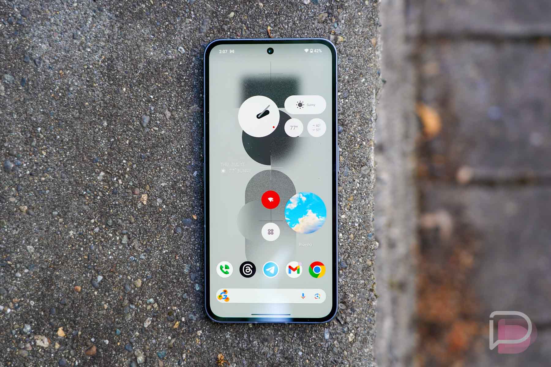
Display. The display here is a fully flat 6.7″ OLED with LTPO and a resolution of 2412×1080. It refreshes at 120Hz, so you have the potential for an extra smooth experience. Overall, I’d call this a solid display, but probably not that close to being the best.
When using the Nothing Phone (2), you most definitely get one of the snappiest experiences around. This phone’s display tracks your finger inputs better than almost any other phone, and this probably shows how good Nothing seems to be already at optimizing software and hardware together. You also get a really nice dark theme, adaptive brightness, HDR brightness peaking, and some controls over the color profile.
My only real complaints are in brightness levels and its adaptive tendencies. The phone is capable of 1000 nits of outdoor brightness that can jump to 1600 nits when viewing HDR content. When outdoors, I just didn’t think the display got bright enough on several occasions. My wife even complained when I handed it to her at one point because she wanted to turn the brightness up, only to find it was at 100%. I also just found it wanting to aggressively adapt to lighting situations that often led to it being too dim and that would force me to manually brighten it. But on the flip of that, in ultra dark situations, it doesn’t quite get dark enough for me, even with Extra Dim toggled on.
I do like the display on the Nothing Phone (2) for daily, indoor usage. It’s clear, colorful, and extra responsive. I just didn’t love its outdoor performance and the aggressive adaptive brightness.
Software. The Nothing Phone (2) ships with Nothing OS 2.0 (Android 13) and it might already be one of my favorite takes on Android. For the most part, I’d call this a clean Android skin that is closer to matching Google’s Pixel skin than anything Samsung or OnePlus ships. And since I like Google’s Pixel experience, it shouldn’t be a surprise that I like what Nothing is doing.
Nothing OS 2.0 is great for a number of reasons, but the biggest is that it isn’t trying to dramatically change Google’s vision for Android. Things like the notification system work as they should. The home launcher is simple and fast like Google’s, but with more options that are useful and playful. All of the sound and display settings you are used to are here, there are expanded controls for the lock screen and always-on display, and they even included a handful of experimental features, like one that’ll connect to your Tesla or AirPods.
They’ve also enhanced Android some by bringing back lockscreen widgets, using the Glyph Interface with software to make it more than a gimmick, and they care enough to build out lots of custom widgets and give you beautiful custom themes. I’ve written an entire piece on the unique features of Nothing OS that you should look through.
But when it comes to software, we have to talk about updates. For now, Nothing is committing to 3 years of Android OS updates and 4 years of security patches that show up every 2 months. That’s not even close to being the best in the industry (Samsung is the best). Since Nothing doesn’t have a long history to fall back on, this area is going to be a bit of a mystery that we’ll learn from. All we know for now is that Nothing has supposedly brought on a big in-house software development staff in recent months and that has helped them pump out those regular bi-monthly security patches for the Nothing Phone (1) and has let them ship at least one Android 14 Beta. They seem to be doing better in this department this year.
My general takeaway from the software on the Nothing Phone (2) is that I like it a lot and like all of the little additions they’ve added onto Android. I do have my concerns about software updates and am hoping they only improve there to make this brand one of the best. Time will tell on that, of course.
Camera. For cameras, Nothing is offering a main 50MP Sony IMX890 sensor next to a 50MP Samsung JN1 wide-angle sensor. I don’t think anyone would call this a top tier camera setup, and Nothing appears to agree. They spent a lot of time talking about camera software and tuning and algorithms during their unveiling and in briefings to us. Their pitch is that almost all cameras these days can take good photos in good light, but in the fringe cases you need great software to improve images. They believe they are doing that with the camera system on the Phone (2), coupled with the Qualcomm chip onboard.
In my testing, I found images captured by this phone to be quite good in several settings. I’m big on snapping photos of the beer and food I consume, as well as other up-close objects that require a portrait-style. It excels in these situations. I also liked most of the indoor pictures I took of my silly cats and found some fun shots from a pinball session we had recently. Where it might struggle is in landscape shots (I think it’s over-sharpening) and those with complex skies (it struggles with consistency in exposure). But other than that, I was surprised at how many great pictures I took.
Using the camera couldn’t be simpler. It fires up with the double-click on power that’s standard in Android phones, focuses quickly, and snaps photo after photo without hesitation. This is a speedy little camera app that also comes equipped with separate portrait, “expert” or pro, and slow-mo modes. It doesn’t have a dedicated night mode you can choose, which is odd, but it’ll recognize lighting conditions and flip on night mode when necessary.
To recap – not a camera that’s supposed to compete with the Pixel and Galaxy Ultras of the world, but it probably holds its own.
Price. At a starting price of $599, the Nothing Phone (2) seems like a pretty decent deal to me. You get a high-end Qualcomm chip, 8GB RAM and 128GB storage, lovely software (with support that has potential), a very solid camera, fun and also premium hardware, outstanding battery life, and an overall unique experience to Android.
Competitors are probably phones like the Pixel 7, but performance, the display, network connectivity, and battery life are miles better than the Pixel 7. If we’re talking a phone with similar specs and size, the Galaxy S23+ probably matches up the best, but it starts at $999. Even if you match the storage on the Phone (2) to the S23+, you are still saving $300 – and it’s a $350 difference with pre-orders.
How is this not a good deal?
Glyph Interface. I don’t actually know if I should say I like the lighting system on the back of this phone, but I also don’t dislike it. If anything, it’s not bugging me, yet I feel like I need to talk about it. It is one of the unique features of the Nothing Phone (2) and I’ve hardly mentioned it up until this point. So here we go.
Nothing included their Glyph Interface on the back of this phone, which is an LED lighting system that can let you know when notifications roll in on your device, act as a countdown timer in visual form, and show charging progress if you plug your phone in. You can watch it dance between lights for ringtones, create your own ringtones to light up, and use the lights to help you take pictures in dark settings. It’s cool! I also have barely used it during testing.
Why is that? Because I don’t put phones face down on anything. I’m still scared to this day that doing so will scratch a display, so I leave my phones face up. That’s too bad because the Glyph thing is pretty neat to play with, but it’s not something I will likely ever take advantage of. That’s my take – I wish I had more for you.
What’s bugging me about it?
Only IP54. The first thing that stands out as a potential red flag with the Nothing Phone (2) is in durability. This thing is rated IP54, which means it can withstand some dust and is splash resistant. You probably shouldn’t dunk it or take it to a super sandy beach. If you do, you are risking its life. For comparison, Google’s cheap Pixel 7a ($499) is IP67 and can fully withstand a good amount of water and sand. Google’s Pixel Fold, a ridiculously fragile foldable, is also more resistant to water than Nothing’s phone.
This seems like a pretty big corner to have cut, but since this is the OnePlus team running it back, it shouldn’t surprise us. For years, they claimed to not want to pay for an IP certification as they lagged the industry in providing good water and dust resistance.
Limited Verizon. The other thing that will affect a number of you is in network connectivity. The Nothing Phone (2) is primed and ready for AT&T and T-Mobile, but is not fully supported on Verizon. It appears to be missing LTE Band 13 and also Verizon’s 5G mmW bands. Without full LTE support, your connections could be spotty. Without 5G mmW, you probably won’t notice because it does support the rest of Verizon’s 5G bands.
Should you buy a Nothing Phone (2)?
I have almost nothing but good things to say about the Nothing Phone (2). The software is excellent, as is performance and battery life, the camera holds its own against competitors, and the design is unique in all of the right ways. I even think the price is quite friendly for the package being delivered by Nothing.
If you need the negatives wrapped up somewhere nicely, I would point to the size (it’s large to me), lack of true Verizon support, and sub-par IP rating. If those aren’t of concern in your world, then by all means buy a Nothing Phone (2). While still a new company with a lot to prove, this is an excellent 2nd phone that we’re happy to see added to the list of choices in the US. We needed this.







Collapse Show Comments35 Comments