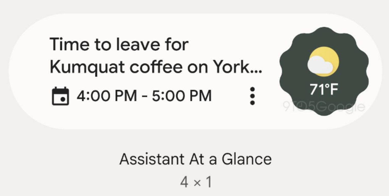
It appears that Google is working to overhaul the Assistant At a Glance widget on Android devices (other than Pixels), bringing the Material You aesthetic to the feature. This update will allow it to fit in with the suite of other widgets that have received the same change.
Thanks to 9toGoogle, we have an idea of what it will look like once it’s ready for the public, but currently, the update is in testing and not quite fully baked. From the widgets menu, we can see that there can be a oval shape outlining the information provided in the widget. Currently, Assistant At a Glance is full transparent and you’re not able to tweak that setting. Following the update, it appears there will be more customization allowed, which makes perfect sense given that’s the whole point behind Material You.
I must say, I’m surprised it has taken Google this long to get to updating At a Glance. It’s always better late than never, but considering the push that Google has put into widgets over the past couple of Android versions, At a Glance was definitely feeling left out in the cold. As a Pixel user, I would also still love a way to fully disable it from my homescreen. Wink, wink.
We will patiently await the arrival of this updated appearance.
// 9to5Google


Collapse Show Comments10 Comments