Pre-orders for the Nothing Phone (2) are already open for those who took in yesterday’s announcement and decided that this would be their next phone. For the rest of you who are waiting for a bit more info (like Nothing Phone 2 reviews), we promise that we’ll have that shortly.
Today, since I have the phone and can’t wait to share more, I wanted to point out some of the new software features that Nothing has included that might help you make a decision over whether or not to buy one. This phone runs Nothing OS 2.0 over Android 13 and has some pretty cool tricks up its sleeves that you might not see on any other phone.
Here are five of the Nothing Phone (2)’s most interesting features.
They brought back lock screen widgets
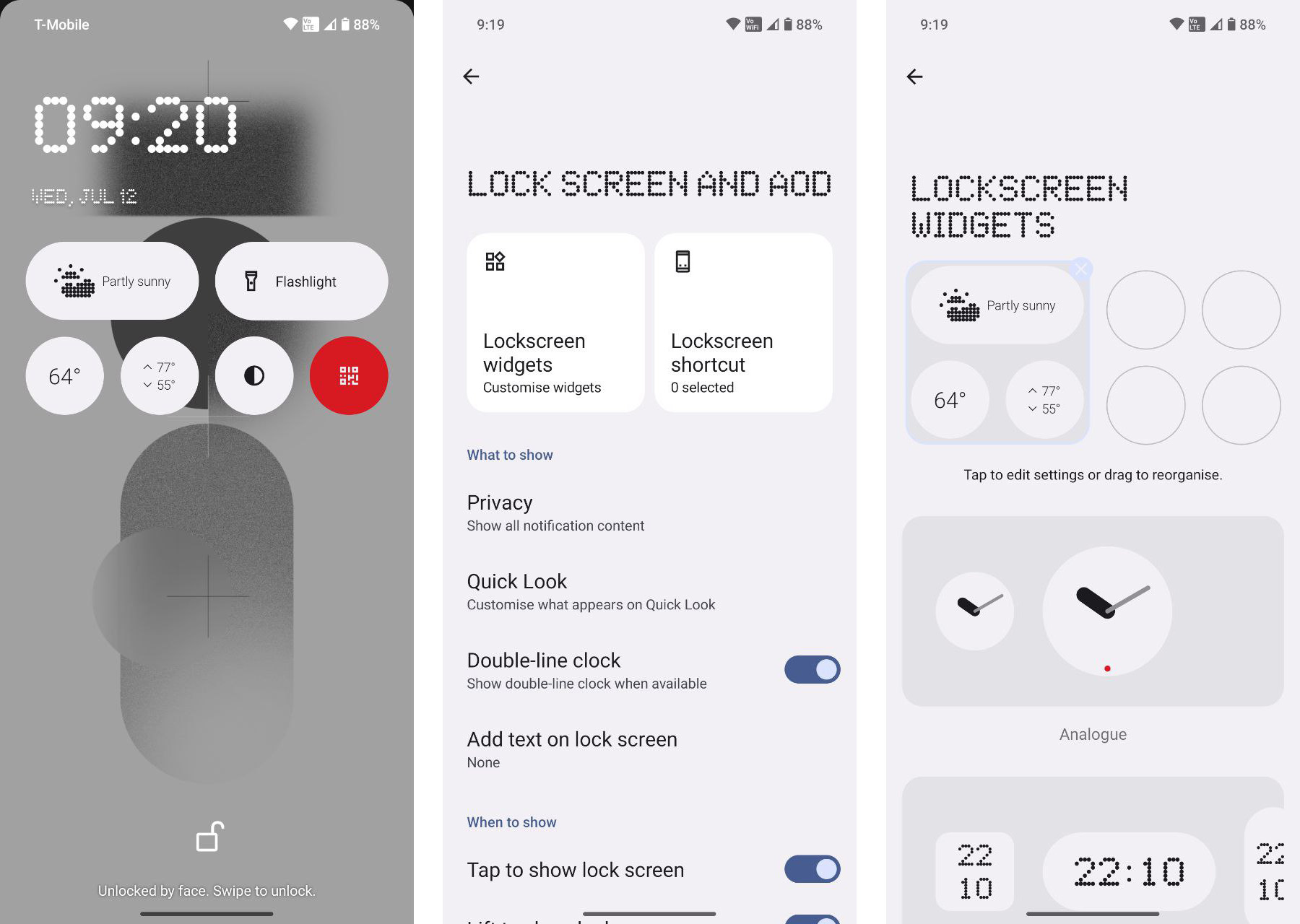
Not even kidding here – Nothing added lock screen widgets to the Phone (2) and Nothing OS. Unlike in the old days of Android, where you could only setup the widgets on a side panel, or on Samsung phones where they are also on a side panel, Nothing lets you put them on your main front lock screen.
In settings, when you open up the “Lock Screen and AOD” area, you’ll find a button for lockscreen widgets. Tapping into that opens up a setup screen with a 4×2 area that you are allowed to add items to. Nothing offers up various clocks and weather widgets, as well as quick settings shortcuts that can do things like turn on a flashlight, flip your phone to dark mode, open the QR scanner, open the calculator, and more.
So we’re clear, I’m not talking about lockscreen shortcuts, which live in the bottom left and right corners of most Android phones. The Nothing Phone (2) has those as well, in addition to these new lockscreen widgets.
Monochrome theme is hot
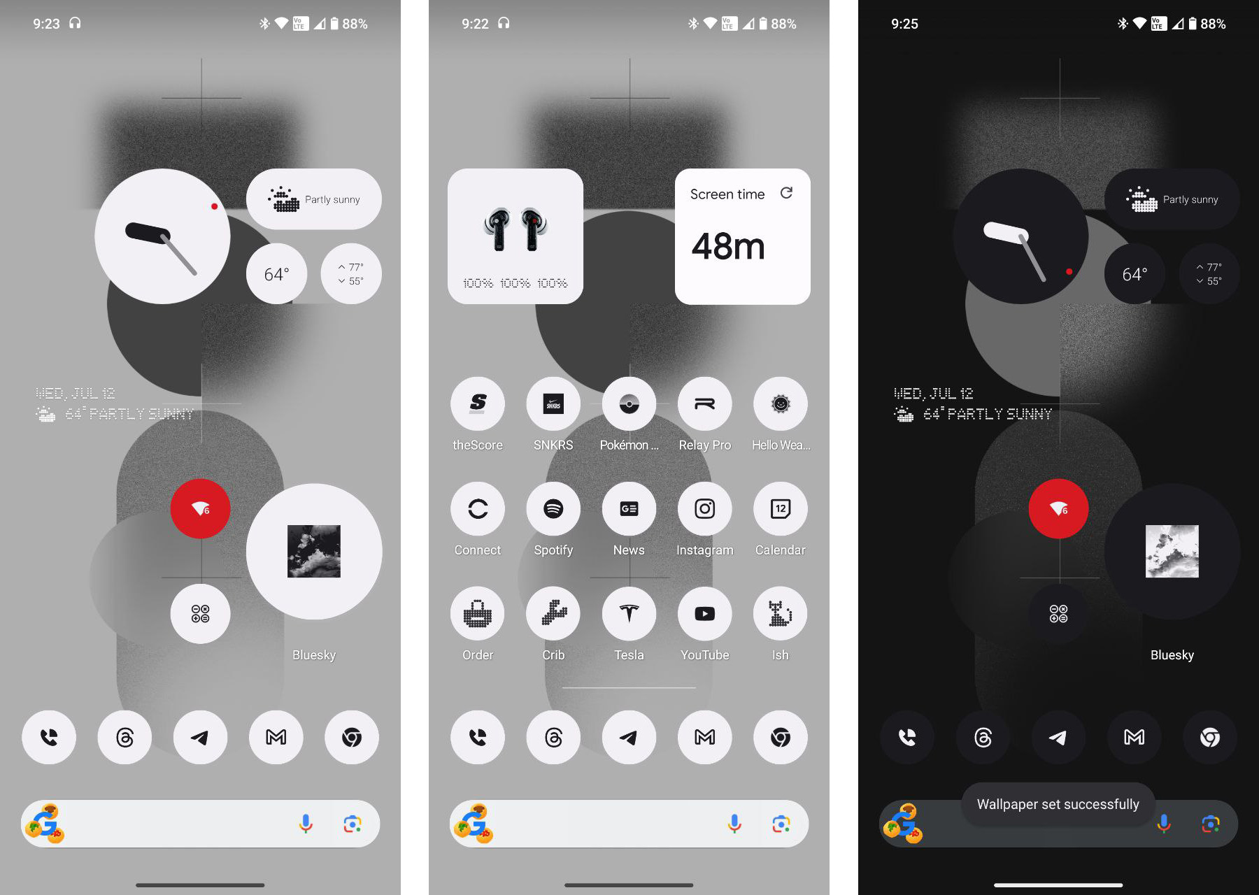
A new monochrome theme has been added to Nothing OS 2.0 and it does exactly what you think it might – it turns everything to white and/or black. This is a lot like a full theme and it includes icons. Nothing has found a way to add a white or black mask to every single icon on the phone, so no app is left looking weird.
If you long-press the home screen and choose “Customization,” you’ll see an option for the Icon Pack. If you choose “Nothing” in there, all of your icons flip to white, but then change to black when you apply your system dark theme. The widgets will match as well, assuming you are using those made by Nothing.
Home screen customization is back
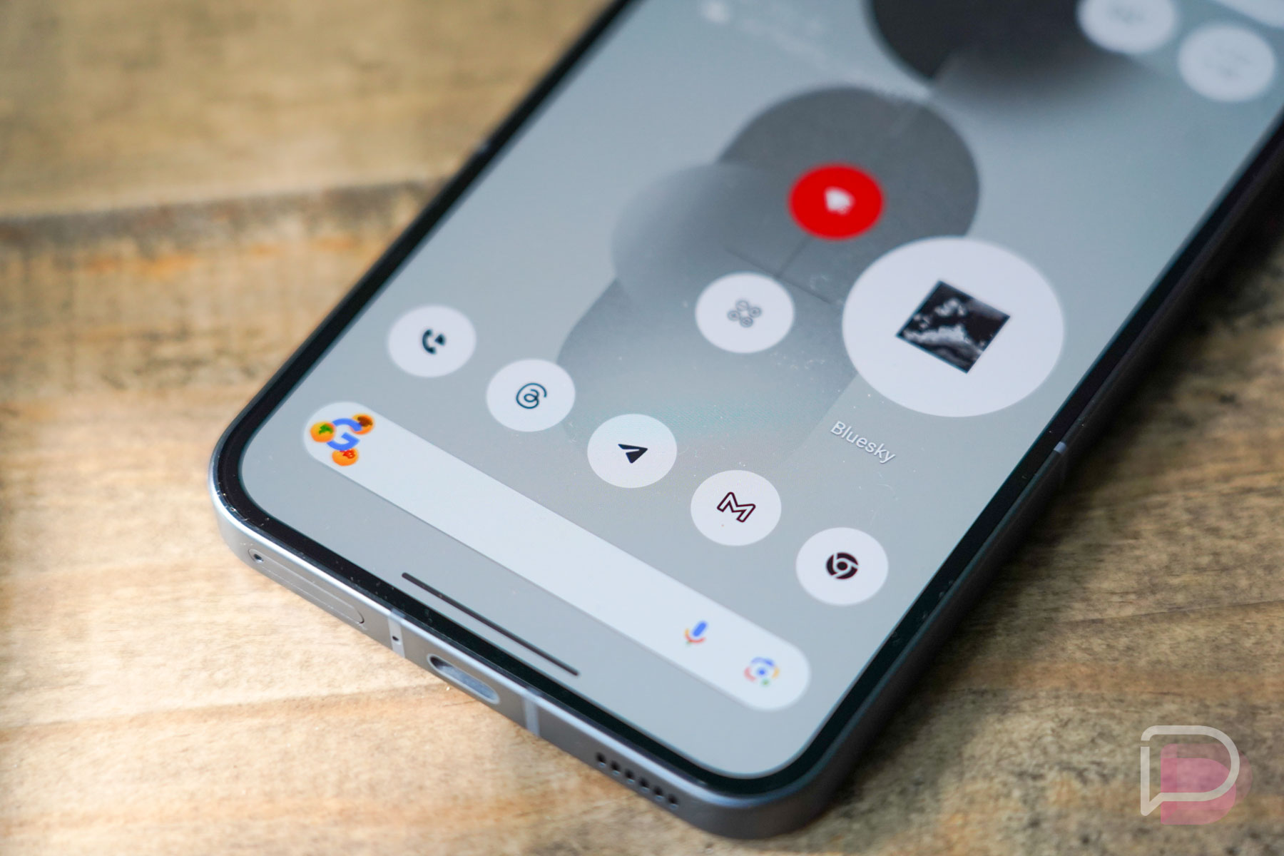
Customizing the home screen of a Nothing Phone (2) is a step above something like a Pixel phone. You can certainly go with a traditional setup with your favorite apps and folders and select widgets, but you can also take advantage of several enhancements Nothing has made.
For example, you can get rid of labels on icons to free up more space for more things. You can change individual icon sizes to a larger icon to mix up the overall look or to simply make it easier to access. This works on folders too. Speaking of folders, Nothing lets you customize the cover art on them, so instead of seeing the mini-preview of the folder’s apps, you can change it to a cat or shopping bag or wrench, as you’ll see in some of my icons above.
Nothing includes several widgets as well. Not only do they offer clock and weather options of all sizes, they have widgets that work with their Nothing earbuds and those same quick settings widget shortcuts we talked about for the lock screen.
Essential notifications in the Glyph
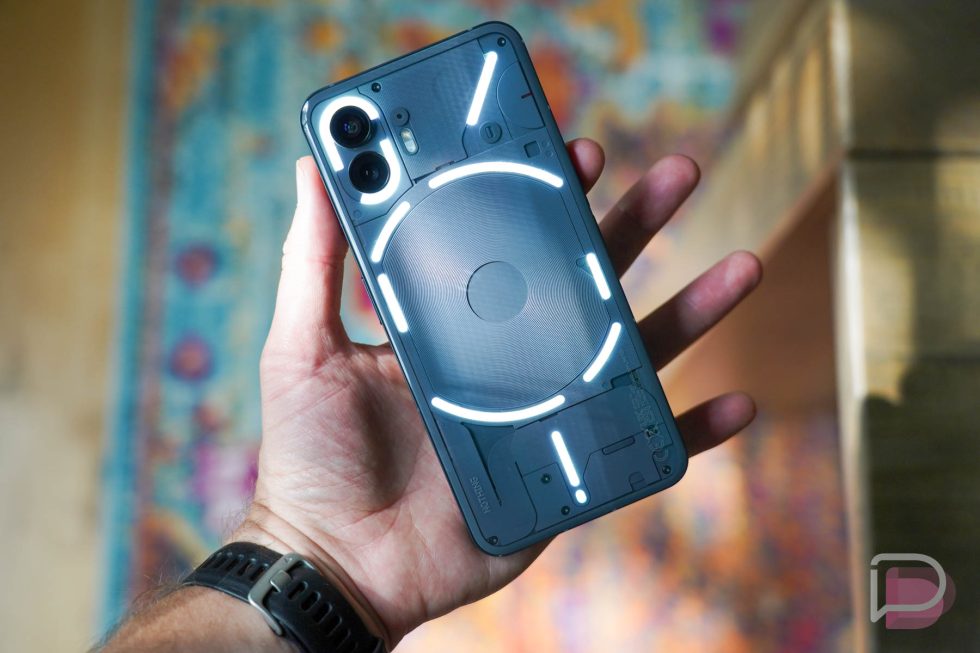
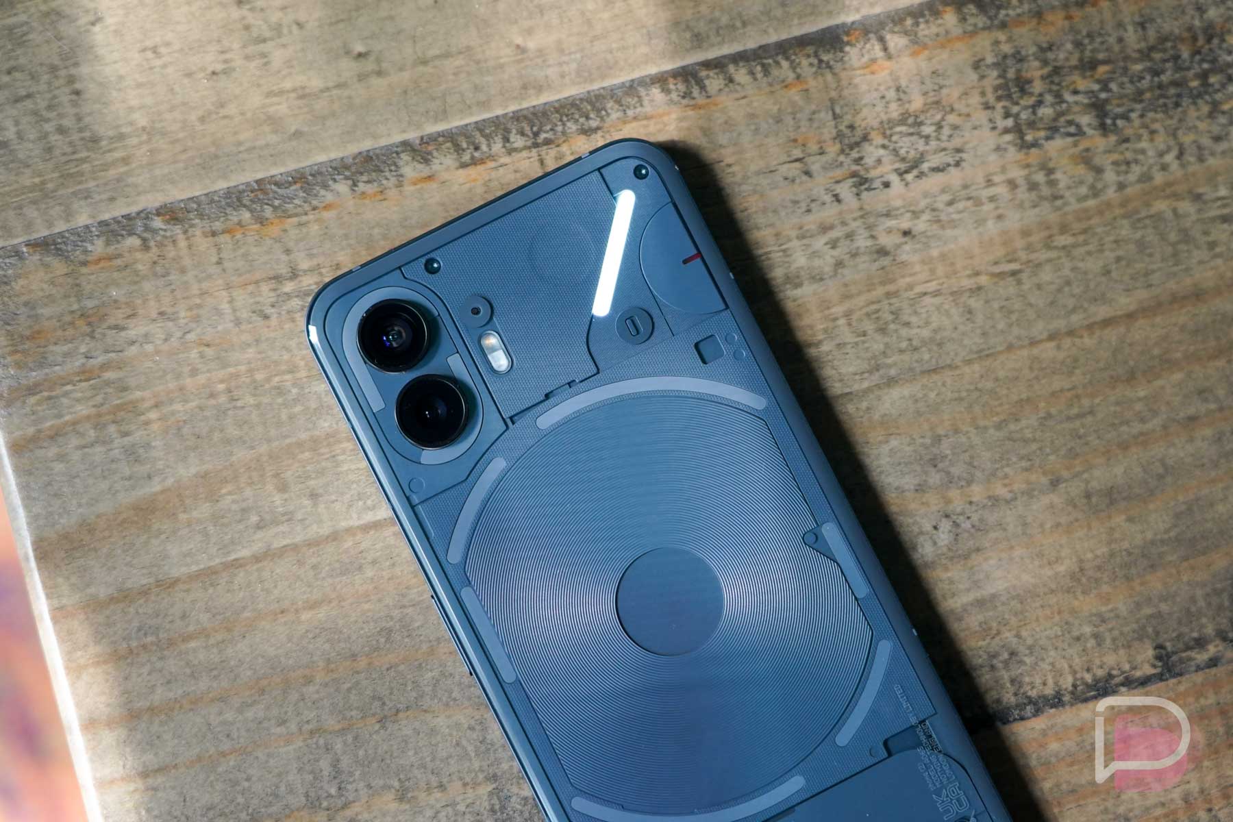
The Glyph Interface is a big piece of the Nothing Phone experience and you already know that Nothing added more LEDs and changed up the featureset. One particular feature you might find useful is called Essential Notifications.
As notifications roll in on your phone, you can long-press on them and then set as essential. This could be for a specific contact or app. Once set and your phone is flipped over to see the Glyph lights on the back, a light will continue to shine in the upper right corner if a notification comes through as essential. It’s like you have flagged specific contacts or apps during do not disturb to still ping you. This is there for those looking to disconnect from time to time yet still need the essentials.
AirPods support
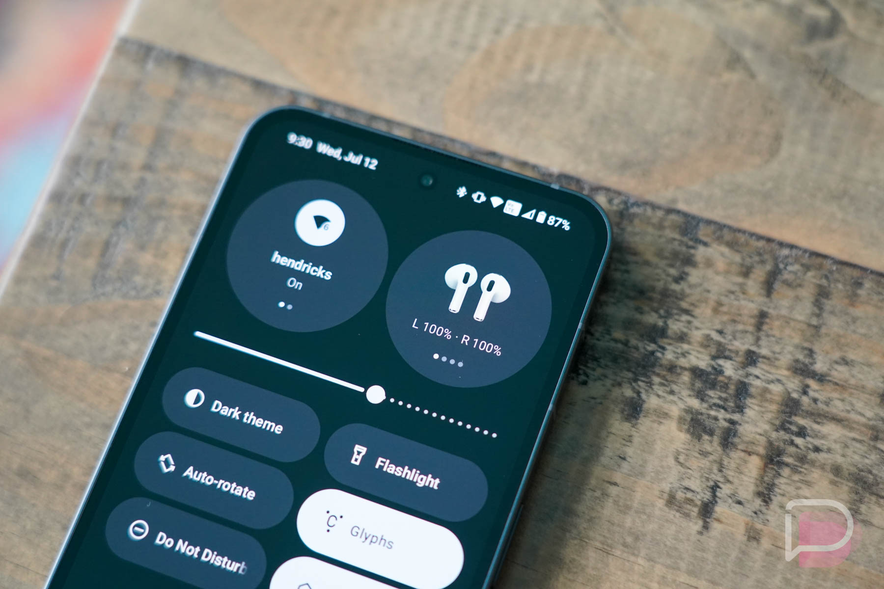
This final feature is a bit silly, but Nothing understands that people love their AirPods and might also think about owning a Nothing Phone. So they built in a experimental feature that recognizes AirPods and then shows you their battery status and icon, just like we get with most other earbuds.
So there you have it – a bunch of software related features worth noting on the Nothing Phone (2) that very well could help it standout.
More to come soon!
Collapse Show Comments17 Comments