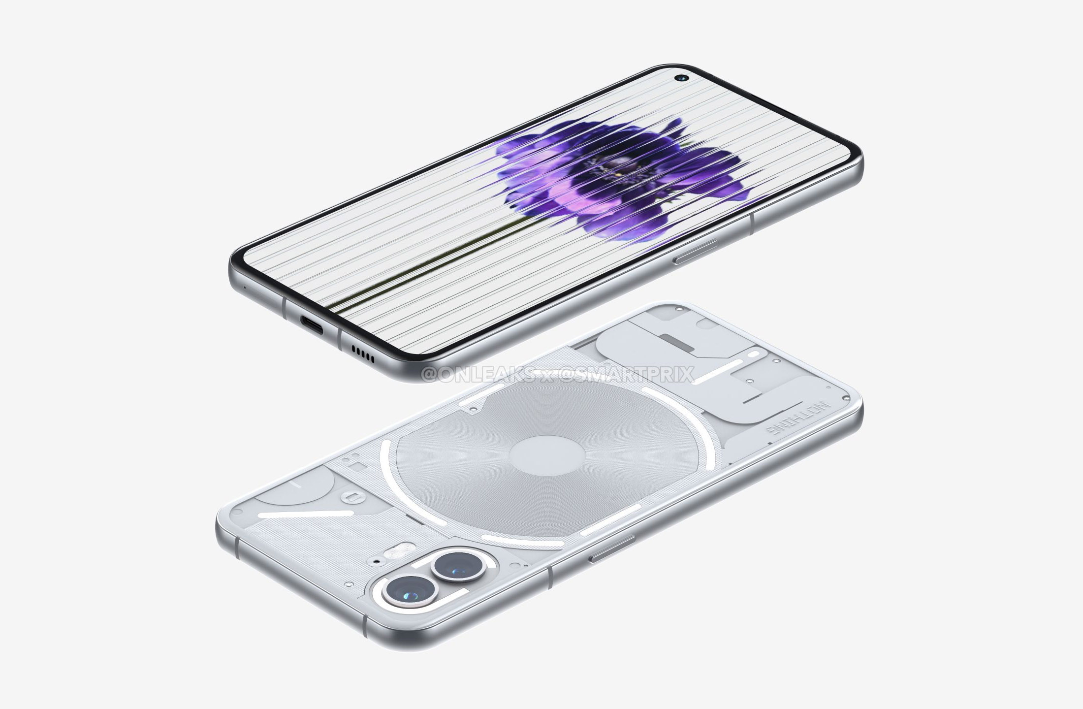
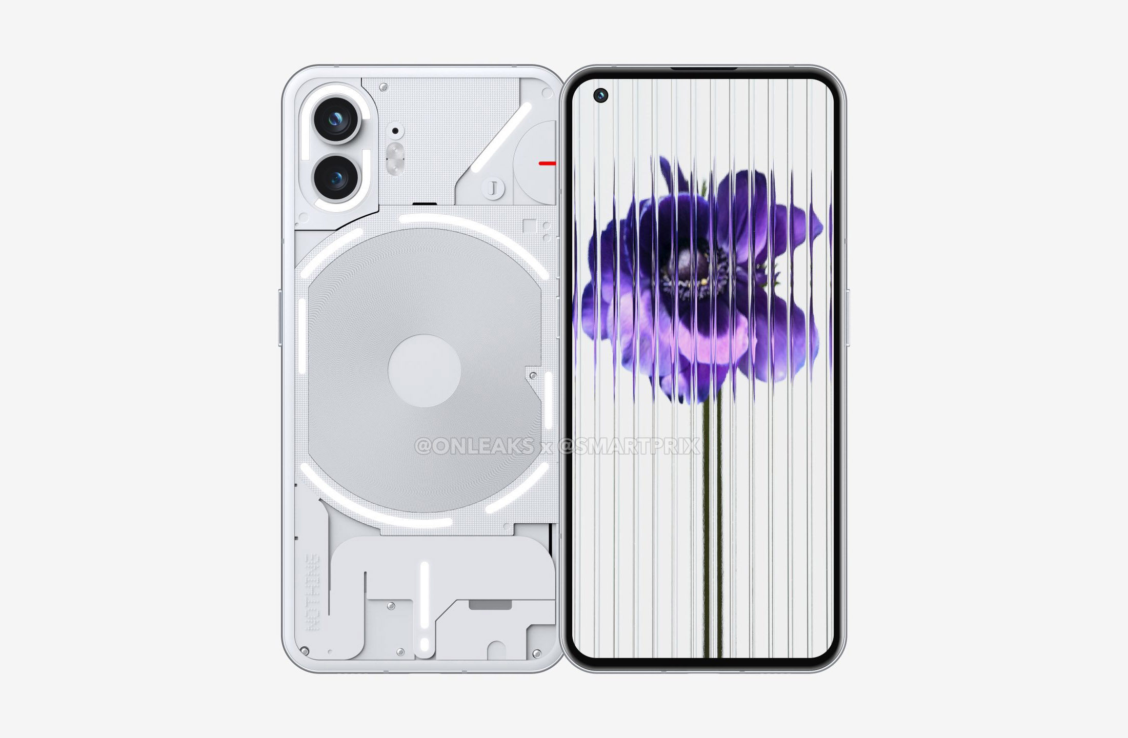
The launch of the Nothing Phone (2) approaches quickly and we’re now getting a first look at the device in render form, based off a testing unit likely being used by accessory makers to prepare cases and other goods. Renders like these are often quite accurate, so let’s talk about what’s changing from the Nothing Phone (1) to the (2).
The renders arrive via @onleaks as usual and show a device with proper refinement that should lead to a more comfortable in-hand experience. According to these renders, we should see an updated Glyph Interface lighting design on the back, though the changes appear to be subtle there.
For those who have never used a Nothing Phone (1) – and that’s going to be almost all of you in the US – I can tell you that its design not only looks like an older iPhone, it feels like a newer one in hand too. For me, that’s never been a good thing as someone who regularly dabbles in life with an iPhone 14 Pro. Apple’s squared edges are uncomfortable to use for extended periods of time and the Nothing Phone (1) brought out that same fatigue or pain for me. So for the Nothing Phone (2), it looks like we’re getting curves in the right places that should fix that problem.
These renders show a pinch of roundness to the rear panel edges that flow into a rounded side frame before landing on the smallest of curves to the front display. It looks similar to how the Pixel 7’s back-to-front roundness is pulled off, if not slightly more round at the display. We’re not talking about Motorola Edge curves, though, and that’s a good thing. There is nothing wrong with a touch of curve on a display that takes away the sharpness of a purely flat display.
The Nothing Phone (1) is a flat box on all sides with rounded corners. It certainly looks nice and feels premium enough, but again, it’s the long periods of using it that can change your opinion on fully-flat being good. The palm of your hand could always use a bit of roundness. For this Nothing Phone (2) design, it sure seems like Nothing heard complaints and addressed them head on.
As for the rear Glyph Interface lighting situation, most of the lights remain in familiar spots, but Nothing has broken them up from being continuous in places. An example is in the camera, where we are now seeing two separate light curves around the lenses, where that setup was one continue curved light that looked like a “C” in the Phone (1). You can see additional breakups of the lights around the wireless charging coil too.
And that’s mostly all there is to take from these renders. The rest of the details of this story include a Snapdragon 8+ Gen 1 processor, “Premium” everything else, and a launch in July that should happen in the US alongside the rest of the world.
As frustrating as the launch of the Nothing Phone (1) was, thanks to a decision to hide the fact that it was never going to launch in the US until the last minute, we’re still really looking forward to this Phone (2). The Nothing Phone (1) runs as smoothly and with as much snap as a Pixel phone, plus it just looks so damn clean. We actually can’t wait for this next launch.
// smartprix


Collapse Show Comments9 Comments