Apple released iOS 16 today to its still-supported line-up of iPhones and that means Google was ready with an announcement about its plans for the new update. That may read in a weird way, but you have to understand that a new version of Apple’s mobile OS also typically pushes companies like Google to update their apps and services to take advantage of anything new or noteworthy.
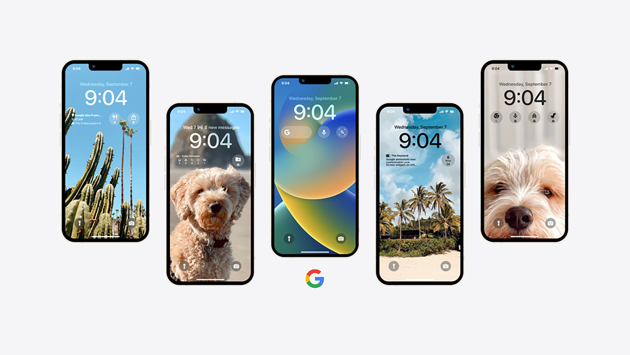
For iOS 16, Apple is giving iPhone users a feature you may remember: lock screen widgets. Yes, seriously. And because Google has a ton of important apps on iOS, they announced all of the lock screen widgets that iPhone owners will soon be able to take advantage of.
Is this not the weirdest of timelines? A feature that Google released on Android in 2012 and then killed by 2014 is a brand new item in Apple’s iOS in 2022. Of course, there have been enough advancements in software that Apple’s version of a lock screen widget is quite different from Google’s, so naturally we are seeing where Google could have taken things if they hadn’t decided to abandon the idea altogether.
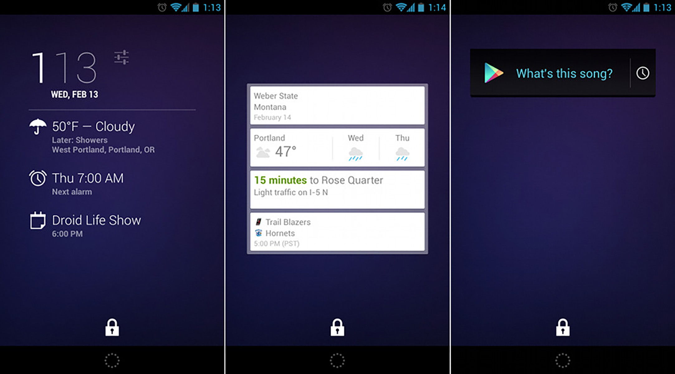
To step back for a minute, let’s remember the world of lock screen widgets on Android. First released in 2012 as a part of Android 4.2, Google’s lock screen widgets were mostly a new space for your regular home screen widgets to live. You could add a widget to find out a song that was playing nearby, add a Google Now info-provider (RIP), and show upcoming events or the weather or next alarms.
Google’s lock screen widgets weren’t perfect in those semi-early Android days. In fact, I wrote up an entire piece on what was good and bad about them. I think part of the problem really was that they were ahead of their time and Google gave up before they could better implement widgets or marinate on how to improve them as Android grew more powerful and polished.
So if you fast forward to today on iOS 16, they are indeed back in mobile form, only not on Android. Google revealed its plans that include lock screen widgets for Google Search, Maps, Drive, Gmail, News, and Chrome. Once they release them all, you’ll be able to set them up to do a quick search, see the latest news, open a Chrome tab, navigate home or to work (with traffic estimates), and check the status of your inbox. And again, this can all be done from your lock screen on an iPhone.
Apple’s widgets only live within a 4×1 area, just under the clock on the lock screen. You are limited in what can be there, but it still gives you an option to have shortcuts to actions or apps or to at least show easily accessible info. EDIT: You can update the widget above the clock too, which I didn’t realize at first. So that’s another area to customize!
Is this a better setup than what Google had in Android 4.2? In some ways it is, mostly because the widgets have been modernized and update in real-time. They are supposed to be built to a standard that fits the styling of Apple’s lock screen and isn’t the weird wild west of implementations from developers like it was on Android. The only real issue at the moment is that it’s such a small space to put them in.
Anyways, the point here is that, yes, the Android world had lock screen widgets a long, long time ago and they were an OK idea then. Apple has decided to give them a shot in 2022 and the idea has evolved quite a bit to a simpler place that might make more sense. We’ll soon see once everyone with an iPhone takes them for a spin.
If anything, and this always hurts to say, but it might be time for Google to give them another look. Apple just showed what an advanced always-on display can look like and is now using it to bring back the lock screen widget in a new form. Let’s see what you can do, Google.


Collapse Show Comments21 Comments