When you buy a phone, the design of it is important, but not one of the most important pieces. You probably care more about the camera and display and processor than you do the color or camera layout. That’s mostly because the chances of you putting it in a case are high and also that the way a phone runs and works are sort of the point in owning one. With a smartwatch, I’d argue that design is as important as anything.
A watch is certainly a tool and has been from the moment it was invented – let’s not suggest otherwise. But over the years, a watch has grown to become much more than that, and is often first looked at from a fashion perspective. You typically buy a watch because you like the way it looks. Even with a smartwatch, I don’t think most would buy one if they don’t think it is an attractive piece of tech, since it’ll live on their wrist, out-in-the-open at all times.
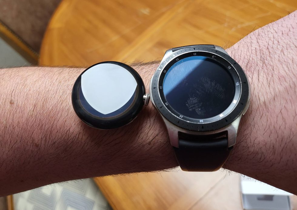
With that in mind, I’m genuinely curious what you all think about the design of the Google Pixel Watch, especially now that an early, yet also sort of finished-looking, version of one has leaked from a classic iPhone 4-esque restaurant drop.
The watch, as seen above next to a Galaxy Watch (46mm), is quite minimal in design. It is fully round with glass curving to create a domed display. You have a large crown, as well as semi-hidden buttons on each side of, plus a strap that should tuck nicely into the body like the original Moto 360.
It is somewhat of a striking design, though. It doesn’t have a chunky bezel or lugs or really much in the shape of a traditional watch, like the Galaxy Watch 4 Classic has. It sort of blends between looking like a pocket watch and the Apple Watch. In fact, it’s almost like a rounded version of the Apple Watch, which if I’m being honest, is exactly what so many of us wanted someone to make.
Let us know – the Pixel Watch is hot or nah?
This post was last modified on April 25, 2022 10:52 am

