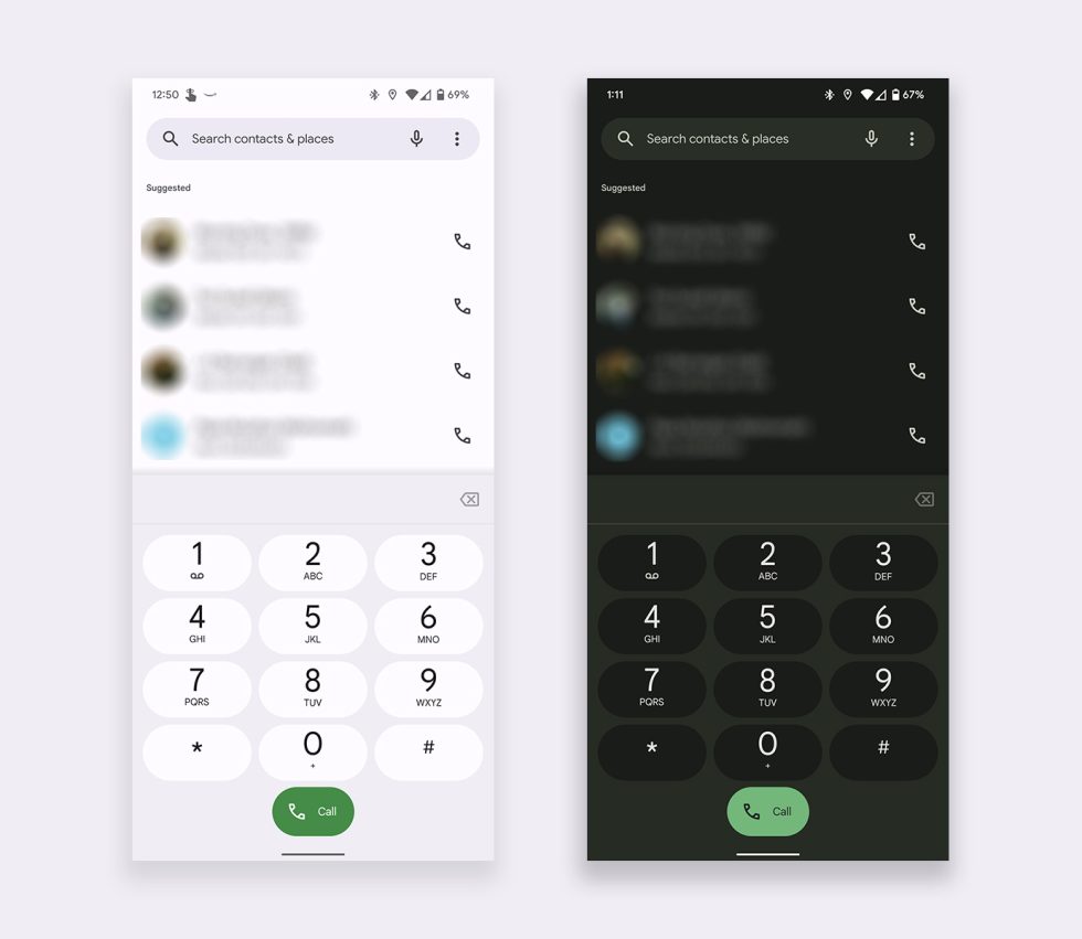
Not that any of us place actual phone calls anymore, but if you happen to on a phone running Android 12+ and with the Google Phone app, you should see an even cuter Material You look after a fresh update. A new build started rolling out last week that makes some very slight tweaks to the look of each button.
Not that the Phone didn’t look good already with Material You colors from an update that dropped last year, but now we’re really getting into it. As you can see here, this new tweak brings each button its own border, so that there is no mistaking which number you are dialing. Each number flips colors when pressed too, and of course, the colors of it change as your wallpaper theme changes.
See, super cute, right?
I know that Material You isn’t love by all, but one thing you can’t deny – Google loves it! We haven’t seen Google go all-in on updates for their Android apps in some time. For Material You and the launch of Android 12, they’ve made big changes to so many that you can’t avoid all of the playful colors.
Google Play Link: Google Phone


Collapse Show Comments8 Comments