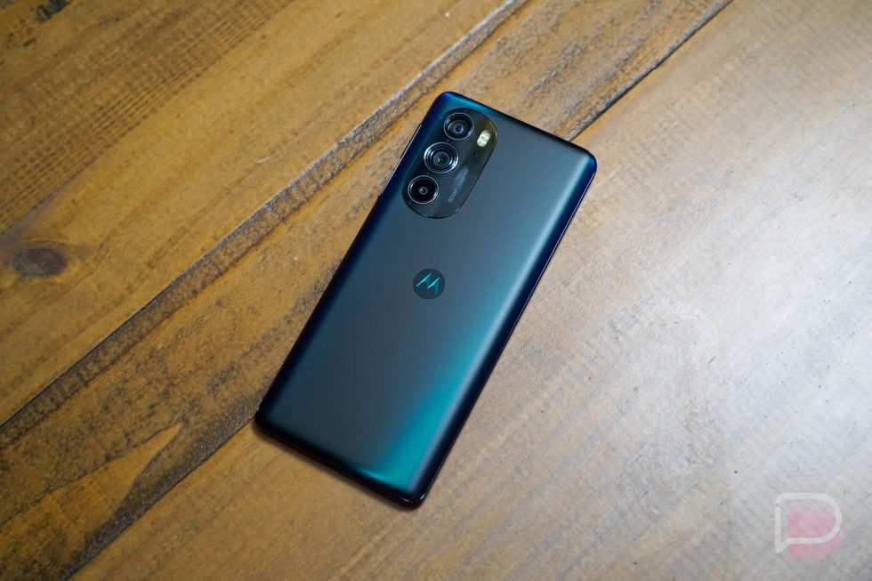
In an attempt to return to the high-end smartphone space for 2022, Motorola has delivered the Edge+ (2022), a device that was actually first shipped in China at the end of 2021, but is now in the US. Don’t let the lag time in-between launches worry you, though – this is still very much a current and properly outfitted flagship phone.
The story here isn’t about the timing so much as whether or not Motorola, after years of dipping in and out of this space, can compete with Samsung, OnePlus, and Google. With the Edge+, they are very much trying to in both specs and price, but there are familiar worries we should talk about. There are also plenty of highlights as well.
Let’s dive in – this is our Motorola Edge+ (2022) review.
What do I like about the Motorola Edge+?
Specs. If you took away the branding and sat this phone in front of almost anyone with its specs sheet next to it, they should be able to nod in agreement with you that it checks the boxes. You have a big and fast display (6.7″ at 144Hz), lots of RAM and storage (12GB x 256GB), a couple of high-end wide angle cameras (dual 50MP sensors) with the typical features, a big battery that charges quickly (4800mAh at 30W with 15W wireless charging too), stereo speakers, WiFi 6E, 5G, fingerprint reader, Android 12, 60MP selfie camera, and a Snapdragon 8 Gen 1 chipset.
But when you put “Motorola” back onto the story, you have to start asking what they cut or where does it miss a step. Whether you think that’s fair or not, Motorola often does weird things with specs in the US. For example, they almost always leave out NFC in their mid-range phones here, a move that is absolutely baffling. Thankfully, for the Edge+, there isn’t anything worrisome here, outside of the lack of an IP68 water and dust resistance rating (it’s rated at IP52). It does lack a high-end telephoto lens too, but that may not matter to everyone. It does have NFC, thankfully, and the rest all looks pretty good.
As far as I can tell, Motorola hasn’t really cut, unless again, you really need a super telephoto shooter. I do wish they would add some true water resistance too.
Display. Motorola used a 6.7″ pOLED display in the Edge+ with a full HD resolution (2400×1080) and 144Hz refresh rate. Some may wonder why it’s not a QHD resolution, but I’m still not sure I’ve seen the need for such a high resolution on such a small-scale. A 1080p display in a smartphone is completely acceptable, especially when it looks as good as this one.
This display is as absurdly fast and smooth as the 144Hz spec suggests. And I left it on “auto” for my testing, so I’ve let the system put in the work on whether or not it shows me smoothness. I haven’t noticed it dropping often, at least in situations where I would notice. Motorola also includes a 144Hz option that locks the display there, for those who really want nothing but smooth, and I applaud them for that. Most phone makers are so worried about battery life, they won’t let you force it in general display settings.
The display’s color profile looks pretty solid out of the box and probably leans towards the cooler side, which my eye always appreciates. You can tweak that, of course, plus the touch sensitivity is top notch. I do feel like it lacks in the high brightness area. It gets plenty dim, but can’t match-up to the brightness levels of my Galaxy S22. Another issue is a slight color shifting when looking at the display at an off-angle.
For the most part, this display quality is quite good, just not as good as what you might find in the Galaxy S22 line or the Pixel 6 Pro from color and brightness standpoints. I do think it looks smoother more often than those two, though.
Maybe most importantly, you also shouldn’t overlook the fact that it’s a flat display, unlike on the 6 Pro and S22 Ultra. Those two continue to push curved displays, which the world should collectively despise in a phone. They offer no benefits and only negatives outside of looking sort of cool. Motorola didn’t bring back a curved display and instead offers the classic flat design that helps it succeed in being a daily tool.
Battery life. I have no complaints in battery life on the Edge+. I wasn’t expecting there to be any going into testing because Motorola is one of the few that almost always impresses here, but I’m just confirming to you that we’re all good in this area.
The 4800mAh battery proves to be plenty and the 30W wired charging means it powers up quickly. Would Motorola benefit from 60W wired and 50W wireless charging? Yeah I guess, but for the most part, 30W wired charging should get you the juice you need in a short amount of time if you need it.
Oh, and Motorola includes a 30W wired charger in the box, which you all seem to think is a big deal. So there’s that!
For my testing, I’m still running phones from 6AM to 11PM on most days, with 3.5 to 5 hours of screen on time. My mix of use includes a lot of Twitter, Instagram, Chrome, Telegram, Google News, and some word games here and there. On one particularly heavy day, I hit 5.5 hours of screen on time and still had 24% battery left at 11PM. That’s really good in my book.
Software. The Edge+ ships with Android 12 and Motorola’s My UX software. Moto continues to keep things clean, in a “pure” Android way, while still improving the user experience by offering up their suite of features, like chopping for the flashlight or twisting your wrist to launch the camera. It’s a good combination of Google’s take on Android that also lets Motorola improve some areas.
This latest version of My UX doesn’t do anything incredibly new, but for Android 12 they are bringing in even more personalization. For example, they brought in the Material You dynamic coloring that changes system colors and accents based on your wallpaper. They are giving you choices in icon shape too, as well as fonts and font sizes. They added this new gesture where you can double tap the power button (not press it, just tap) and it’ll bring up a window with shortcuts to apps of your choosing, sort of like Samsung’s app edge stuff.
You know, that’s mostly it for new stuff. Motorola still isn’t doing an always-on display and instead does their “Peek” display, that lights up with new notifications or if you tap or move your phone. It’s not a bad alternative to an always-on display, but I don’t like the fact that it requires interaction to see information.
Besides that minor gripe, what’s great about Motorola’s software is that it isn’t trying to dramatically change Android. They really do give you a close-to-Pixel experience, so the quick settings look normal, as does the app drawer and settings menus. Everything looks like you might find it on Google’s phones, which happen to run our favorite Android.
I should probably point out that this has Motorola’s Ready For software. Ready For is like Samsung’s DeX, in that it brings a desktop-like computer experience from your phone to a big screen. I have no idea who uses this stuff, but it is here and available. I haven’t tested it and probably won’t. Sorry.
Like I’ve said probably dozens of times by now, Motorola’s software is a style I prefer. It’s lean and fast and isn’t overdoing it, but there are subtle improvements. It’s a dramatic change from what Samsung and OnePlus are doing.
I’ll talk about software updates down below.
Performance. This Motorola Edge+ (2022) was one of the first phones (the Chinese version, that is) to run a Snapdragon 8 Gen 1, the newest chip from Qualcomm. This particular review unit pairs that chip with 12GB LPDDR5 RAM and 256GB UFS3.1 storage. The combination of those insides and with a 144Hz display, along with lean and clean software, means you will enjoy the performance of this phone.
As I always note, we don’t do benchmarks and instead use phones as we would our own personal phones during review purposes to get a feel for the experience from one phone to the next. I can tell you that this phone is as buttery smooth as you’d hope. It almost never skips a beat. The simple things are nailed here, like a swipe up from within an app to go home, where the animation shrinks back down to the app icon’s location on a screen. My Galaxy S22 often jitters during this movement or misses a frame during general use, but not this Edge+.
I don’t really know how else to explain it other than that you would be thoroughly impressed by how fast this phone feels. It feels fast in a way that OnePlus has perfected over the years, even though the components they use are the same as everyone else’s. Motorola has truly dialed this Edge+ in.
Design. For a large phone, the Edge+ doesn’t necessarily present itself as being as big as it is. Motorola has designed this phone so that it curves into your hand, is balanced from top to bottom, and doesn’t weigh (or at least feel like it weighs) so much that you’ll experience fatigue trying to mange it. The subtle curves on the back fit my hand perfectly, and as someone who complains a lot about all the big phones on the market, this one hasn’t been difficult to deal with while reviewing.
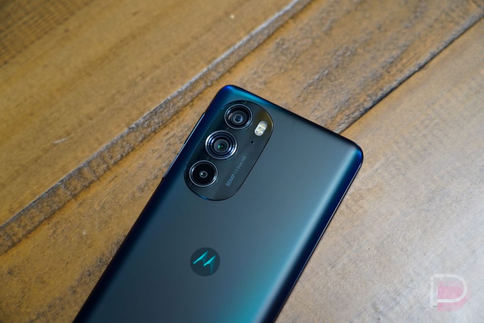
Motorola put this really cool finish on the backside that looks like a holographic or reflective frosting, so as you move the phone around, you can see the deep blue color shift around. It’s a cool effect and the finish on the back doesn’t pick up a ton of fingerprints. The camera hump on the backside also doesn’t stick out so much that the phone can’t be used when sitting on a flat surface. There is a touch of wobble, but not in an obnoxious way like on the Galaxy S22 Ultra.
If I have complaints about the design, it’s maybe that it is a bit boring. We’ve seen this smartphone design on numerous other phones in recent years. The volume rocker is placed horribly too, so far up the right side that it can be hard to reach without doing a big shimmy shift in the hand.
But mostly, the design is unassuming with a fun reflective coloring on the back, good balance for a big device, and one that isn’t trying too hard to make a statement.
Camera. The Edge+ is outfitted with a dual 50MP camera setup, so you’ve got a 50MP main shooter at f/1.8 and a 50MP ultra-wide shooter at f/2.2. There is a third sensor that weighs in at 2MP, but I’d be wasting my time trying to find a use for it. Just consider this phone to have two 50MP sensors and get to work with it.
In my testing, I found this Edge+ camera to be fast, versatile in both indoor and outdoor lighting situations, and flexible enough with that ultra-wide lens along for the ride. You can capture great depth of field, shoot solid portraits, and have a lot of fun with their macro mode.
The app Motorola uses has gotten better too, so portrait mode works in a lot of situations now, there is a full Pro mode, and there are several gimmicky modes that all smartphone makers keep including because someone must use them. It’s a pretty well-rounded camera app.
For results, I’ve been in smartphone testing mode lately, with several phones (including the Edge+) in and out of my pocket and I think this holds up nicely to the competition. It’s ultra-wide can process a littler warmer than the main shooter. There’s some pretty heavy-handed binning going on too (from 50MP to 12.6MP) that really removes detail from landscape shots, so consider switching to the full 50MP mode for some of those. Otherwise, not many complaints from me – I think Motorola did solid work with this camera.
Fingerprint reader. You might find it odd that I’m pointing out a fingerprint reader in 2022, but Motorola isn’t following the current trend of slapping in whatever bad in-display reader is currently available and sticking to it. Instead, they included a fingerprint reader in the side-mounted power button and it works so well. The positioning can be somewhat awkward at times, depending on which hand you are holding the phone in, but this thing is fast.
I’m not sure I believe that in-display fingerprint readers will ever be very good, so it brings me joy to see someone not use one. These hardware or capacitive or touch pads that we see from time to time remain the best. On this Edge+, you barely have to touch your finger to it and the phone is immediately unlocked. It rarely-if-ever errors or fails to read and is about the most trustworthy fingerprint reader I’ve used since the Pixel 5’s.
Please, smartphone industry, can we go back to these?
What don’t I like about it?
The update situation. Motorola deserves plenty of praise for their approach to a software experience, but they deserve as much ridicule for their approach to software updates. Google has expanded its support to 4 years and Samsung is doing up to 5 years now, yet Motorola almost always falls back to 2 years of OS updates and 3 years of security patches that only come every couple of months.
The Motorola Edge+ is a $1,000 phone. Supporting a $1,000 phone in 2022 for only 2-3 years with sporadic updates that are often months and months behind the rest of the industry is borderline unacceptable. But Motorola just doesn’t care. My guess is that they aren’t seeing customers hang onto their phones for longer than 2 years and so they don’t feel the need to commit any further. It sure looks bad when the rest of the players they compete against are only getting more serious about them.
Should you not buy the Motorola Edge+ because it may only get 2 OS updates and (maybe) 3 years of security patches? You would need to ask yourself how much you care about software updates. If you need to have the most up-to-date security patches and don’t want to see every other Android phone around you get Android 13 or 14 months before you, then you would need to look elsewhere.
What’s the pitch? For the most part, there isn’t much to dislike about the Motorola Edge+ and there are plenty of things to like about it. But what’s the big sell here? The phone is big and runs well and has good specs and a solid camera and battery life and all that. It looks nice enough out of the box and isn’t offensive. But what are you buying this for?
Does it have the best camera? A good one, but maybe not the best. The best display or most attractive design? No. Is the price incredible? No. Is the software support better than competitors? Definitely, not. Maybe you want software that can double as a desktop…but you don’t like Samsung’s DeX? Uhhh.
This is a weird phone. Motorola made a good one, but at $1,000 you start comparing to other $1,000 phones. We know why you buy the Pixel 6 Pro (only $899, incredible cameras, software support, and the Pixel experience) or the Galaxy S22 Ultra (incredible software support, excellent cameras, S Pen, and more). Why do you buy a Motorola Edge+? I don’t really have an answer.
Video
Unboxing
Should you buy a Motorola Edge+ (2022)?
I know that I just tried to answer this above, so obviously I don’t know if you should buy a Motorola Edge+. Here’s one way to look at the Edge+ — If this were a phone I was considering, it would probably be because I was sick of Samsung’s excessively bloated One UI skin (and I truly am), I don’t trust Google’s Pixel 6 Pro with all of the software bugs they are still trying to get rid of 6 months later, and OnePlus is trending in a direction I’m not a fan of. Then this would be on my list.
And if that’s you, the Edge+ really is giving you great performance and battery life, a nice display, solid camera, and clean software that stays out of your way. There will always be worries about software updates and their timeliness, so keep that in mind that not all is well here. But yeah, like the Edge+ from 2020, I think this is indeed a phone to consider.


Collapse Show Comments20 Comments