Be prepared for us to talk a lot about this app or that app receiving its “Material You update,” because as Android 12 gets closer to launch, Google is going to continue to prepare its main apps with theme makeovers to match their new design language. It’s a lot like how we couldn’t shut up about dark themes in apps for a good couple of years, which is (thankfully) not a thing we worry about any longer.
An example of this type of story is this one here, or the story you are reading, where we’re looking at Gboard and the rollout Google has begun for it with a theme switch. The Gboard Material You update is here!
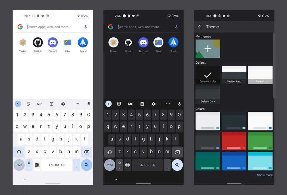
A number of users at reddit noticed today that their Gboard apps now have extra rounded bits, as well as new colors they weren’t expecting. What we are seeing is Gboard adopting not only a new look, but it’s taking on the system accent color that is being pulled from wallpapers.
Many have suggested that they are in the Gboard beta and that’s how they are getting this. I’m also in the Gboard beta and am most definitely not seeing this action. F*cking server side rollouts.
How you’ll know if you have the new Gboard is if you head into Gboard settings, you’ll see a “Dynamic Color” choice in the Theme section. Being Dynamic lets it adopt the colors that your wallpaper has supplied to the system. If you aren’t liking that look, you can always manually force it back to a standard theme.
Anyone seeing this? How’s it look?


Collapse Show Comments13 Comments