Now that you have the Android 12 Beta 2 up and running on your phone (or you are considering it), let’s talk about all that is new in this latest build. Up front, Google wants you to know that the privacy dashboard, mic and camera indicators, and WiFi UX are all new and here, but we get the feeling there is more.
We’ll continue to update this post as we find everything new in Android 12 Beta 2!
Privacy Dashboard


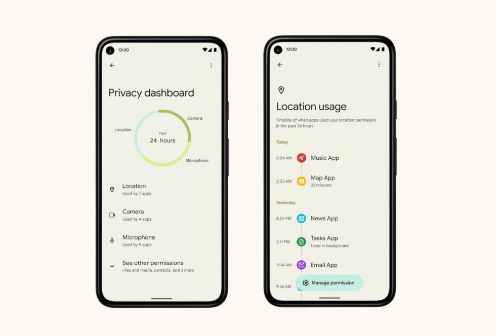
We thought the Privacy Dashboard might show up in Beta 1, but here it is now in Beta 2. Google wants this to be a centralized place for better visibility over the data that apps are accessing. It should offer a clear view or timeline of the apps trying to use your location, camera, and microphone over the past 24 hours.
You can view other permissions in this Dashboard, but those 3 are the big ones Google is focusing on here.
Microphone and Camera indicators and toggles
We knew these were coming from previous leaks, but in Beta 2, Google is adding the microphone and camera indicators you see in the screenshot above in the top right corner. Those are there to tell you that apps have accessed those. You should be able to tap that to see recent usage history and which apps were involved.
Google is also giving you system-level Quick Settings toggles to turn off both microphone and camera in the easiest way.
- UPDATE: Here are the Quick Settings shortcuts.
New WiFi UX experience
Google says they’ve added a new “Internet” network connections area that pops-up when you long press the related Quick Settings tile. The point is to have “a simpler and more intuitive connectivity experience across the Status Bar, Quick Settings, and Settings.” This new settings area should make it easier to switch between service providers or troubleshoot connection issues.
New quick settings tiles and shortcuts are here?
We’ll update this section once we can flash Beta 2, but the screenshots Google posted today show a tweaked Quick Settings area that not only adds the Google Pay tile (was missing in Beta 1), we get new buttons below that. You can see the edit button for Quick Settings, but next to that we have a profile switcher, settings button, and a power menu button.
That new power button is likely in response to Android 12 bringing support for Google Assistant to be accessed via the power button on the side of your phone. In Beta 1, turning that functionality on sort of made it difficult to turn your phone off or reboot it. This should fix that.
- UPDATE: Here is that new power menu.
Enhanced Notifications
When you first boot Android 12 Beta 2, it tells you that Android has ditched Android Adaptive Notifications and switched to Enhanced Notifications. Clicking “Learn more” tells us that these show “suggested actions and replies, and organizes your notifications.” These can access notification content, including personal info (!), and that it can “dismiss or respond to notifications, such as answering phone calls and controlling Do Not Disturb.” OK, then.
We’ll see what else we can learn about these.
Notifications area has a new dedicated space, with a more prominent background.
So the notification area has changed. It has a separated round-top background from the Quick Settings area. If you swipe down for notifications and have none, you just get a big blank space with nothing in it. If you have notifications (below), it fills up nicely and looks less weird. But it really looks weird with nothing there.
The “Quick Tap” gesture works!
The double-tap gesture now works on the back of phones to open Assistant, take screenshots, open apps, and more. Here it is working with Google Assistant in these screenshots. To turn it on, head into Settings>System>Gestures.
The wallpaper color theme engine is working! We have colors everywhere!
To briefly explain, the system is now matching items to the prominent color of your wallpaper. Here I simply switched between orange and blue-heavy wallpapers that the system then pulled from. I wish the colors were slightly stronger, but there could be ways to tweak it. We’re still playing!
Lock screen gets new Google Pay shortcut and screen
On the lock screen, Google added a new bottom-right corner shortcut to get you into Google Pay easier. Tapping that opens a new Pay screen where you can use your default cart or choose another. You will need to unlock your phone to do much more, but this makes Pay really easy to access.
Updating this post with more!
This post was last modified on June 9, 2021 6:09 pm

