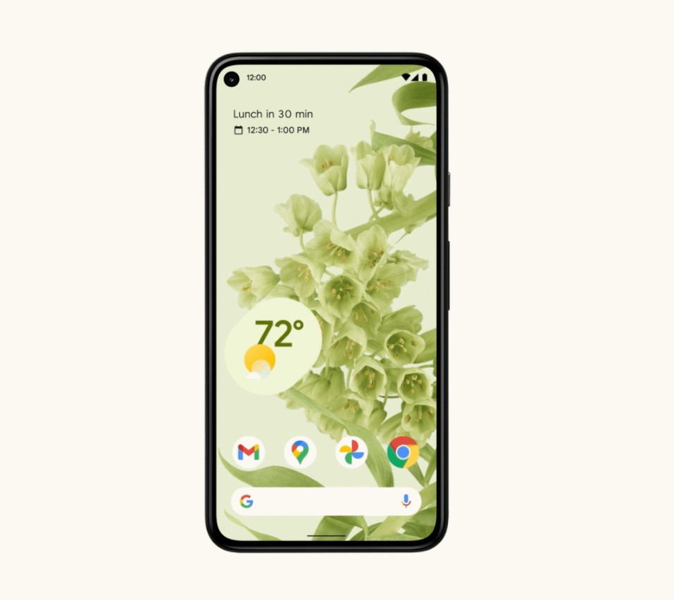
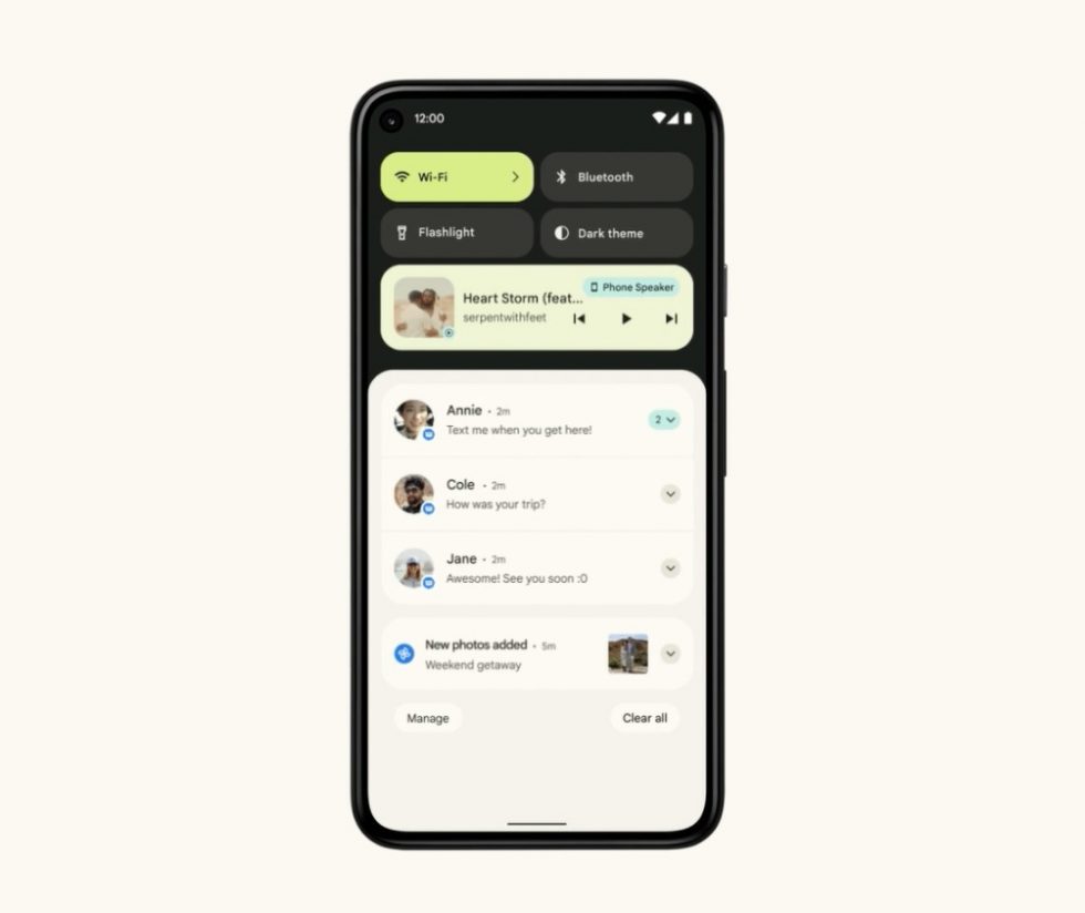
Google just announced its new design language for Android and its called Material You. This is the big Android 12 UI overhaul we hoped was coming and it is now official. It looks incredible.
With Material You on Android 12, you get a more personalized appearance, where yes, your wallpaper leads the charge in highlighting colors throughout the UI. A blueish wallpaper could add blue notes to notifications, settings areas, widgets, the keyboard, and more.
Google is also redoing widgets with this new language, greatly improving animations and performance everywhere to ensure the smoothest experience yet, and has tweaked system spaces like the notification area (with Pay and Home shortcuts). Even simple things like showing a bigger clock on the lock screen when you have no notifications or lighting up the phone depending on where you touch it first, all have been added to Android 12.
Google is releasing the Android 12 Beta today with parts of this UI as they continue to build it out into the fall and the stable release of Android 12.


Collapse Show Comments25 Comments